Gigabyte GSmart S1205 review: A smart duo
A smart duo
Smart Pack Custom interface
Gigabyte GSmart S1205 runs Windows Mobile 6.5. That’s not an impressive start really – several months now since the much fresher WinMo 6.5.3 has been around and the new Windows Phone 7 is expected in another few months.
Luckily, there is some eye candy – and a bit of functionality boost – on top of the stock OS to make up for the missing WinMo 6.5.3.
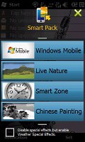
Let’s take a closer look at the home-brewed Smart Pack. This is actually what makes the Gigabyte GSmart S1205 worth a look – apart from the dual SIM thing. What you get is not only a revamped homescreen but three Gigabyte-made themes that will let you further customize the handling – with quite a number of homescreen panes, various shortcuts, sweep gestures and widgetry.
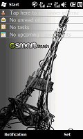
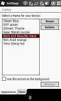
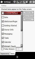
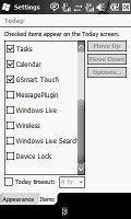
There’s nothing special about the Windows Mobile theme. You have a homescreen with customizable wallpaper and some virtual buttons (called “items”). You can add as many items as you wish until the whole Today screen is covered with them. The items are most of the time simple small-font lines of text you can’t really tap – stylus works way better. It doesn’t look too tidy, let alone stylish, especially on a low-res screen.
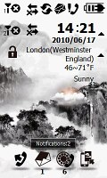
Next up is the Chinese Painting theme which brings you three homescreen panes. The first one (central) features four shortcuts docked at the bottom. By default, those virtual buttons are assigned to the dialer, messaging, call log and the theme switcher. Notice the small numbers below the Messages and Call Log icons – those indicate the number of new messages and missed calls.
Tapping and holding on any of those four shortcuts will launch a menu to let you assign other functions – you have a choice between nine items.
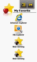
The favorite features list is a swipe away to the right, on the next homescreen pane. Again, you can tap and hold on an item to change or remove it.
A swipe to the left form the central homescreen will take you to E-mail, Call History, Contacts and Quick Contacts.
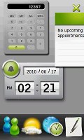
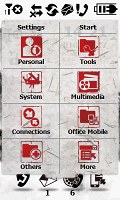
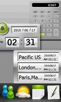
Another swipe, this time upwards, leads you to the widgets – Calculator, Notes, Windows Live, Clock, World Clock, Schedule, and Weather. A downward swipe (or pressing the hardware Confirm key), will take you to the menu. Those two screens (widgets and menu) are also available in the next two themes. They only look a bit different.
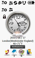
The other things that the three Gigabyte themes have in common are the icons on top of the homescreen. Those are somewhat oversized (bad-looking, but are finger-friendly) indicators for the battery, signal strength (for both SIM cards) and connectivity with the lock key underneath. And under the battery indicator you’ll see information on the time and date as well as a weather forecast.
A tap on the battery indicator starts the Power Manager while tapping on either of the signal strength indicators will bring you to the Wireless Manager where you can switch Wi-Fi and Bluetooth on and off, enable/disable any of the SIM cards and activate Airplane Mode.
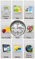
The Smart Zone theme has 9 homescreen panes, which are accessible by thumb sweeps in all four directions. The funny thing is you even have diagonal swipes. If you press the Confirm key, you’ll get a tiled view of all 9 homescreen panes.
The central screen displays the same information as the Chinese Painting homescreen but this time there is a large centrally located analog clock with weather readings just underneath. The rest is the same.
Again, the left screen (swipe to the right to access it) is reserved for the favorite features list and the right one – for E-mail account, Call History, Contacts and Quick Contacts.
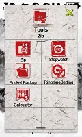
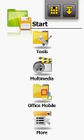
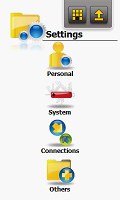
To get to the settings screen you swipe upwards from the homescreen, while a short menu (Tools, Media, Office Mobile) is hidden in the upper screen. Windows Media is launched by a diagonal swipe downwards left to right. A downward diagonal swipe right to left reveals the Photo Album. The other two (upward) diagonal swipes will take you to the Widget screen and the Internet Explorer, respectively.
To go back from any of the panes to the central homescreen, there’s a dedicated button in the upper right corner of each screen. Right next to it, is a button that will bring up the aggregated tile view of all the screens.
It sounds complicated but it isn’t once you’ve spent some time with the phone. The graphics generally look poor on the low-res screen and the Smart Zone theme does look rather basic with its white background. The diagonal swipes are just too much perhaps. But some users will appreciate the number of shortcuts available on the Gigabyte GSmart S1205.
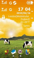
The Live Nature theme is our favorite. There are no countless screens here (just the homescreen, a custom-made launcher and a widget screen) but it still is convenient enough. And reasonably attractive too – as much as it could be on a WQVGA screen.
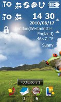
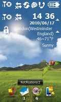
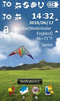
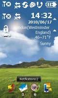
The homescreen is pretty standard with one major exception – it’s alive. There’s always something going on – a snail will slide down a leave, cows grazing in the meadow will moo when touched, a little frog will snap at a buzzing fly. You may notice a flying kite, an airplane or a flock of birds crossing the sky, rain falling down. None of these though is informative in any way, no alerts or signals or anything. It’s all there for fun’s sake. .
The Widget screen is an upward swipe away while the Application launcher menu is in the opposite direction (or accessed through the Confirm key).
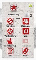
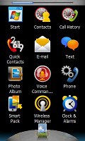
Speaking of the special Application menu, it’s like a list of all your applications and most important settings all in one place. It consists of three screens. The indicator on top of the display tells you which of the menu screens you’re currently looking at.
If you prefer the standard Windows honeycomb, it’s a tap away on the Start key below the display.
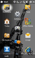
The standard honeycomb Windows Start menu
We decided to do a benchmark and see how the Gigabyte GSmart S1205 stacks up next to the much powerful Acer neoTouch, which comes with the 1GHz Snapdragon processor on board. From the screenshots bellow you may see that CPU results of the Snapdragon are 3 times better, while most of the other neoTouch benchmark results are even more impressive.
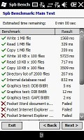
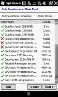
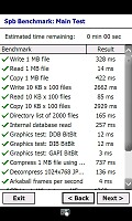
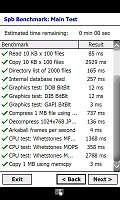
Spb Benchmark - Gigabyte GSmart S1205 and Acer neoTouch
Overall, Gigabyte deserve some credit for trying to boost customization options. It’s not always consistent and not all of their design decisions make sense. Not to mention that the poor screen resolution does the interface little favor.
The respectable number of shortcuts and the level of homescreen customization are commendable. The themes are diverse enough and give users adequate choice. On the other hand, the lack of a proper Back button does affect navigation. And sadly, there are too many places in the interface where the stylus is essential.
Reader comments
- Bishop casey
- 25 Jun 2012
- HDQ
my hand set also broken, no one can help me to repair bbroken lcd. anyone there who could say something?
- Anonymous
- 17 Apr 2011
- SX1
LCD was broken. I cant repair it. It's very expensive for repairing - 100 euros!!!
- Jayaram
- 12 Feb 2011
- utV
Gigabyte GSMART S1205 is the best dual sim available with all the features of a mobile (except 3G and front camera). Its connectivity is super in both the sim. You will not miss any call any where. The sound volume though low is very clear. In distur...
