Google Nexus 10 review: Perfect ten
Perfect ten
Small but important changes to the UI
The Nexus 10 tablet comes with Android Jelly Bean but it's the latest version, 4.2. While the update is mostly about polishing the experience than bringing something completely new to the table, Google has nearly perfected the interface.
Here's a taste of 4.2 Jelly Bean on video:
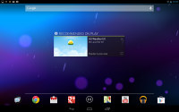
The lockscreen is one area where 4.2 vastly differs from 4.1 - there's so much new functionality that it will change the way you use tablets. As usual, there are multiple unlock routines, some more secure, some quicker to unlock, but the default is swipe to unlock.
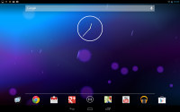
The clock on the lockscreen is now a widget rather than a fixed item. You can have multiple widgets (you swipe left and right to go between them) and you can rearrange them similar to homescreen widgets. The difference is that only one widget can be visible at a time. The widgets that are available by default are a digital clock, Gmail and Calendar (you can have multiple copies of each). Apps can add their own lockscreen widgets to the list.
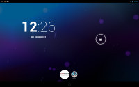
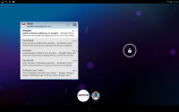
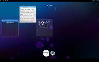
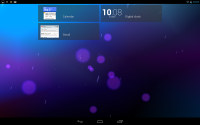
The Jelly Bean unlock screen: slide up for Google Now, anywhere else to unlock
One difference between the phone and tablet versions of the 4.2 lockscreen is that you can't unlock straight into the camera app.
The other major novelty on the lockscreen is multi-user support. If you have more than one user set for the tablet, you'll see their images as circles at the bottom of the screen. This is a great way to share a tablet at home as everyone will get to use the Nexus 10 as they like - as long as you don't want to use it at the same time, of course.
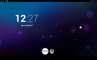
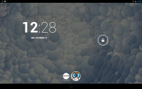
The user-switching shortcuts at the bottom of the lockscreen
You can tap a circle to switch to that user, which will also change everything from settings through what installed apps are installed to what files are accessible. So, if you snap a photo while signed into your account, it will only be accessible from that account. That works even when you hook up the tablet to a computer - you can't access files from another account.
If you try to install an app that's already installed on the tablet, but on another account, the OS will make it available for your account too (without re-downloading it). The apps files will be separate for the different accounts.
Overall, the multi-user support is a great way of sharing your Nexus 10 with your partner/kids or even friends and it's quite nicely implemented. It doesn't waste any storage and there's no need to fear that your settings will be messed up or your apps/saved files deleted. Nor is there the need to deal with other people's apps that you don't need either.
Anyway, the default Jelly Bean homescreen has hardly changed. It shares many similarities with what we were first introduced to in Ice Cream Sandwich. Long gone are the days of contextual hardware controls - everything is done on the display itself.
There are still the usual five homescreen panes, none to be added or removed.
A portion along the bottom of the display has been reserved for three on-screen buttons - Back, Home and Recent apps. These buttons are now placed in the center, which on a 10.1" tablet in landscape orientation can be hard to reach.
Above the row is the favorites tray. The Nexus 10 allows up to eight shortcuts to be placed within this dock, surrounding the app drawer shortcut in the middle. Any of the eight shortcuts can be customized by dragging icons into and out of the tray, and you can even create folders by dragging icons on top of one another.
Another permanent fixture is the Google Search bar at the top of the screen, which stays in place as you scroll the homescreen panes.
The improved notification area is another Jelly Bean highlight. It features a redesigned clock and date icons in the top left, followed by a larger Settings icon. The clear notifications button has also been refreshed and it looks much sharper now.
As you probably know, some notifications can be expanded to show more info (the top one is expanded by default, other can be expanded or collapsed by a two finger swipe). For example, you can view meeting or message reminders directly in the notification area, and even email the recipients directly from within the notification bar.
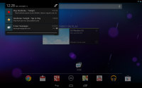
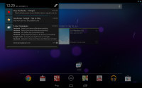
The standard notification area • expanding a notification
But with Android 4.2 the Notification area is split into two, much like the split-screen keyboard in iOS, so you actually get two separate pull-downs. We already saw the first one, the second holds various settings shortcuts. The one in the top left shows the current user and lets you switch to another one. Other settings include Wi-Fi, auto-rotate, battery info, airplane mode and Bluetooth. Wi-Fi and Bluetooth will bring you to the full settings instead of just toggling them on and off as is more common with notification area toggles.
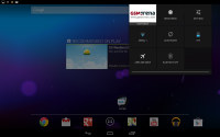
The second area with the power toggles
The app drawer is pretty much the same as it was in Ice Cream Sandwich. It features two tabs - Apps and Widgets - that feature side-scrollable pages. If you don't like swiping (it's quite a distance on a 10.1" screen), you can tap on the margin on the left and right of the grid of shortcuts to quickly move between screens.
If you scroll past the available apps you automatically move into the Widgets tab. There's also a shortcut next to the tabs, for quick access to the Android app market. Apps and widgets are ordered alphabetically and there's no other sorting option or a way to manually rearrange.
Placing a shortcut or widget works as you would expect - you press and hold to grab it and then position it anywhere on the homescreen. While you're dragging, an Uninstall field will appear along the top of the screen, where you can drop to remove widgets.
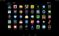
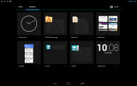
The app drawer houses both shortcuts and widgets • Placing a shortcut on the homescreen
Besides being resizable both vertically and horizontally (some can be resized only in one direction), widgets in Jelly Bean automatically adjust their size to fit where you want to put them. This is especially useful on an already busy homescreen. Also, if you drag one widget on top of the other, it will make space for itself by forcing the icons underneath to rearrange.
To resize a widget, you tap and hold and then release it. Four handles will appear on its sides, allowing you to change the widget's size in the direction you want.
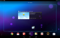
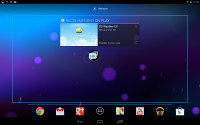
When placing a widget, icons located underneath will automatically rearrange to make room
Folders are created in much the same way as in the shortcut dock; you simply drag one shortcut on top of another. By default, a new folder won't have a label, but you can name it by opening it and tapping on the "Unnamed folder" label. Opening a folder expands it only as much as needed to display the icons inside.
The folder icons are circular with the shortcuts inside lined one behind the other as if looked at an angle (complete with perspective). They are lined up in order, so the first shortcut in the folder will be the only one clearly visible, with the rest falling behind progressively smaller and obscured.
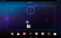
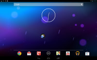
Folders can be created by dropping icons on top of one another
The Recent apps button brings up a list of your recently-used applications. It displays thumbnails of the applications which you can press to open quickly, or swipe to the side to remove.
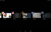
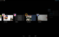
The Recent apps list • Dismissing an app
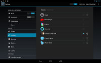
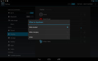
Android 4.2 Jelly Bean isn't just business and no play. Google has integrated a little feature called Daydream, which is simply a sort of a screensaver. Once turned on, you can set it up to show photo albums or the latest news from Google Currents when the device is either docked or idle.
Reader comments
- Taimoor1
- 09 Sep 2019
- ki$
Hi somebody help me My Nexus 10 was updated 4.2 to 5.1 After updating ram memory was decreased 1gb Now total ram is showing 1 gb I do factory reset but this problem is not solved Also do hard reset but still have this problem
- Ducu
- 11 Oct 2016
- 3ce
Very,very good tablet,love it much,have too samsung tab pro 8.4 and asus memo pad 7,prefer n 10.
- Gayan Abeygunawardha
- 29 Nov 2015
- XNp
Don't buy this tab.....I brought it from Australia but I live in sri lanka,any electronic item may damage with or without our mistake my tab screen is broken by my friend ever since Iam trying to replace the screen but the Samsung has stopped product...
