Google Nexus One review: Firstborn
Firstborn
User interface
The homescreen is the first (in a very short list) of novelties the Google Nexus One brings to the Android interface. The default available space is extended to five screen panes (mind you the HTC Desire has seven). More homescreen panes were available before as well, by downloading an alternative homescreen from the Android Market.
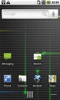
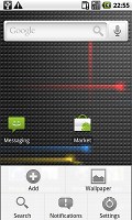
The homescreen estate has been increased to seven screen panes
Another change is the Application Launcher (main menu). The sliding tray is no more, there’s a virtual button at the bottom of the screen instead. Upon a press, the grid of icons smoothly zooms in out of nowhere to fill the screen.
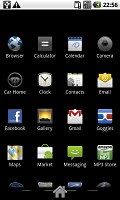
The sliding tray is now replaced by a virtual button
The main menu is vertically scrollable to get to all the icons within the ever growing app grid. Scrolling has a nice 3D touch to it: the top and bottom rows of icons tilt and recede in the distance, as if wrapping around the sides of a roller. A little like the Star Wars opening credits, if you will.
The homescreen space is all yours to fill up with shortcuts to applications of your choice, folders and widgets. Folders can help you keep the shortcuts organized but you can't put folders within folders. Still, they can be used for a few quick tricks – like faking a quick-dial contact list. A contact's photo serves as a dial shortcut so all you have to do is put a bunch of them in a folder.
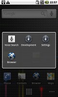
But there’s nothing too special about that – it's when live folders come into play that it gets exciting. The main difference to ordinary folders is that the live folders are automatically filled with content. All sorts of lists can go into Live folders. For example, you can have a folder that contains all the tweets from a contact, or RSS feeds, or maybe even a folder with all the good restaurants within walking distance from a given location.
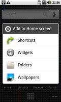
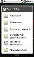
The live folders on the Nexus One
The default Live folders are "Contacts with phone numbers" , "Starred contacts", “Bluetooth received”, “All contacts” and “Facebook Phonebook”. What goes in each of those is pretty much self-explanatory.
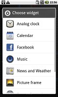
The better part of the Android homescreen residents are the widgets. The new preinstalled widgets (new over Android 1.6) include a corporate calendar (the one synced with your Exchange account), a Weather widget and the Power control widget (a handy connectivity manger for your desktop). The power control was known as Switchers on the Galaxy so it's not really new but they added a display backlighting control to it so it counts here.
The traditional search widget shows suggestions as you type, just like the Google homepage. It searches local files or gives you a shortcut to initiate a web search, which is a really neat solution. You can also make use of voice searches just like with Google's iPhone app.
The live wallpapers do make the homescreen a looker. Those react to your presses or the currently playing music track. Effects vary from water ripples and shooting colored cubes to analog sound meters and polar clocks. They do little to boost usability but are certainly nice to look at.

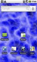
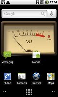
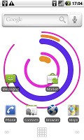
Some of the preinstalled live wallpapers
They reduce battery life though, by about five percent, so if that bothers you, you can switch them off just as well.
A major advantage of Android is the notification area. It's a thin bar at the top of the screen with status info about battery, signal strength and others such as Bluetooth or missed events. But if you slide it down you get a list of all recent notifications - that's the so called notifications area. Tapping on one of the listed notifications takes a context relevant action - for instance, a tap on a notification of a successful installation would launch that application; a finished download notification will open the file and so on.
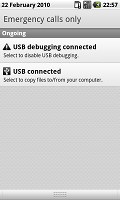
The notification area is one of the best parts about Android
Since you can open the notification area from wherever the top bar is visible, new events won't interrupt your work. You can pull the tray down like a window blind just enough to see more details about what has happened and if it doesn't need your immediate attention you can let it roll back up and continue where you left off.
To bring up the task switcher on the Nexus One you can press and hold the Home key just like on any other Android phone. It allows you access to the six most recently used apps though some of them might be hibernated rather than up and running.
Android 2.1 runs like a charm on the 1GHz Snapdragon CPU processor of the Nexus One. Lagging and holdups are very rare despite the added eye-candy (which can be cut-down or completely switched off if you prefer) and the not quite responsive soft keys are the only thing that hurts the user experience (to a small extent).
Check out this short video demo of the Google Nexus One so you can see that for yourselves.
Reader comments
- Anonymous
- 19 Dec 2017
- Nu7
am having. problem with Bluetooth widow and hotspots
- sumeetghalot
- 03 Feb 2014
- 9Fw
not open googleacount and videos also
- sumeetghalot
- 03 Feb 2014
- 9Fw
not open googleacount and videos also
