Google Play web design gets an update
Google has rolled out the updated design of the website to everyone. The redesign is only focused on improved product pages more than anything else.
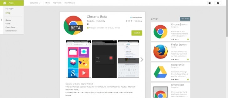
If you click on any item on the website now, you will be greeted by a narrow view that looks almost like someone copy pasted the Google Play app UI on to the web page. The narrow column wastes quite a bit of space on the side.
It's only when you widen your window that a 'similar apps' section pops on the side but even then you can't help but feel like a lot of space is being wasted. Google also moved the +1 button at the bottom, which was actually a convenient to tell others you approve of an app, but that might be a sign of greater things at Google+.
Overall, not the greatest UI design, especially for people with widescreen monitors (so, like, most of us).
Reader comments
- Rosy
- 13 Aug 2015
- vGf
very nice information Regards Rosy
- AnonD-70029
- 15 Jul 2015
- dNA
See ya, bye, you've been a laugh...
- WTF GSMArena
- 11 Jul 2015
- t}p
Deploy Disquss or go to hell and enjoy least traffic


 Samsung
 Samsung
 Apple
Apple Apple
Apple