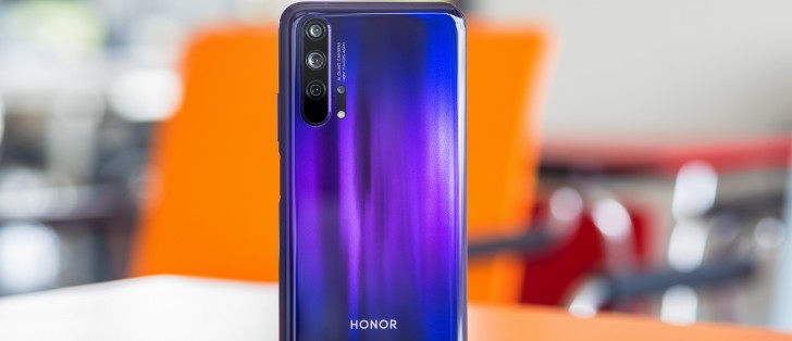
Honor 20 Pro review

Magic UI 2.1 on top of Android 9.0 Pie
Like most Honor devices, the 20 Pro also comes with Magic UI 2.1 on top of the Android 9.0 Pie OS. Essentially, it's identical to the software we've reviewed on the Honor View 20 but we will go over it again as there are some small additional tidbits.

In a typical Honor/Huawei fashion, the default state of the UI is without an app drawer. You can always change that in the Settings menu under the Home screen and wallpaper sub-menu. You can also disable the Google feed panel that comes out when you swipe to the right from the home screen. And as for the notification shade and the recent apps menu - there are no changes here. If you are coming from another Honor or Huawei device, you will find the navigation familiar.


Home screen, lock screen, recent apps and notification shade
Speaking of navigation, the Honor 20 Pro gives you the option to opt for the gestures instead of the regular software keys. They are Huawei's standard gestures - swiping from the left or right side of the screen. Swiping from the bottom brings you back to the home screen and swipe and hold brings out the recent apps menu. Keep in mind that the back gesture from the left edge of the screen might interfere sometimes with apps that have the so-called hamburger menu. Also, if you are using the handset in landscape orientation, the back gestures are moved to the top and bottom edge. Interestingly, to activate the gestures you have to go into the System sub-menu and tap on System navigation. An odd place to put the navigation options.
And since the phone has a tall aspect ratio, we would have appreciated the option to bring down the notification shade with a single swipe on the home screen. Unfortunately, this gesture opens up the app search.
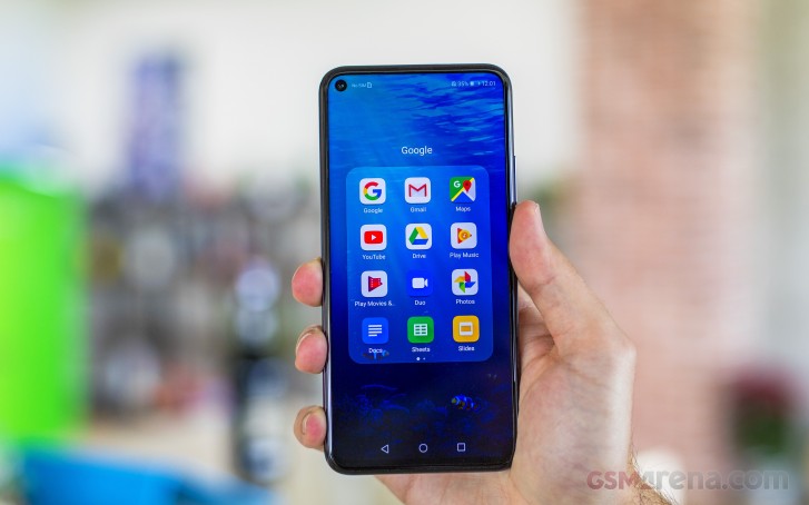
If you are hating the punch-hole as much as you are hating the notch, Honor has given you the option to hide it. But don't get too excited, though - it only turns the upper part of the screen black so you won't see the camera but the notification icons, the clock and the battery status remain up there. You also have the option to hide it only in selected apps. On the other hand, as we already stated in our Honor View 20 review, the punch-hole isn't as obtrusive as a notch so in most cases, it won't get in the way even when playing games or watching content.
Interestingly, the Display sub-menu also offers the option to switch to lower HD+ resolution as opposed to the native FHD+. The reasoning behind it is that it saves up battery but as past experience has shown us, it's only minimal as the same pixels light up but you off-load the GPU a little. You will benefit from this option only if you are doing intensive gaming sessions. We recommend that you leave it on Smart resolution as the system will utilize the appropriate resolution depending on the scenario.


Display menu and "notch" options
Moving onto the battery section, we see all the familiar settings from previous Magic UI/EMUI versions. You've got three power modes - high-performance that draws more juice from the battery, normal power saving mode and an ultra-power saving mode. The latter aggressively limits the functionality of the handset to extended the battery life.
The App launch sub-menu might be of particular interest to you. Since the Magic UI and EMUI are quite aggressive towards background-running tasks and apps, the system often kills off some messaging apps or other software that you might need running in the background to receive notifications. You can whitelist the desired apps to prevent that from happening.
Security and privacy is where the biometrics are located. You can set up the fingerprint from there with some additional options. The face unlock is in there as well but keep in mind that it's less secure due to the lack of any additional scanning tech - it relies only on the standard front-facing camera. It's pretty fast and convenient, though, we give it that.
A couple of more useful gestures are buried within the Smart assistance menu. The Shortcuts and gestures sub-menu contains all those options like starting the split-screen mode, start recording your actions on the screen or just take a screenshot. All those with your knuckles, how cool is that? And maybe a bit over the top as well. The rest of the actions are pretty self-explanatory.


The shortcuts and gestures menu
Honor has pre-loaded a couple of apps of its own as well. For example, the Music and Gallery apps are proprietary, as well as the Browser. Almost all of them have their alternatives in the Play Store but unfortunately, you can't uninstall the system apps - only disable them.
Overall, the Magic 2.1 UI runs smoothly on the Kirin 980 and we weren't expecting anything less. It's also one of the heaviest customizations of Android OS so purists will have hard time getting used to but others will appreciate all the available features and options.
Performance
The Honor 20 Pro comes with the well-known Kirin 980 chipset that powers up all of Huawei's and Honor's flagships. It incorporates an octa-core CPU with 2x Cortex-A76 cores clocked at 2.6 GHz, 2x Cortex-A76 cores ticking at 1.92 GHz and 4x smaller Cortex-A55 cores running at 1.8 GHz. It also has a Mali-G76 MP10 GPU and our unit is paired with 8GB of RAM and 256GB of internal storage. Since the Kirin 980 is based on the 7nm, it's also energy-efficient as shown in our battery tests.
In addition, Honor has introduced a thin graphene-based sheet on top of the SoC to help heat conductivity and thus keeping temperatures lower for longer periods of time ensuring smooth and consistent gaming performance.
Unfortunately, though, we weren't able to run any synthetic benchmarks on our unit but we are fairly certain that the results won't be any different than the ones we got on the Honor View 20 as it sports the same display, chipset and software.
Reader comments
- T3K
- 05 Jun 2020
- mr}
Btw, there is no IR blaster. And it's a great phone.
- Lulu
- 01 Apr 2020
- DkD
Yes it have
- B187
- 17 Mar 2020
- m9$
Does this have ir blaster for use as TV remote?


