Honor V30 Pro review

Android 10 flavored with Magic UI 3.0
As a phone without official support for Google Services, the V30 offered some limitations to our review process so we resorted to sideloading the needed files and apps unofficially and in the end, we managed to get the Play Store up and running. The process is not officially endorsed by the manufacturer and the loophole which made it possible might be patched in future releases by either Honor or Google.

Aside from that, this is actually the first Honor device we get to review running the latest OS from Google and the latest UI from Honor - Magic UI 3.0. There are mostly visual changes to the software compared to the previous version of Magic UI. Of course, the under-the-hood changes that Android 10 brings are also here, such as the new location permission management. You can now choose for each app the location access - always (including in the background), only when you are using the app in the foreground or never. It’s pretty neat when you are looking to preserve some battery.
Anyway, the new gesture-based navigation remains almost the same as before and it’s mostly in line with the default one in Android 10. Single swipe from the bottom takes you back to the home screen, swipe and hold for recent apps menu and swipe from the left or right edge of the screen acts as a back button. It’s been like that for a couple of versions of the software now and we still can’t seem to figure out how the quick switch gesture works if there’s one at all. There’s no way to quickly switch between your current app and the last used one and the fastest way to do so is to open up the recent apps menu and tap on the previous app. No way to do this with one action.


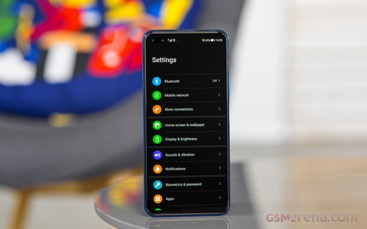
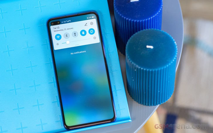
Home screen, notification shade and general settings menu
The biggest visual change to the Magic UI 3.0 is the option to turn on the system-wide Dark mode. It's not a Magic UI thing, though, as Android 10 has it by default. It can now run all the apps that are compatible with the Dark mode and all the system menus, including the drop-down menu, will appear in black. Unfortunately, you won't be able to benefit from the dark mode as much in terms of battery saving but it will surely come in handy when navigating through your phone during the late hours - the dark theme will reduce the strain on your eyes. Additionally, the icons in the main settings menu and the quick toggles in the notification shade are circular. This design choice brings the Magic UI closer to the stock Android aesthetics. Oh, and we find the new icons in the general settings menu to be quite appealing and follow some sort of logic so you can easily navigate to the desired menu with a quick glance.
Additional appearance settings include an eBook mode that turns everything to black and white and an Eye Comfort mode that cranks up the color temperature to reduce the blue light emissions before going to bed. And if you find the punch-hole particularly obtrusive, you can hide it with a black bar. Of course, the status bar icons will remain but the UI will be pushed a couple of pixels down.

Moving onto the biometrics, we can't think of a single complaint regarding the face unlock and the fingerprint reader functionality. Both are fast, accurate and reliable, especially the fingerprint scanner. We found it to be one of the fastest on the market, just like the Honor 20 Pro we reviewed last year. But as always, the face unlock feature isn't as secure as the fingerprint reader as it uses the standard camera only and isn't aided by some advanced 3D-scanning tech.
Like all Huawei and Honor phones, there are a couple of extra battery settings for you to explore. There are three separate modes - Performance, Power Saving and Ultra Power Saving. They are pretty self-explanatory but the last one limits the phone’s functionality to a point where you can only use it for texts, calls, reminders, calculator and calendar. It should be used only in extreme cases where you need to squeeze out a few more hours out of the almost empty battery. Sadly, the new version of Magic UI doesn’t offer you to manually whitelist apps so they don’t get cut off in the background. Magic UI and EMUI are notorious for being way too aggressive on some apps when it comes to background activity management and often users don’t receive notifications from certain apps because they get restricted. We didn’t experience those issues but then again, we had only a couple of apps installed anyway.
This is also the place where you can turn on the reverse wireless charging - you can charge other devices that support wireless charging using the Honor V30 Pro. This is pretty ineffective way to charge devices as a lot of the energy gets wasted with wireless charging but it can help you in a pinch if your smart wearable is running low.
And last, but not least, there are several nifty gestures that you can take advantage of. The usual ones like double-tap-to-unlock and the raise-to-wake are here along with auto-answering when you bring the phone to your ear without touching the screen (especially useful when your hands are dirty) and mute the ringtone when you turn the phone facing down.
In terms of performance, this phone is nothing short of beast. The software felt exceptionally snappy and responsive, especially compared to the older Magic UI version we’ve tested on the Honor 20 Pro. It could be due to the more powerful SoC but we doubt this is the only reason for the good performance as the performance gains of the Kirin 990 over the Kirin 980 are rather modest. Software optimization is the main suspect here.
Performance
The Kirin 990 is not uncharted territory for us as we've reviewed it in the Mate 30 Pro, which, by the way, just like the Honor V30 doesn't have Google Play Services. Anyway, we know what to expect in terms of raw performance but there are some small differences since the V30 Pro has the 5G variant and the Mate 30 Pro unit we have is 4G only. The 5G version gets higher clocks for two of its big cores along with all of its small cores.

The Kirin 990 (5G) is built on the improved 7nm+ manufacturing node using the EUV process. An octa-core CPU does the number crunching using 2x Cortex-A76 cores clocked at 2.86GHz, 2x Cortex-A76 cores running at 2.36GHz and 4x energy-efficient Cortex-A55 cores ticking at 1.95GHz. The graphically-intensive tasks are handled by the Mali-G76 MP16 GPU. In contrast, the 4G Kirin 990 settles for lower clocked 2x Cortex-A76 cores at 2.09GHz and 4x Cortex-A55 at 1.86GHz. The main two Cortex-A76 cores remain at 2.86GHz regardless of the chipset's version.
This particular model holds 8GB of RAM and has 256GB of internal storage without support for microSD cards.
The interesting bit about this SoC is that it has integrated 5G modem inside boasting energy savings compared to its rivals that have a separate 5G modem. So far, this is the only SoC to feature integrated 5G modem that also handles 4G connectivity - an all-in-one solution.
So here's how it stacks against the competition and its predecessor.
GeekBench 4.1 (multi-core)
Higher is better
-
Apple iPhone 11
13882 -
Honor V30 Pro
12824 -
Huawei Mate 30 Pro (Perf mode)
11936 -
Huawei Mate 30 Pro
11733 -
OnePlus 7T
11394 -
Redmi K20 Pro/Mi 9T Pro
10684 -
Samsung Galaxy Note10+
10403 -
Realme X2 Pro
10373 -
Xiaomi Mi Note 10
6737
GeekBench 4.1 (single-core)
Higher is better
-
Apple iPhone 11
5477 -
Samsung Galaxy Note10+
4541 -
Honor V30 Pro
3932 -
Huawei Mate 30 Pro
3869 -
Huawei Mate 30 Pro (Perf mode)
3864 -
OnePlus 7T
3644 -
Realme X2 Pro
3527 -
Redmi K20 Pro/Mi 9T Pro
3000 -
Xiaomi Mi Note 10
2536
GeekBench 5.1 (multi-core)
Higher is better
-
Honor V30 Pro
3204 -
Huawei Mate 30 Pro (Perf mode)
3038 -
OnePlus 7T
2858 -
Redmi K20 Pro/Mi 9T Pro
2732 -
Samsung Galaxy Note10+
2154
GeekBench 5.1 (single-core)
Higher is better
-
Huawei Mate 30 Pro (Perf mode)
779 -
Honor V30 Pro
778 -
OnePlus 7T
776 -
Samsung Galaxy Note10+
776 -
Redmi K20 Pro/Mi 9T Pro
744
AnTuTu 7
Higher is better
-
Apple iPhone 11
419453 -
Realme X2 Pro
396827 -
OnePlus 7T
391545 -
Honor V30 Pro
381241 -
Huawei Mate 30 Pro (Perf mode)
378950 -
Redmi K20 Pro/Mi 9T Pro
368846 -
Samsung Galaxy Note10+
342208 -
Huawei Mate 30 Pro
323423 -
Xiaomi Mi Note 10
213566
AnTuTu 8
Higher is better
-
Honor V30 Pro
500571 -
OnePlus 7T
485585 -
Huawei Mate 30 Pro (Perf mode)
484529 -
Realme X2 Pro
467653 -
Samsung Galaxy Note10+
438622 -
Redmi K20 Pro/Mi 9T Pro
437823 -
Xiaomi Mi Note 10
256717
GFX 3.1 Car scene (1080p offscreen)
Higher is better
-
Apple iPhone 11
76 -
OnePlus 7T
48 -
Realme X2 Pro
47 -
Samsung Galaxy Note10+
43 -
Honor V30 Pro
42 -
Huawei Mate 30 Pro (Perf mode)
42 -
Redmi K20 Pro/Mi 9T Pro
42 -
Xiaomi Mi Note 10
17
GFX 3.1 Car scene (onscreen)
Higher is better
-
Apple iPhone 11
60 -
OnePlus 7T
41 -
Realme X2 Pro
37 -
Redmi K20 Pro/Mi 9T Pro
36 -
Honor V30 Pro
35 -
Huawei Mate 30 Pro (Perf mode)
34 -
Samsung Galaxy Note10+
24 -
Xiaomi Mi Note 10
15
3DMark SSE Vulkan 1440p
Higher is better
-
Honor V30 Pro
5627 -
OnePlus 7T
5540 -
Huawei Mate 30 Pro (Perf mode)
5489 -
Realme X2 Pro
5337 -
Redmi K20 Pro/Mi 9T Pro
5000 -
Samsung Galaxy Note10+
4763 -
Huawei Mate 30 Pro
4233
As we expected, the Kirin 990 5G comes out on top of most chipsets released in 2019 in terms of combined, multi-core and single-core tests. Also, in pure GPU-intensive tests, the SoC drags behind the competition, which has always been the case.
However, we are a bit surprised to see such performance gains over the Kirin 980 and the Mate 30 Pro, which is also running on the Kirin 990 but with the 4G version. In all multi-threaded and combined scenarios, the Honor V30 Pro seems to outperform the Mate 30 Pro, in some cases significantly, which is due to the higher clocked middle and small cores.
Reader comments
- Abhishek
- 20 Apr 2020
- f}1
The price is too high if compared to the quality and the performance. The processor is Kirin which on paper specs are great but really the performance is average. I don't understand what were the manufacturer's thinking while pricing the handset.
- Suraj
- 07 Feb 2020
- YQ5
Nice
- regs
- 04 Feb 2020
- pRV
Front camera hole is utterly ugly. Doesn't fit the UI. No padding below and huge padding above. S10e single well positioned into UI hole on right is far better.


