HTC 7 Mozart review: Eine kleine Nachtmusik
Eine kleine Nachtmusik
Same homescreen, same Live tiles
The software part of Windows Phone 7 reviews feels like a book you’ve read – that’s because all WP7 phones run the exact same software, with just a couple of preinstalled apps that make some difference. So don’t get surprised that we’ve reused some texts from our previous Windows Phone 7 reviews (including our dedicated WP7 review). We want you to be sure that even when we reuse portions of the texts, we always take care to check our facts with the review unit thoroughly.
Update, October 7, 2011: The Windows Phone 7.5 update is out and it brings new functionality and resolves some of the issues that we've mentioned in this review. Check out our Windows Phone 7.5 review here.
HTC fans will be disappointed to find out that the Taiwanese company wasn’t allowed to do a complete UI makeover like they have on other platforms, but still they managed to give the Mozart that trademark HTC feel. The HTC Hub has the familiar clock and a few other apps that wouldn’t look out of place in a Sense UI environment.
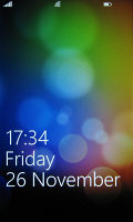
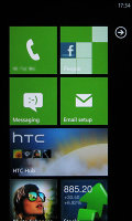
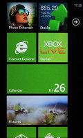
The lock screen • the homescreen • reorganizing the homescreen
HTC added a handful of apps including Connection Setup, Stocks, Photo Enhancer, Sound Enhancer, etc. They are all full of eye candy and fancy animations. If some of them are not preloaded on your device, you can get them for free over at the HTC Hub or at the HTC Apps where you can find a few more apps.
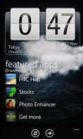
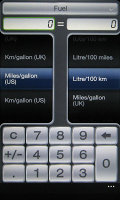
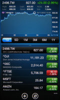
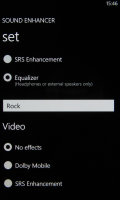
The new apps from HTC • the HTC Hub
Before we go into details, here’s a video of the HTC 7 Mozart and the Windows Phone 7 interface.
With Windows Phone 7 the old Today screen is gone and it has been replaced with a set of Live tiles. It’s one of the most flexible homescreens we’ve seen. You’ll notice just how many useful things you can put on it as this review goes on. The iconic Start menu has gone too and there’s no trace of the honeycomb pattern either.
The Windows Phone 7 Metro UI has two main parts that live side by side – the homescreen (referred to as “Start”) and the main menu. You can switch between the two by sideways swipes or using the arrow button.
The homescreen is a grid of Live tiles. Live tiles fit the broad concept of “widget” but, unlike most widgets out there, are very uniform with clear labels of what each of them does. They display info (e.g. number of messages, the date) and are also the Windows Phone 7 equivalent of homescreen shortcuts.
The color theme of the interface is customizable – the background can be either dark or light and there’s a long list of accent colors (the fill color of the tiles).
The main menu is a traditional list – this is where all the hubs and installed apps are listed in alphabetical order. A press and hold reveals a context menu, which lets you “pin” items to the homescreen (that is put their Live tile there), uninstall them or rate and review an app that you’ve downloaded.
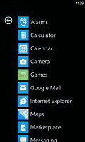
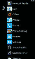
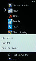
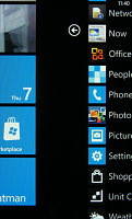
The main menu • pinning something to the homescreen • swiping halfway through
There are no folders in the main menu – so the more apps you install, the longer the list will get. So, finding apps that you chose not to pin to the homescreen may involve plenty of scrolling. The list is alphabetical, so at least you’ll know where to look (an alphabet scroll would have been useful here).
The interface is quite simple – sideways swipes navigate a sort of tabbed interface and there are on-screen soft keys. This will cover the most commonly used features, but for advanced features you can tap the “...” symbol.
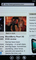
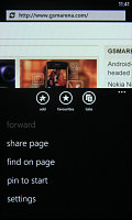
The on-screen soft keys • the extended “...” menu
It opens an extended context menu (and also reveals a label under each soft key, if the icon wasn’t revealing enough). Pressing and holding on an item in a list (e.g. a single message) will reveal a context menu relevant to that item only.
What Windows Phone 7 has lost since the 6th iteration is multitasking. It handles a lot like a pre-version-4 iOS. The Start key (the one with the Windows logo) will get you out of the app and on the homescreen. Alternatively, you can exit an app using the Back key. That gets you back to the app last used.
That last app will continue from exactly the same point from where you left it. Getting back into an app is done by tapping its live tile or shortcut in the menu or by using the back button, which returns to the previous screen (even if it was from a completely different app).
However, lack of multitasking means you can’t, say, run third party music players (e.g. last.fm) in the background. Apps also get suspended when you lock the screen – however, there’s the option to allow them to run with a locked screen.
Microsoft will lift that restriction, but only for the apps that prove battery-efficient – the phone must be able to work at least 6 hours with the app running if it’s a music player and 120 hours otherwise.
Still, all the other apps get suspended when you lock the phone – unlocking the phone will cause the app or game to reload, which can be slow and you usually lose your progress. This can be very annoying to even casual gamers.
There’s no “recently used” type of list to make going back to the app you need easier – so you might have to search for it in the main menu or keep hitting the Back button until you see it. So, multitasking is not a complete loss, but not quite as comfortable as true multitasking OSes either.
Reader comments
- habuati
- 10 Dec 2016
- Nug
How do I update my phone
- AnonD-57108
- 31 May 2012
- PUm
How can I have the music in my phone??? I owned tis phone 1 1/2years already...
- seang sotheany
- 31 Mar 2012
- YTS
Sorry May I can ask ? Why I can't use Bluetooth with other phone ? Or i must go to shop find program for jbreak as iPhone ? What can I do ?