HTC Aria review: The little tenor
The little tenor
Same old HTC Sense
HTC Aria is the latest addition to the company’s Android lineup, made on purpose to look and feel like the Windows Mobile-powered HTC Mini. With the Sense UI on top, the similarities are more than skin deep. Despite the same hardware and software plug-in however, the Aria offers a completely different experience.
Talking about feeling, Aria has much in common with the HTC Legend. The screen is the same size and resolution, and so are most of the specs. Android 2.1 ticking inside and the elaborate Sense UI are a perfect match for the Legend. The Aria even has a trackpad.
But let’s take a closer look anyway and see what Eclair and Sense can offer. Here's a video that goes through some of the key components of Sense UI on the HTC Aria.
At the bottom of the screen there are three virtual keys and an arched scrollbar.
The left key launches the main menu. This time around you simply tap to get to it, you can't pull the menu out, though you can drag it back in.
The middle key is a shortcut to the Phone app and the right key brings up the "Add to Home" menu. And there's plenty to add to the homescreen but more on that later.
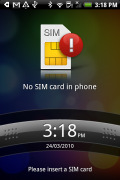
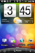
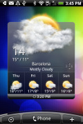
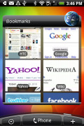
The lock screen • some of the homescreen sections
The scrollbar at the bottom is just an indication of which homescreen you’re on – it can't be used for actual scrolling. HTC have extended the homescreen to a total of seven desktop panes. Even if it sounds too much, with all those widgets (which are quite useful too) it may not even be enough.
The Aria has the fancy way of accessing any of the homescreen panes without scrolling. With a single tap or pinch, Leap view displays the thumbnails of all seven homescreen panes at once.
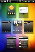
Leap View lets you quickly toggle between the available homescreen panes
HTC Sense UI revolves around Scenes, which are essentially six custom homescreen setups (Work, Travel, Social, etc). Each scene changes the wallpaper and the widgets on the homescreen - for instance, the Work scene has a stocks widget, while the Social offers a Twitter widget.
You can't modify the scenes but if you rearrange the current homescreen you are prompted to save changes as a new scene.
The Clean slate scene in turn lets you start from scratch – it's just the default Android setup with a Clock and a few shortcuts underneath.
Switching between scenes takes a couple of seconds but sure allows wide customization – the business and personal modes that some competing phones offer seem quite limited compared to the HTC Scenes.
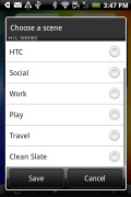
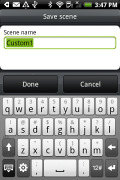
Predefined scenes • saving a new scene
Scenes are far from perfect though: the Travel scene has the HTC Footprints widget but nothing on GPS or maps. And as we already mentioned, you can’t edit the default scenes. Your only option is to save a new modified Travel scene under a different name along with the original.
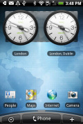
Social scene on the left and Travel scene on the right
Now back to the other stuff beyond the homescreen and the available Scenes. The changes brought by the Sense UI go deeper than just the homescreen.
For instance, the main menu has the typical icon grid layout, but you can switch it to a list similar to what you see in TouchFLO in HTC WinMo phones. With it, you can use an alphabet scroll, which makes locating apps faster.
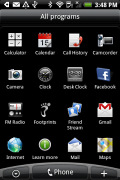
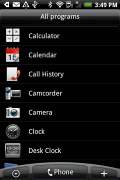
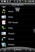
The grid layout • the list layout • alphabet scroll
In the widget section, both types of widgets (HTC and Android) are now placed in one page. There are so many of them that you may find the seven homescreens not enough.
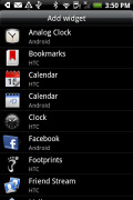
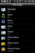

Plenty of HTC widgets • the Settings widgets are simple one-tap switches
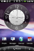
When you select a widget you are prompted to choose between several versions – most widgets have at least two styles. The different versions typically offer at least two sizes of the widget and different skins. For example, there are twelve different clocks. That's right, twelve!.
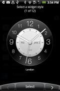
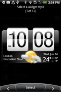
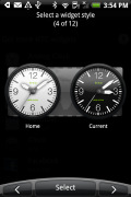
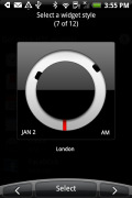
Some different styles of the Clock widget
And some widget styles even offer different functionality. Take the Twitter widget for instance - one version also shows updates for the people you follow, while the other version only lets you tweet from the homescreen. There's nothing stopping you from using both, of course.
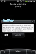
The two versions of the Twitter widget are functionally different
Friend Stream shows the latest status updates of your friends. To use this widget you must link your profile to Facebook and have matching friends to your phone’s contact. After this is done properly, their latest updates will be noted in the Friend Stream widget.

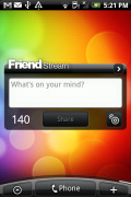
Friend Stream widget
The HTC widgets offer a better level of interaction than the stock Android widgets – there's a Favorites widget that keeps a list of your favorite contacts you can scroll through, no need to get to the contacts list.
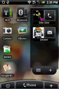
The People widget and Wi-Fi and Bluetooth setting widgets
The Photo album widget is a "stack" of photos that shows all the photos in some folder and you can flick them to view the next photo in line. This is quite fun but the experience is somewhat ruined by optimization – during the animation of the photo going up and the next one settling in, the widget uses low resolution previews of the photos and it takes a couple of seconds for the next image to load up in full quality. Higher-res photos suffer the most from this, of course.
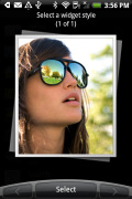
Photo widget is smoothly animated, not smoothly drawn
The Messages and Mail widgets work much the same way, but instead of photos, you flick messages. And you don't get the pixelization issue.

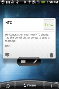
The Mail widget • Messages widget
Well, that’s about the part of the Sense UI that’s closest to the surface. There’s more to it but we’ll discuss those bits and pieces throughout the review.
The HTC Aria UI is generally fast and we must give credit for that to the faster CPU and the optimized software. This time around the UI performance is great – even with lots of files on the microSD card.
As usual the only noticeable slowdown is with widgets that need internet connection to refresh content, but that’s completely normal.
Here is how the HTC Aria compares to its sibling, the HTC Legend in terms of performance. We used the free Benhcmark and BenchmarkPi apps from the Android Market for the test and the results are here for you to see.
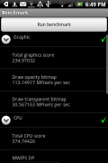
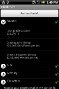
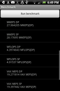
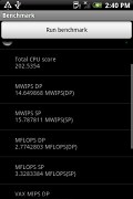
HTC Aria • HTC Legend • HTC Aria • HTC Legend
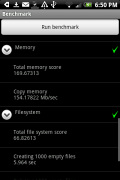
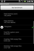
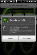
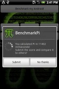
HTC Aria • HTC Legend • HTC Aria • HTC Legend
The trackpad is an auxiliary navigation tool here – given the responsive capacitive touchscreen. You can swipe, scroll and precisely select elements with the trackpad but we were barely using it except in the camera app. It serves as the shutter key there but it’s far from essential either, as the touch focus works well.
Reader comments
- Kitkat1667
- 18 Jun 2012
- CpJ
This phone is pro. I have only had it since January, and in that short time I would go with nothing else. HTC is a good quality brand that makes sure that everything they sell is top standard. Though I would say that the camera needs improving. The s...
- Doug Chance
- 20 Jul 2011
- 4Z%
The back pops off to give you access to the SD card without unscrewing anything.
- rigelstuff
- 18 Dec 2010
- 9xk
"Excellent 5 megapixel snapper" and then you say "The image quality of the HTC Aria is not that great... still way worse than the best 5 megapixel cameraphones we’ve seen" Huh???
