HTC Desire HD review: Most wanted
Most wanted
Sense UI stretches in legs on a 4.3” screen
The latest HTC Sense UI for Android is debuting on two new Desire phones – the Desire HD and the Desire Z. The UI customization goes deep as usual and there’s a fair amount of new stuff from HTC too (like the HTCSense.com integration).
The HTC Desire HD is the first in the pipeline so we’ll take the opportunity to get into the details of what has changed.
On the outside, it is very familiar to previous iterations but there is some fine tuning that has gone into the latest version.
At the bottom of the screen there are three virtual keys and an arched scrollbar. The left key launches the main menu. The middle key is a shortcut to the Phone app and the right key brings up the "Personalize" menu. The way to place stuff on the screen has slightly changed but more on that later.
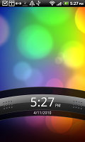
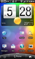

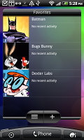
The lock screen • some of the homescreen sections
The scrollbar at the bottom is just an indication of which homescreen you’re on – it can't be used for actual scrolling.
The Desire HD has the Leap view option: tap the home key (while on the center homescreen) or do a pinch gesture to zoom out to display the thumbnails of all seven homescreen panes at once. With a press and hold you can rearrange the homescreens as well.
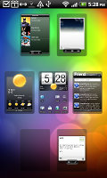
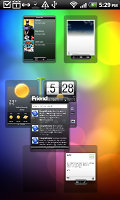
Leap View lets you quickly switch between the available homescreen panes
Seven homescreens is all you get though – there’s no add or delete option. With all those widgets (which are quite useful too) you’ll want to keep all of them anyway.
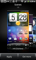
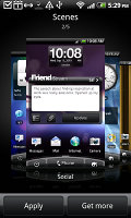
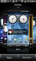
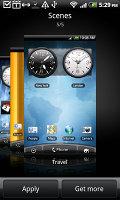
The HTC Sense UI offers Scenes – essentially six custom homescreen setups (Work, Travel, Social, etc). Each scene changes the wallpaper and the widgets on the homescreen. For instance, the Work scene has a stocks widget, while the Social offers a Twitter widget.
Scenes are now selected from a fancy-looking 3D card interface but other than that, their functionality is mostly unchanged. You can modify existing scenes (older Sense versions prompted you to save modifications as a new scene) and you can get more scenes from the HTC Hub.
Switching between scenes takes a couple of seconds but sure allows wide customization – the business and personal modes that some competing phones offer seem quite limited compared to the HTC Scenes.
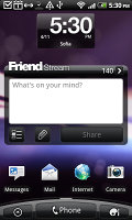
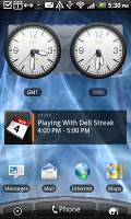
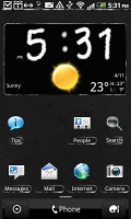
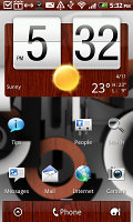
Social scene and Travel scene • Two different themes
The main menu has the typical icon grid layout, but you can switch to a list. In the list layout, there’s an alphabet scroll, which makes locating apps faster. It’s similar to what you used to see in TouchFLO on older HTC WinMo phones.
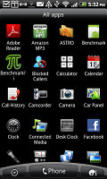
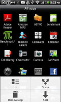
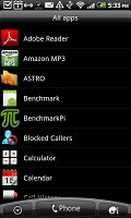
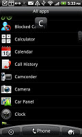
The grid layout • the list layout • alphabet scroll
Tapping the Personalize button brings out a whole screen of things to choose from – for the display (scenes, wallpapers and skin), for the homescreen (widgets, shortcuts, folders, etc.) and even sounds (ringtones, alarms, notifications and Sound set, which is a sound theme of sorts).
In the widget section, both types of widgets (HTC and Android) are placed on the same page. There are so many of them you may find the seven homescreens short. You can download new widgets off the Market or the HTC Hub.
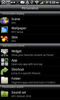
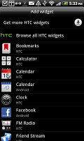
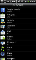
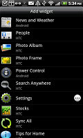
Plenty of HTC widgets • the Settings widgets are simple one-tap switches
When you select a widget you are prompted to choose between several versions – most widgets have at least two styles. The different versions typically offer at least two sizes of the widget and different skins. For example, there are twelve different clocks. That's right, twelve!
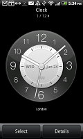
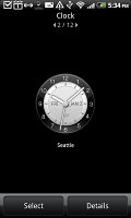
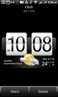
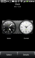
Some different styles of the Clock widget
Some widget styles even offer different functionality. The Twitter widget for instance – one version shows updates for the people you follow and lets you tweet, while the other version is more compact but is for tweeting only. There's nothing stopping you from using both, of course.
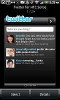

The two versions of the Twitter widget are functionally different
The notification area has seen some renovation – it now features a list of recent apps, just like a task switcher. A press and hold on the Home button works too. Maybe some people will use the notification area as the easier way to switch apps, but we would have preferred some quick switches for Wi-Fi, GPS, etc. rather than duplicated functionality.
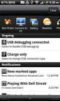
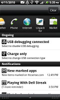
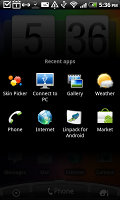
The new notification area doubles as a task switcher • the regular task switcher
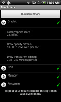
The Desire Z managed to beat the original Desire thanks to the newer Android (2.2 vs. 2.1) despite the lower clock speed (800MHz vs. 1GHz). The HTC Desire HD runs at full 1GHz speed and it scales as expected – the performance increase is proportional to the clock speed increase.
Another thing – the Desire is powered by a QSD8250 Snapdragon while the Desire HD uses the newer QSD8255, which is manufactured using a 45nm process (vs. 65nm of the old). This should result in a small improvement in the battery performance, but it seems that it’s too small compared to the power draw of the huge screen.
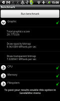
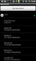
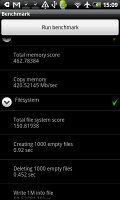
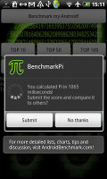
HTC Desire HD benchmarks (1GHz, Android 2.2 Froyo)
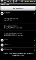
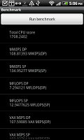
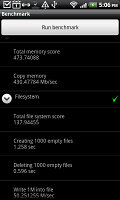
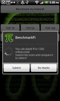
HTC Desire Z benchmarks (800MHz, Android 2.2 Froyo)
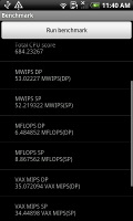
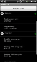
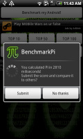
Original HTC Desire benchmarks (1GHz CPU, Android 2.1 Eclair)
Oh, and the magically fast boot-up is part of the Desire HD package – watch the end of video at the top of the page and you’ll see just how fast it is. Note that if you take out the battery, the Desire HD will have to do the regular slow boot.
It’s annoying that when you press down the power key, the phone won’t start booting until you’ve released the key, which is quite misleading.
Our guess is, HTC has used some sort of Suspend or Hibernate logic as we know them from regular computers to implement the fast boot.
Reader comments
- TEBZA
- 13 Jul 2017
- N7$
htc good good phone and is un breakable
- sonu
- 01 Dec 2015
- U@D
My phone is no good plz help me....
- syed hakeemuddin
- 23 Sep 2014
- 7j$
HTC desire Hd a 919 is very good mobile and very nice result I am using lots of time and I suggest to all my friend for this model used if you are not use this mobile means your life vest.please use this mobile you forgetts all other's company mod...
