HTC First review: The socialite
The socialite
Facebook Home comes preinstalled
The most talked about feature of the HTC First for AT&T is the addition of the freshly announced Facebook Home launcher into the device's preloaded software. You can take a quick look of the launcher in action in the video below.
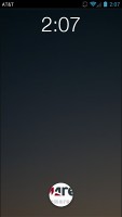
Once you power-up the HTC First with Facebook Home switched on, you are greeted by a lockscreen, which displays your friends' photos on the entire screen area. You can swipe through the available photos and like or leave a comment under the photos - straight from the lockscreen, without even unlocking the device.
The lockscreen also shows useful notifications. They can be removed with a swiping gesture.
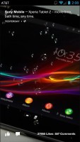
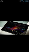
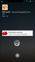
Checking out the lockscreen • the notification
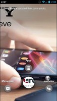
A circular icon at the bottom which has your profile photo gives you access to the launcher's features via three shortcuts. They include one for messaging, one for opening the app launcher, and one for accessing your last used app.
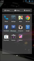
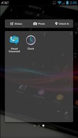
The app launcher shows the most commonly used applications. A strip at the top has shortcuts for updating your Facebook status, uploading a photo, and checking-in places. A full-blown app launcher is also available by swiping to the left.
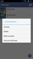
When you access the Facebook messages via the lockscreen shortcut, you have the option to activate the much talked about chat head functionality. The latter brings an icon to the screen of the device, which helps you access your conversation with a friend of your choosing.
The implementation of chat heads is arguably one of the handiest features, which Facebook Home has on offer. It makes communicating with your Facebook friends quite seamless and might cause some trouble even for the established IM apps down the line.
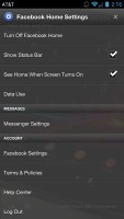
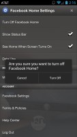
The Facebook Home options menu is straightforward. It also allows you to switch Facebook accounts or turn the launcher off altogether.
Overall, Facebook Home works mostly as advertised - while it won't fit all tastes, the launcher offers fairly deep and seamless integration with the most popular social network and is bound to get better with time.
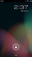
With Facebook Home switched off, the HTC First offers plain vanilla Android 4.1.2 Jelly Bean. Despite not being the latest version of the OS, Android 4.1.2 still offers the most important Jelly Bean goodies, including Google Now and Project Butter.
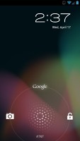
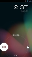
The unlock screen offers access via shortcuts to Google Now and the camera. There are no surprises here.
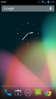
The default Jelly Bean homescreen shares many similarities with the one we were first introduced to in Ice Cream Sandwich. There are five homescreen panes, none to be added or removed.
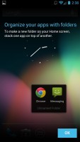
The docked apps tray allows up to four shortcuts to be placed within this dock, surrounding the app drawer shortcut in the middle. Any of the shortcuts can be customized by dragging icons into and out of the tray, and you can even create folders by dragging icons on top of one another.
A permanent fixture is the Google Search bar at the top of the screen, which stays in place as you scroll the homescreen panes.
The notification area features a redesigned clock and date icons in the top left, followed by a larger Settings icon. The clear notifications button has also been refreshed and it looks much sharper now.
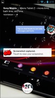
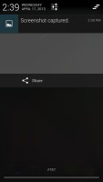
Besides the usual swipe to remove functionality, notifications can be expanded by dragging downwards with two fingers to reveal additional information. For example, you can view meeting or message reminders directly in the notification area, and even email the recipients directly from the notification bar. Viewing Google+ photos or captured screenshots can also be done with this gesture.
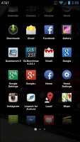
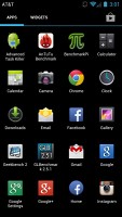
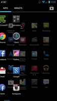
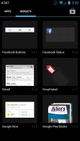
The app drawer features two tabs - Apps and Widgets - that feature side-scrollable pages. If you scroll past the available apps you automatically move into the Widgets tab. There's also a shortcut next to the tabs, for quick access to the Google Play Store.
Apps and widgets are ordered alphabetically and there's no other sorting option or a way to manually rearrange them.
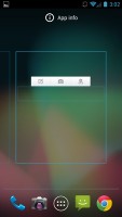
Placing a shortcut or widget works as you would expect - you press and hold to grab it and then position it somewhere on the homescreen. While you're dragging, an Uninstall field will appear along the top of the screen, where you can drop widgets into to remove them.
Besides being resizable both vertically and horizontally (some can be resized only in one direction), widgets in Jelly Bean automatically adjust their size to fit where you want to put them. This is especially useful on a homescreen filled with widgets. Also, if you drag one widget on top of the other, it will make space for itself by forcing the icons underneath to rearrange.
To resize a widget, you tap and hold on it and then release it. Four handles will appear on its sides, allowing you to change the widget's size in the direction you want.
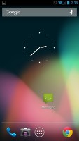
Folders are created much in the same way as in the shortcut dock; you simply drag one shortcut on top of another. By default, a new folder won't have a label, but you can name it by opening it and tapping on the "Unnamed folder" label. Opening a folder expands it only as much as needed to fit the icons inside.
The Recent apps button brings up a list of your recently-accessed applications. It displays thumbnails of the applications which you can press to open quickly, or swipe to the side to remove.
Reader comments
- pitbull_person12
- 10 Aug 2013
- Rup
I honestly hate this phone, so many different this goes wrong with this phone.
- blacterian
- 16 Jun 2013
- 3sE
Pls what is d nigerian price for. Htc first
- 1234
- 05 May 2013
- t1$
The phone's design and it's UI are both boring.
