HTC Flyer review – Pen pal
Pen pal
User interface: tablet-ready Sense UI
Instead of going for the tablet-ready Android Honeycomb, HTC chose to stick with 2.3 Gingerbread for its Flyer tablet. The Taiwanese company thought it would be smart to bring the tablet optimizations through their Sense launcher, rather than a different OS, which was probably a good idea.
This way the Flyer has access to a huge number of apps that aren't compatible with Honeycomb yet and saves itself some of the performance issues that we saw in the first tablets running Android 3.0 (Honeycomb). Since HTC already confirmed that they will be updating the Flyer to Honeycomb eventually the company is probably just waiting for the right moment.
So as a result, the HTC Flyer UI is merely an upscaled version of the HTC Sensation’s, with a small tweak here and there to make a better use of the larger screen estate.
Well done to HTC for the new lockscreen. By default, it has four shortcuts and a ring at the bottom. You drag the ring towards the center of the screen to unlock the phone (Honeycomb, anyone?). Or, you can drag any of the shortcuts into the ring to unlock the phone and launch the corresponding app. You can assign any four apps to the lockscreen.
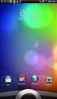
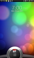
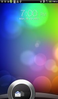
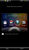
Sense UI has arguably the best designed lockscreen • Changing the lockscreen shortcuts
But that's not the end of it - the HTC Flyer, just like the Sensation also offers plenty of alternative lockscreens. You can access the others from the Personalize menu.
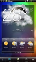
We find the Photo album lockscreen, which tosses photos from your gallery in cool 3D graphics to be among the more attractive options, but there's the Friend Stream widget which shows SNS updates from your friends and the Weather widget, which shows off the Sense UI's cool weather animations.
There's Stocks too - with quotes flying up or down, again, in eye-pleasing 3D graphics. Finally, there's the Clock lockscreen, which shows a bigger clock - you can pick any of the 11 clock widgets you have.
Going further than the lockscreen reveals the Sense homescreen. There, we meet a scroll arc at the bottom that is just an indication of which homescreen pane you’re on – it can't be used for actual scrolling.
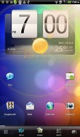
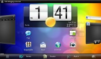
The homescreen is quite familiar
There’s Leap view instead - tap the home key (while on the center homescreen) or do a pinch gesture to zoom out to display the thumbnails of all seven homescreen panes at once. Upon a press and hold you can drag to reposition the homescreen panes as well.
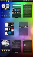
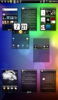
Leap View lets you quickly switch between homescreen panes
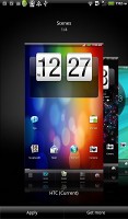
HTC Sense comes with HTC proprietary Scenes – essentially custom homescreen setups. Each scene changes the wallpaper and the set of widgets. Those can be customized, of course.
You select a Scene within a fancy-looking 3D card interface. You can modify existing scenes (older Sense versions prompted you to save modifications as a new scene) and you can get more scenes off the HTC Hub.
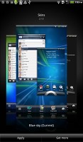
The HTC Sense has another customization option called Skins. Every skin changes the look and feel of most of the onscreen buttons, application screens, option menus, and other items. They also come with a unique wallpaper image and use different colors for various UI elements. They can also replace the standard dock, lockscreen and widget frames with custom ones or change their shape.
The app drawer has the typical grid layout, which is composed of vertical pages with icons. You can set different sorting options - alphabetically, most recent or oldest - but you can't rearrange them manually. There's an alternative list layout too if that's what you prefer.
The main menu has a tabbed layout similar to different Sense elements (such as the phonebook). There are three tabs available at the bottom – All apps, Frequent and Favorites. They are quite useful especially when you have lots of installed applications.
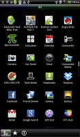
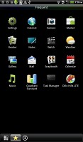
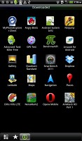
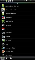
The Flyer app drawer in grid and list view modes
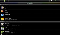
Tapping the Personalize button brings out a whole screen of items to choose from – for the display (scenes, wallpapers and skin), for the homescreen (widgets, shortcuts, folders, etc.) and even sounds (ringtones, alarms, notifications and Sound set).
When you select a widget, you are prompted to choose between several versions – most widgets have at least two styles. The different versions typically offer at least two sizes of the widget and different skins. For example, there are seventeen different clocks (yes, seventeen!).
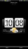
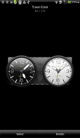
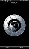
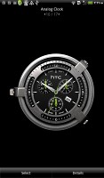
Different styles of the clock widget
Some widget styles even offer different functionality. One version of the Twitter widget, for instance, shows updates for the people you follow and lets you tweet/update status. The other version is more compact and only allows status updates and tweets.
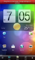
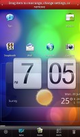
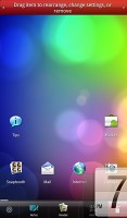
Editing the homescreen is different from your vanilla Android. You can tap and hold on a widget and you can it drag across homescreen panes. While you're dragging a widget (or shortcut or whatever), two "buttons" appear at the bottom corners of the screen of the screen - Edit and Remove. You drop the widget on either button to perform the corresponding action.
Edit can be used to modify the settings of a widget - e.g. choose a different folder for the Photo Frame album or even choose a different version of the Clock widget. This saves you the trouble of first deleting a widget and then putting it on the screen again to choose a different version, setting and so on.
The notification area features a list of recent apps (in addition to the notification list), just like a task switcher. A press and hold of the Home button works too. The notification area is tabbed too - the second tab has toggles for WLAN, Bluetooth, GPS, cellular data or the Wi-Fi hotspot. There is a shortcut to the full list of settings and the last line shows used/free memory.
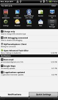
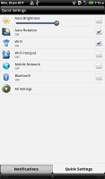
The notification area got Sense'd as well
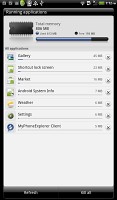
Besides the standard task switcher, you get a task manager too. It's simple to use - each running app is listed with an indication of how much RAM it's using (no CPU usage reading though). You can terminate apps one by one and there's a Kill All button too.
Synthetic benchmarks
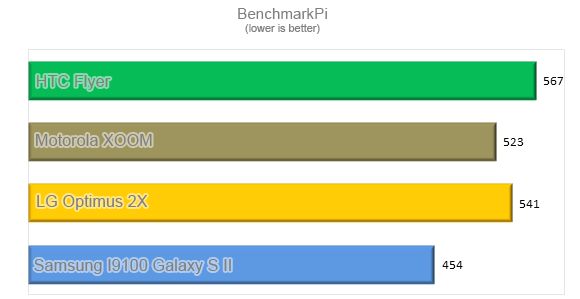
Now the HTC Flyer benchmark results show that its 1.5GHz single-core CPU comes quite close to its dual-core competitors in pure processing power. The higher clock speed and the lower helps it do decently against the Tegra 2-packing XOOM, but the Flyer is no match for the Galaxy S II and its Exynos.
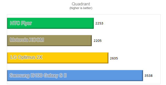
Plus Flyer competitors might have more to offer in terms of future-proofing, which is not to be neglected.
Reader comments
- Frank
- 29 Nov 2019
- CDF
Is it still in market
- Segapo
- 06 Apr 2016
- rsI
Hello everyone I have this HTC tab so it fell and broke the screen and I am struggling to repair it because they can't find the screen/ LCD. Please me up guys I love it so so much and I want to fix it. email: smade124@gmail.com
- Akesh
- 16 Jun 2012
- Fq{
Hi All I have just signed up for the HTC flyer.The one issue thats bugging me literally is the fact that on PDF Viewer,the thinnest pen stroke is too thick !! The same problem does not apply when using the Reader and annotating an EBook. Please a...
