HTC Gratia review: Body double
Body double
Sense UI graces Android Froyo
The HTC Gratia runs Android 2.2 Froyo out of the box – no longer the latest and greatest Android OS out there but with the addition of Sense UI you still get above-average droid experience.
Since the UI is exactly the same as the one on the previously reviewed HTC Desire HD and Desire Z, we’ll reuse portions of the text but you should rest assured that we’ve reflected any differences in the user experience throughout the text.
You’ve probably seen Sense UI many times before, but here it is running on the HTC Gratia.
The scrollbar at the bottom is just an indication of which homescreen you’re on – it can't be used for actual scrolling.

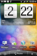
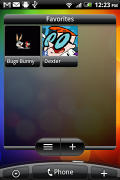

The lock screen • some of the homescreen sections
The Gratia has the Leap view option: tap the home key (while on the center homescreen) or do a pinch gesture to zoom out to display the thumbnails of all seven homescreen panes at once. You can’t rearrange the homescreens.
Leap View lets you quickly switch between the available homescreen panes
Seven homescreens is all you get though – there’s no add or delete option. With all those widgets (which are quite useful too) you’ll want to keep all of them anyway.
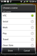
The HTC Sense UI offers Scenes – essentially six custom homescreen setups (Work, Travel, Social, etc). Each scene changes the wallpaper and the widgets on the homescreen. For instance, the Work scene has a stocks widget, while the Social offers a Twitter widget.
Scenes are selected from a drop down menu and they are fixed – any changes you make can be saved as a new Scene but you can’t modify existing scenes.
Switching between Scenes takes a couple of seconds but sure allows wide customization – the business and personal modes that some competing phones offer seem quite limited compared to the HTC Scenes.
The main menu has the typical icon grid layout, but you can switch to a list. In the list layout, there’s an alphabet scroll, which makes locating apps faster. It’s similar to what you used to see in TouchFLO on older HTC WinMo phones.
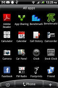


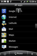
The grid layout • the list layout • alphabet scroll
Tapping the Personalize button brings out a whole screen of things to choose from – for the display (scenes and wallpapers) and for the homescreen (widgets, shortcuts, folders, etc.).
In the widget section, both types of widgets (HTC and Android) are placed on the same page. There are so many of them you may find the seven homescreens short. You can download new widgets by tapping the “Get more HTC widgets” button or from the Android Marketplace.
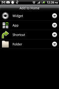
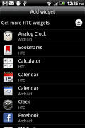
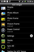
Plenty of HTC widgets • the Settings widgets are simple one-tap switches
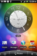
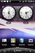
When you select a widget you are prompted to choose between several versions – most widgets have at least two styles. The different versions typically offer at least two sizes of the widget and different skins. For example, there are twelve different clocks. That's right, twelve!
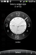
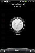
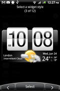
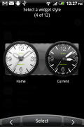
Some different styles of the Clock widget
Some widget styles even offer different functionality. The Twitter widget for instance – one version shows updates for the people you follow and lets you tweet, while the other version is more compact but is for tweeting only. There's nothing stopping you from using both, of course.


The two versions of the Twitter widget are functionally different
The notification area is the same as on older phones – the Desire HD and Desire Z came with a recent apps list on the top of the notification area but there’s no such thing with the HTC Gratia, not even power toggles for Bluetooth, Wi-Fi and so on.


The old notification area doubles as a task switcher • the regular task switcher
Another thing that the two new Desire phones enjoyed but it missing from the Gratia is HTC’s magically fast boot. Still, mobile phones are rarely powered on and off so that’s not a huge loss.
The HTCSense.com integration is missing too – that is reserved only for HTC’s new phones (and the Gratia doesn’t quite qualify).
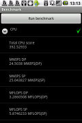
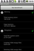
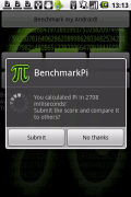
Froyo is really important for app performance – the two benchmarks we tried show almost a two-fold performance compared to an Eclair-running Aria (with pretty much the same hardware). It even managed to outperform the LG Optimus One P500, which runs Froyo on the same CPU. We’re guessing its software wasn’t set up as well as the Gratia one.
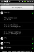
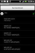
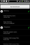
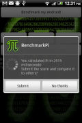
HTC Gratia benchmarks (600MHz CPU, 384MB RAM, Android 2.2 Froyo)
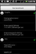
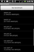
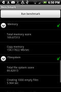
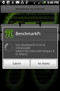
HTC Aria benchmarks (600MHz CPU, 384MB RAM, Android 2.1 Eclair)
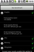
Original LG Optimus One P500 benchmarks (600MHz CPU, 512MB RAM, Android 2.2 Froyo)
Reader comments
- mr.kandi
- 22 Jan 2011
- 0CU
guys. How much is gratia
- Anonymous
- 17 Jan 2011
- vxY
So the Aria was never released in Europe? We've had the Aria in Australia on Optus for quite a while now, in a version using the same bands as Europe (2100/900). Named the Aria. Not "Gratia"....
- Anonymous
- 14 Jan 2011
- 0Ud
Camera seems to be not as good as Aria's camera,I saw this in other reviews too.Can you make a new review of the camera with a new unit?
