HTC Nexus 9 review: Game on
Game on
Android 5.0 Lollipop at your service
It's certainly not all about the hardware here - the fact that Google Nexus 9 is the first tablet to boot the latest Android 5.0 Lollipop makes it just as interesting. The latest Android build features brand new material design, as well as a new ART runtime. Check it out in action in the video below.
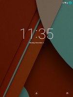
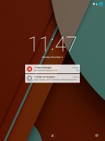
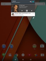
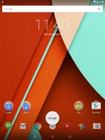
The lockscreen can display all your notifications. It contains a camera shortcut that activates the snapper by simply swiping from the right side. Gone are the widgets from Android versions of old.
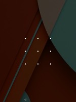
You can unlock your device via a swipe, a pattern, a pin, or a password. There's an option to have no screen lock at all if you would like quicker access and don't need the extra security.
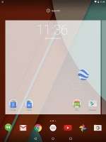
The homescreen of Android 5.0 Lollipop features a brand new app arrangement. There are three folders with apps alongside the Play store app - Google, Create, and Play. Each folder contains contextually grouped Google apps.
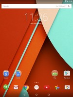
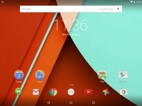
The Android Lollipop homescreen
The homescreen dock contains six app shortcuts. Out of the box, you will find Hangouts, Gmail, Chrome, YouTube, Photos, and Camera lined up from left to right.
The trio of on-screen navigation buttons has changed too. Home button is now circular, app switcher a square, while the back button is a triangular arrow.
You can have as many homescreen panes as you like (we gave up trying to add more at 11). Adding a new homescreen pane is as easy as long pressing an app and dragging it to the left of the homescreen.
Like before, the homescreen customization options can be accessed via a long press. The latter gives you access to the available widgets, the Google Now settings, as well as the option to change the wallpaper.
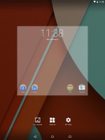
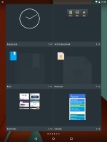
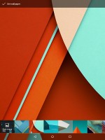
Homescreen customization options
Creating a folder is a familiar affair. You simply drag an app over another you want to group it with.
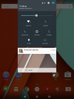
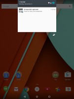
One finger swipe from the top of the homescreen will open the notification area, which features a cleaner look in Android 5.0 Lollipop. Additional swipe reveals quick toggles that include Wi-Fi, Bluetooth, Airplane mode, screen auto-rotate, flashlight, location on/off, and the option to cast the screen.
Of course, you can also adjust the brightness of the screen and go into the tablet's settings menu too. You can access the user profiles available on the tablet as well.
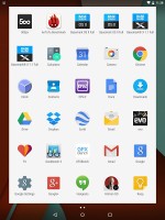
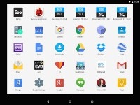
The app drawer has a new look too. It appears in a window with white background, though its functionality hasn't changed.
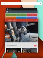
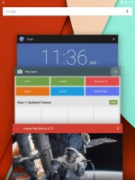
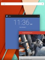
The app switcher has a neat card interface that allows you to select the app you need by swiping up or down. You can close apps by swiping left or right, or by hitting the dedicated button on the top right corner of each card.
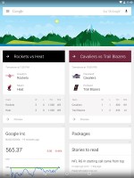
Swiping to the left of the homescreen reveals Google Now. You can access via swiping from the bottom of the screen too.
Google Now has brand new material design, but its functionality hasn't changed much. You can manage your daily routine and all your interests by using the service.
Overall, the best part about the user interface of Android 5.0 Lollipop is that it truly feels new, well polished, and superbly executed. The new ART runtime is a huge deal too - it eliminates any form of lag and makes interaction with the device feel a lot more immediate.
Reader comments
- Anonymous
- 14 Dec 2019
- amb
The worst tablet on earth. Slow performance crashes can’t handle software Warning do not buy ever.
- irfan
- 17 Nov 2014
- v$D
Does it support voice calling
- regs
- 13 Nov 2014
- 3NC
Very much disappointing news about video format support. Only up to high profile @ level 5 of h264 is supported. High 10 profile support is broken and HEVC is not supported at all.
