HTC One review: To rule them all
To rule them all
Sense UI 5 centered on BlinkFeed
The HTC One runs Android 4.1.2 Jelly Bean, but more importantly it comes with the latest version of Sense UI, 5.0. Much like Samsung, HTC prefers to add its own exclusive features to Android, instead of marching to Google's drum.
Here's a quick overview of the HTC One interface:
The lockscreen looks different but it is unchanged in terms of functionality. There's a clock, weather info and four (not five) shortcut slots. You can put a folder instead of an app shortcut if you need more than four apps accessible right from the lockscreen. Missed calls and incoming messages are duly displayed too of course.
There's no way to change lockscreen shortcuts independently from the ones docked on the homescreen. Many users may find that inconvenient - LG and Samsung both let you do that.
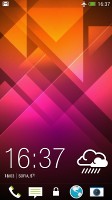
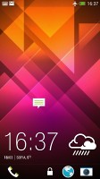
The new lockscreen has no new functionality
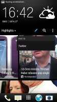
The homescreen is quite different, however. The leftmost pane is called BlinkFeed and looks quite a bit like Flipboard. It aggregates posts from your social networks and stories from over a thousand news sources. You can pick what topics you're interested in and BlinkFeed will automatically pull relevant content. You can also search for specific content.
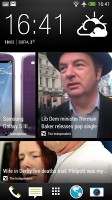
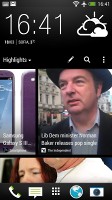
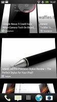

BlinkFeed is the default homescreen pane
You're not stuck with BlinkFeed if you don't like it - the rest of the homescreen panes are the standard type with shortcuts and widgets and you can set one of them to the be default one (the one you get to when you tap Home). You can't remove the BlinkFeed panel altogether, though.
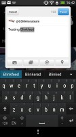
If you have social network accounts linked, you can post on them straight from BlinkFeed, including sharing stories that you've come across on the feed.
Overall, BlinkFeed feels similar to a Flipboard widget, except that it's not a widget, which lets it function better by getting extra gestures. On the other hand a widget would have been easy to move across homescreen panes, delete and even resize, so you can combine it with shortcuts or other widgets on the same pane.
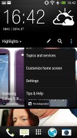
Getting rid of the dedicated Menu button is perhaps emerging as a trend in Android - a button in the app interface itself was the Nexus 4's approach, later adopted by the HTC One X and now by the HTC One too, which doesn't have a Menu key at all. In the BlinkFeed and the app drawer for example, a hidden bar with settings appears when you swipe down on the screen. It works pretty nicely and gives you extra functionality without wasting any screen estate.
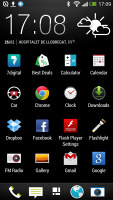
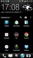
Swiping down reveals a menu bar with options
It's an interesting addition considering Android isn't too fond of gestures, especially compared to something like the BlackBerry OS 10. But apps will need to specifically support this and most apps will still have a menu button integrated into their UI. Older apps that rely on a dedicated Menu key (be it physical or on-screen) run with a black bar at the bottom just for an on-screen Menu key (not many of those left, but it happens).
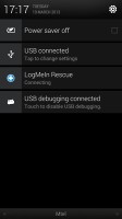
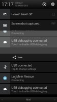
The notification area is one aspect of the interface where the HTC Sense has been behind the curve for a long time now. Sense 4 didn't offer dedicated power toggles in the pull-down - Wi-Fi, Bluetooth, Mobile Data, and the likes - and Sense 5 does nothing about that either.You get notifications, the clock and date, a Power Saver toggle and a shortcut to go into the settings menu and that's that.
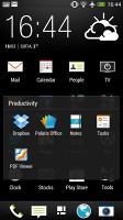
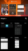
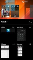
Beyond what we just listed, Sense UI 5 feels very similar to its predecessor. You get up to four homescreen panes to fill with shortcuts and widgets (the fifth is reserved for BlinkFeed). Upon a pinch zoom, the enabled homescreen panes are displayed in the top one third of the screen, the rest available to the interface for adding widgets and shortcuts.
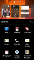
Widgets are pulled out of a dedicated container and are not displayed in the app drawer, which we find to be the more intuitive approach. Another notable difference from Samsung TouchWiz and the LG Optimus UI is that the HTC One's homescreen panes cannot be scrolled in a loop. It seems, HTC cannot quite decide on a permanent solution - the Butterfly had circular scrolling enabled.
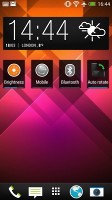
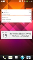
BlinkFeed aside, the homescreen is pretty standard
In the homescreen management interface, you can set any of the panes as default - including the BlinkFeed.
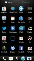
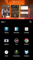
As for the app drawer itself, the default layout is a 3 x 4 grid of icons, which does not make best use of the large, high-res screen. The icons aren't even bigger than usual, they just have plenty of padding. Luckily, you can switch to a 4 x 5 grid. It's an Apple-style vertically scrollable list with an auto-hiding scroll bar on the right, indicating the number of "pages" the list of apps extends across. That's it, no extra tabs for widgets or recent downloads.
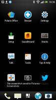

A 3 x 4 and 4 x 5 grid for the app drawer
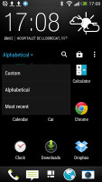
The sorting options (alphabetical, custom and chronological) are available on a hidden toolbar that shows upon a swipe down in the top page of the app drawer. It has shortcuts as well to the Google Play Store and Search, and lets you manage apps and select grid size.
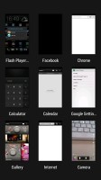
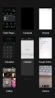
HTC has done well to remodel the task switching interface - recent apps are now displayed in a 3 x 3 grid of thumbnails, which makes way better use of all the available screen size and resolution. It's a single screen that cannot be scrolled, so nine of the most recently used apps is the most you can get. To terminate apps you have to swipe up or down (not left or right). The task switcher launches upon a double tap of the Home button.
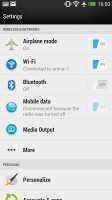
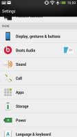
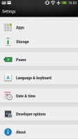
The settings menu isn't dramatically changed in the latest Sense. It has the same design but the app icons and toggles have been redone. Everything is where you'd expect it to be.
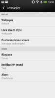
Wallpapers, lockscreen style, ringtones, notification sounds and alarms can be customized straight from here.
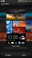
There's a choice between several lockscreen styles, including Photo Album, Productivity and Music. You can opt for just a plain wallpaper, or No Lockscreen at all.
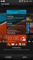
The Productivity lockscreen lists the latest missed calls, texts, emails and scheduled events. Music puts a mini music player on the lockscreen. You can preview the available lockscreens and enable the one you choose.
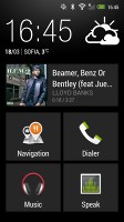
The HTC One comes with a dedicated Car mode screen, which has been styled to look like the rest of the interface. There are only five big controls besides the clock and weather info. There's music info too, which takes a whole row by itself, along with shortcuts to Navigation, Dialer, the Music player (again) and for Voice commands.
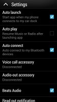
The app can be set to automatically launch when you put the phone in the car dock and connect to the car Audio over Bluetooth. There's also an option to resume playback of the music player or radio when the Car mode app launches, for an uninterrupted listening experience.
There's an interesting option in the phone's Security settings, borrowed from Windows Phone 8. It's called Kid mode and is actually an app that lets you set up a profile for each of your kids, with a photo and birthdate and pick which apps they can have access to. One annoying bit is that to enable Kid mode the first time around, you need to sign up via email.
The app also comes with premium features and you can pretty much get it on any other Android smartphone running Froyo and up.
HTC usually includes an app to help you switch from your old phone by transferring the important data, and on the HTC One it's been updated. It can transfer data from an old HTC phone or an Android from a different maker (v2.3 Gingerbread and above), a Windows Phone, a BlackBerry an iPhone or even some featurephones.
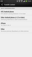
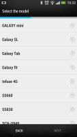
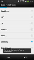
Transferring your data from your old phone to the HTC One is easy
The switch from an iPhone is pretty easy - the One can even read the data off an iPhone backup file, so even if you've lost or sold your iPhone, you'd still be able to copy all your contacts and personal files easily.
Reader comments
- D. M
- 10 Oct 2021
- XF1
I had the same worry when I bought the m7. Because last time I had the m8,the main camera was performing less than the front camera
- Paula
- 15 Jan 2021
- XFu
The phone has complicated technology and the battery life is terrible but its sound system is comparable to no other phone.
- Anonymous
- 21 Jul 2019
- vxN
I'm still using my M7 as a backup device of my Huawei Mate 20 Pro. It is, for sure after six years from its debut, an outdated phone with insufficient power to support a lot of modern apps, but its sound system is still amazing in my opinion. The bat...
