HTC One Google Play Edition review: One for Google
One for Google
Out with the Sense, in with the Pure Google
The HTC One Google Play Edition comes preinstalled with Android 4.2.2 Jelly Bean and a new live wallpaper dubbed Sun Beam. Just by looking at it this could easily pass as a Nexus device on steroids - it's got the stock OS and everything runs perfectly smooth and fluid.
But seen as how you could get the One Google Play Edition straight off Google Play (in the US, and for a premium) we'll go about with the software part of the review with the disposition that this is, a rare, but honest to goodness Nexus device by Google.
Here's a UI rundown video to start you off.
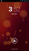
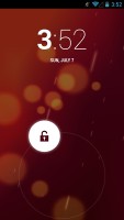
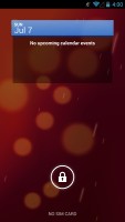
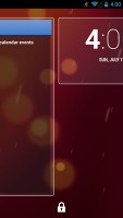
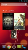
The lockscreen in Android 4.2.2 Jelly Bean features the same large dotted circle around the center-placed padlock button. Lockscreen widgets are present on the One Google Play Edition and are full-screen, resizable tiles, One of which is always visible at the top of the main lockscreen, above the padlock icon. The rest are a swipe to the right away. The One on the main lockscreen is collapsed to make room for the padlock button, but can be expanded to display additional information.
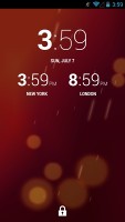
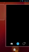
There's a large variety of third-party lockscreen widgets and a few stock Ones: Messages, Calendar, Gmail and Digital Clock. The camera shortcut, previously located at nine o'clock on the unlock circle is now a stand-alone widget, a swipe to the left away from the lockscreen.
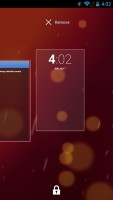
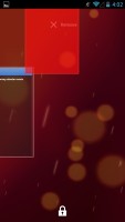
Lockscreen widgets are resizable - tap and drag down to expand and show more content, if available. Lockscreen widgets can also be reordered by tapping and dragging, so you can choose which One is visible on the main lockscreen. They can also be dragged up to discard.
There are multiple unlock patterns to choose from: simple slide, pattern, pin or password, and face unlock. The lockscreen could even be skipped altogether.
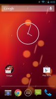
Once unlocked, you're welcomed with the familiar homescreen interface introduced in Ice Cream Sandwich. As the One natively features a home and back buttons, the bottom of the screen is no longer wasted for on-screen buttons. It's up to preference but there's no doubt that on-screen virtual keys work faster and there are no mechanics involved, meaning potentially less things to get broken.
The dock is customizable and features two shortcut icons on either side of the app drawer key. You can have folders there, each with multiple shortcuts.
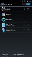
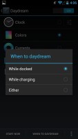
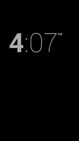
Android 4.2.2 Jelly Bean isn't just business and no play. Google's Daydream is a fun twist on the screensaver concept. Once turned on, you can set it up to show photo albums or the latest news from Google Currents when the device is either docked or idle.
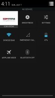
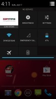
In the notification center you'll find Quick toggles. They're accessible via an icon in the top right corner of the notification area. You get access to key device settings such as brightness, Wi-Fi, Bluetooth and Battery. Some toggles are directly accessible shortcuts to their respected functions in the settings menu.
The quick settings menu can be accessed by a two-finger swipe down from the top of the screen.
Google has added a bit of personalization to the Quick Toggle panel in the notification area. Your name and photo are displayed but only after you've logged in to Google+ or after you've manually set them yourself.
Notifications can be expanded and collapsed with a two-finger swipe, and the top One is expanded by default (if the app that put up the notification supports it, of course).
The homescreen consists of five panes, One to be added or removed, to fill with shortcuts, folders and widgets. More often than not, the latter are resizable in all directions in order to fit any tight space. To resize a widget, you tap and hold and then release. Four handles will appear on its sides, allowing you to change the widget's size in the direction you want.
Folders haven't been changed since Ice Cream Sandwich and function as you'd expect. A folder is created by dropping a shortcut on top of another and can be named by tapping on the "Unnamed folder" label. Opening a folder expands it only as much as needed to fit the icons inside.
The folders themselves are circular with the shortcuts inside drawn as if they are in a line One behind the other and you're looking at them at an angle (complete with perspective). They are lined up so the first shortcut in the folder will be the only One unobscured - the rest of the icons are nearly impossible to tell apart.
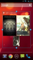
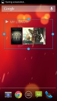
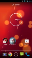
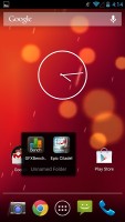
Resizing widgets • managing folders
The app drawer of the One Google Play Edition consists of four rows of icons, instead of the Nexus 4's five. It features two tabs - Apps and Widgets, each with side-scrollable pages. If you scroll past the available apps you move into the Widgets tab. There's also a Market shortcut next to the tabs, for quicker access to Android's app repository.
Apps and widgets are ordered alphabetically and there's no other sorting option.
Placing a shortcut or widget on the homescreen works as you would expect: press and hold to grab it and then position it on the homescreen pane of choice. Two more options appear at the top of the screen while you're dragging - Uninstall (to quickly remove apps) and App info, which opens the application's entry in the Manage applications list. Drop the app or widget on either One to activate it.
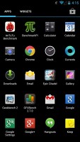
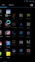
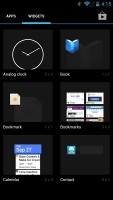
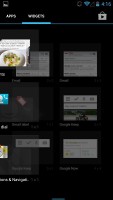
App drawer and widget selector
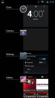
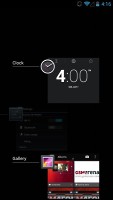
Last but not least, the Recent Apps list has remained virtually unchanged, save for some optimizations in load time and a few neat animations here and there. It all adds up as a really polished user experience and feels fantastic. It would be nice if Google adds a kill/close all option.
Here's where Google's Project Butter comes into play. We've covered it already, but it's generally Google's way of getting the Android user interface rid of stutter and lags. Essentially, Jelly Bean runs at 60 frames per second where the hardware allows it. Since software engineers didn't stop there, they also added triple buffering (CPU, GPU and display working in parallel, not waiting in turns).
As a whole, Android 4.2.2 Jelly Bean offers a polished and smooth user interface and coupled with the top of the line chipset in the HTC One Google Play Edition things are lightning fast all the time. The OS is getting closer to offering a lot of the features that skins like Sense 4+, Nature UX and Optimus UI have been having for a while now, and it's interesting to see Google's spin on them.
However, the Android 4.2.2 tweaks don't end here. Follow us as we continue to explore. Next up, Google Now.
Reader comments
- tech engr.
- 15 Sep 2014
- v0q
for social media photos, no need to have a high resolution camera or high pixels,but only if you want to put your selfies into a large billboard that would be considered.
- butterflybrandy
- 17 Jul 2014
- 4Jr
When I firstGodsmack HTC One it had flash and then after 3 months it just disappeared how can i get it back if possible
- prasanth
- 27 Apr 2014
- rAQ
Actually the performance of HTC one is rocking .. never before seen .. but the camera gets purple ouutlining is main disadvantage..the other one is heating problem .. I don't know y my phone gets 46℃ is really bad ..
