HTC One (M8) review: One and only
One and only
Android 4.4.2 KitKat with brand new Sense 6
The HTC One (M8) boots Android 4.4.2 KitKat, dressed in a brand new version of HTC's own Sense UI. HTC Sense 6 brings new features on board and improves the existing functionality of the user interface.
Here goes a quick video of HTC One with Sense 6 in action.
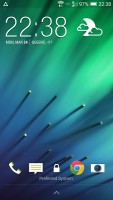
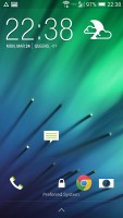
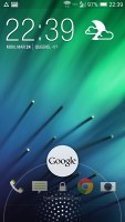
The lockscreen looks different but hasn't changed its functionality. There's a clock, weather info and four shortcut slots. Missed calls and incoming messages are duly displayed too of course.
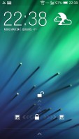
Swiping up the unlock button gives you three different options. Swiping up takes you to the last app you used, while swiping to the left or to the right will take you to the homescreen or BlinkFeed respectively.
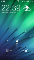
The unlock button gives you options
A useful new HTC Sense 6 feature is the ability to unlock the device via a swiping gesture while its display is turned off - that's the new Motion Launch feature. Swiping up in portrait mode unlocks the device. Swiping down activates a voice calling feature, while swiping left and right takes you to the homescreen and BlinkFeed respectively.
Furthermore, the display of the HTC One (M8) can wake up with a double tap. The gesture takes you to the lockscreen. A second double tap on the lockscreen would turn the screen back off.
Double tapping on the homescreen however doesn't lock back the smartphone. The double tap functionality is only available on the lockscreen to allow users to quickly look up time and notifications.
Perhaps the biggest change to the UI layout introduced by the Sense 6 is the presence of on-screen navigation buttons bringing the One in line with what most other makers have. This move has allowed them to get rid of the buttons under the screen, but it also has a certain downside. The buttons are almost always present (fullscreen images and videos excluded) and thus they eat up some of the available screen real estate.
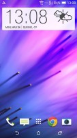
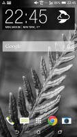
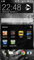
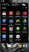
The on-screen navigation buttons are a Sense 6 novelty
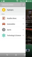
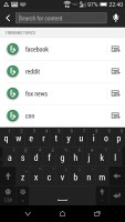
The leftmost homescreen pane of the One (M8) is once again reserved for HTC BlinkFeed. It aggregates content from your social networks, as well as from over a thousand news sources. You can pick what topics you're interested in and BlinkFeed will automatically pull relevant content. You can also search for specific content.
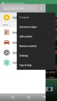
You're not stuck with BlinkFeed if you don't like it - the rest of the homescreen panes are the standard affair with shortcuts and widgets. You can also fully remove the BlinkFeed panel if you wish.
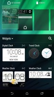
BlinkFeed panel can be fully removed
The notification area is business as usual - you get notifications in the right page and quick toggles in the left. You can access the quick toggles by a tap in the upper right corner or through a two finger swipe from the status bar.
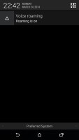
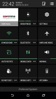
Power toggles made it to the notification area
You get up to five homescreen panes to fill with shortcuts and widgets (the sixth is reserved for BlinkFeed). You can set any of the panes as default - including the BlinkFeed.
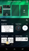
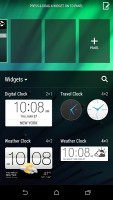
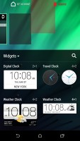
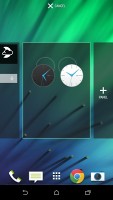
Adding and removing homescreen panes
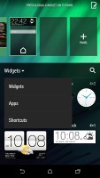
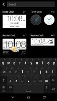
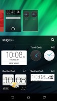
Widgets are pulled out of a dedicated container as opposed to being displayed in the app drawer next to the apps, which we find to be the more intuitive approach. Adding a widget is as simple as long-pressing it and assigning it to the desired screen pane.
The default layout of the app drawer is a 3 x 4 grid of app icons, which does not make best use of the large, high-res screen. The icons aren't even bigger than usual; they just have plenty of padding. Luckily, you can switch to a 4 x 5 grid. You can sort app icons alphabetically or chronologically or have a custom sorting like you would on iOS, for instance.
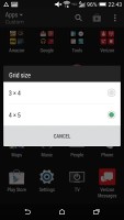
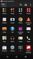
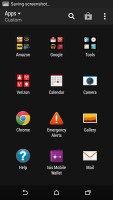
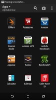
The app drawer grid can be resized
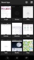
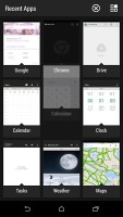
HTC has remodeled the task switching interface - recent apps can now be accessed via a dedicated on-screen button. They are displayed in a 3 x 3 grid of thumbnails, which makes good use of the available screen size and resolution. It's a single screen that cannot be scrolled, so nine of the most recently used apps are the most you can get (which is far from ideal).
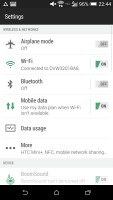
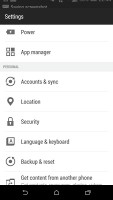
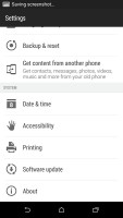
The settings menu isn't dramatically changed in the latest Sense. It has the same design, but with single-color, flat icons and toggles. Everything is where you'd expect it to be.
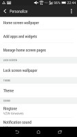
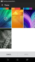
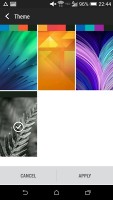
Wallpapers, lockscreen style, ringtones, notification sounds and alarms can be customized via a dedicated menu. This time around, the lockscreen styles cannot be changed.
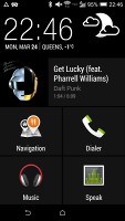
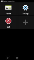
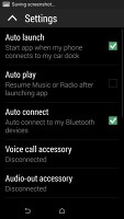
As before, HTC Sense has a dedicated Car mode screen, which has been styled to look like the rest of the interface. There are five big controls shown by default alongside the clock and weather. There's music info too, which takes a whole row by itself, along with shortcuts to Navigation, Dialer, the Music player (again) and for Voice commands.
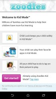
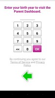
HTC One (M8) also has a built-in restricted access Kid mode. It is an app that lets you set up a profile for each of your kids, with a photo and birthdate and pick which apps they can have access to.
Reader comments
- John
- 23 May 2024
- SHp
htc is working android 6.0 marshmallow
- David
- 19 Dec 2020
- IbI
You need to download NextRadio app on google playstore
- Billy blanks
- 27 May 2020
- XE$
I didn't see any radio facility in it. I need help please
