HTC One (M8) vs Sony Xperia Z2: Unsafe mode
Unsafe mode
User interfaces
It's a story as old as the platform itself - we have two handsets powered by Android but looking nothing like each other. Both the HTC One (M8) and the Sony Xperia Z2 run on Android 4.4.2 KitKat but while the first comes with the Sense 6 launcher, the second one uses the latest Xperia UI, resulting in a rather different user interface.
To give you an idea we have short videos showing both in action.
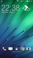
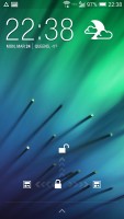
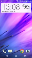
The Sense 6 lockscreen has the usual functionality - there's a clock, weather info, lockscreen widgets and four shortcut slots that mirror the four docked apps you have on the homescreen. The unlock button gives you three options - a swipe up for the last opened app, swipe to the left for the homescreen and a swipe to the right to BlinkFeed.
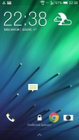
As a cool bonus you can unlock the One (M8) without the assistance of the power button. A double tap will show you the lockscreen, a swipe up will unlock the device, a swipe down will prompt voice call and finally you get swipe left for the homescreen and a swipe right for BlinkFeed.
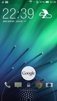
You can always access Google Now by swiping from the bottom up on the lockscreen.
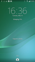
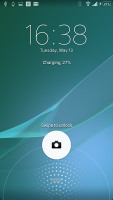
The Sony lockscreen also supports widgets (one per pane), but there is only one shortcut at the bottom - to the camera.
Google Now is accessible in the same way as on the HTC One (M8).
The homescreen of the HTC One (M8) offers five shortcuts in the dock - the app drawer and four apps or folders. You get a standard grid of apps and widgets and a total of five maximum homescreen panes.
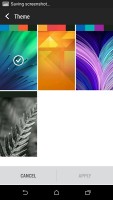
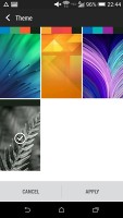
HTC's Personalization menu allows you to change the theme of the UI and it even changes the accent colors.
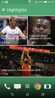
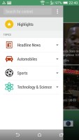
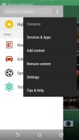
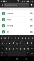
The leftmost homescreen pane of the One (M8) is once again reserved for HTC BlinkFeed. It aggregates content from your social networks, as well as from over a thousand news sources. You can pick what topics you're interested in and BlinkFeed will automatically pull relevant content. You can also search for specific content.
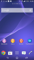
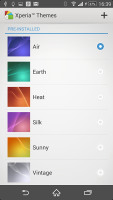
The Sony Xperia Z2's homescreen also offers four docked apps along with an app drawer shortcut. Sony gives you two extra homescreens though for a total of 7. You can also add themes to the Xperia UI which will change the accent colors and the overall look. Themes are downloadable as well and there are many third-party ones.
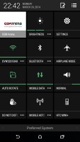
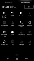
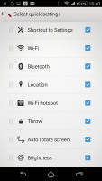
HTC's notification area closely resembles the stock Android one. You get two panes - the one with notifications and another one to hold Quick Toggles. You can access Quick Toggles via a two-finger swipe and the toggles are changeable.
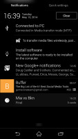
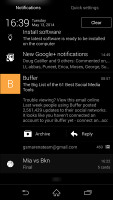
The Sony notification area is pretty much identical with the HTC and stock Android one. You get customizable Quick Toggles in a separate tab that's accessible via a two-finger swipe.
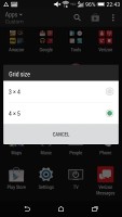
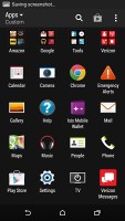
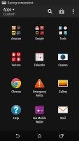
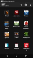
The HTC One (M8)'s app drawer isn't horizontally scrolled but vertically. You can customize the grid by either 3 x 4 or 4 x 5. Sorting is done either alphabetically or chronologically or you can choose to have custom sorting.
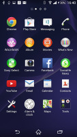
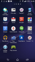
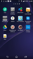
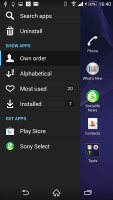
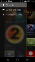
Sony's Xperia Z2 app drawer can be sorted alphabetically, manually (read custom), by most used or recently installed. The leftmost pane is reserved for a swipe-out menu that offers the sorting options.
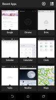
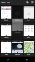
Hitting the recent apps button on the HTC One (M8) shows thumbnails of all recently opened apps. You swipe them upward to dismiss or select them to go to that app. Luckily HTC now has a kill all button at the top.
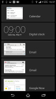
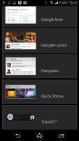
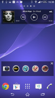
The Sony Xperia Z2 uses the stock Android task switcher interface and allows you to scroll through recent apps thumbnails and swipe them to either side to close them. A point in the Xperia Z2 favor are the so-called Small Apps - they are pop-up tiny widget-like applications on your homescreen. Those are Active Clip, Chrome Bookmarks, Browser, Calculator, Calendar, Gmail, Timer, Notes, and Touch Lock. More are downloadable through the Google Play store.
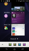
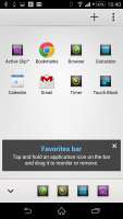
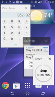
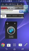
Sony task switcher • Small Apps list • Small apps in action
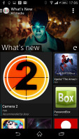
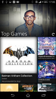
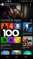
Sony's What's New app can be accessed similarly to Google Now - via a swipe up from the virtual home button and sits right next to Google Now's shortcut. This app has very beautiful UI and will show you the hottest apps and multimedia today, but it isn't limited to the Play Store only. It'll display content from Sony's PlayStation store too.
While two very different ways of operating your smartphone both Sense 6 and Xperia UI offer the functionality you'd expect and need from any smartphone. In the end Android has grown very complicated under the hood and pretty simple on the surface of it. Both UIs follow KitKat's ground rules and the result will leave none wishing.
Sense 6 and Xperia UI are buttery smooth thanks to Google's behind the scenes work and the tip-top Snapdragon hardware orchestrating the scene on both smartphones.
Winner: Tie. Everyone is supposed to break this one as they prefer - picking between the two well-polished launchers is strictly a matter of personal preference.
Reader comments
- Anonymous
- 23 Apr 2018
- X}e
How i wil unsafe mode My Sumsung S3 III My Scran Safe mode
- Anonymous
- 26 Jan 2017
- t7X
HTC seems to last longer than Sony. But waterproofing really would be good. I will still choose HTC over sony because of endurance. Battery life on my m8 didnt seem to change even after 2 years. Although I think battery deteriorates if you use it whi...
- Anonymous
- 07 Jan 2017
- 3SL
I told you facts and you came with offensive answer without any reasons against my comment. Typical android fanboy
