HTC One M9 review: One up
One up
HTC One M9 360-degree spin
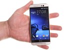
The HTC One M9 measures 144.6 x 69.7 x 9.6mm, which makes it marginally smaller than the previous generation's 146.4 x 70.6 x 9.4mm. The miniscule increase is thickness is not noticeable and the new frame in fact makes the device feel slimmer in hand.
The One M9 also remains quite hefty for a 5-incher at 157g, although HTC has managed to shave off 3g off the predecessor, all the while fitting a higher-capacity battery.
Screen-to-body ratio has never been among HTC's features that lend themselves well to comparison but the One M9, like its flagship siblings, has a better excuse than most - the pair of stereo speakers. The recently reviewed Samsung Galaxy S6 is about the same size (a millimeter shorter) and packs a 5.1-inch display. It's got a hardware Home key / fingerprint scanner at the bottom, where the One M9 accommodates a speaker.

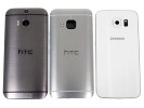
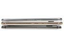
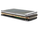
HTC One M9 flanked by the One (M8) and the Samsung Galaxy S6
Design and build
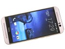
Despite the lack of innovation in the design, we won't get tired of repeating it - the One M9 is simply gorgeous. True, we have here a somewhat questionable color combination that may not be universally appealing and would have a hard time on the Western market. Even so, the aluminum unibody remains unmatched for a third generation in a row in terms of both looks and feel in hand.
HTC deemed it unwise to mess with a design that won the One numerous awards and kept the new model's styling largely unchanged. That's not to say that the One M9 doesn't have its characteristic features and refinements, though you'll need to look closely to find them.
Our review unit came in Silver and Amber Gold attire and the two-tone design is markedly flashier than the conservative Gunmetal Grey One (M8) we have for comparison. The sides shine in a more pronounced golden color, while the front carries a paler tint.
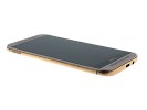
Another new design feature, introduced with this generation HTC flagship is the distinct border between the front panel and the sides. It gives the impression of a layered design, the screen overlaid on top of the aluminum casing. It also makes the phone feel thinner when you hold it in your hand.
Controls
The HTC One M9 right side is now pretty crowded. From top to bottom, the layout features the microSD card tray, which requires a pin to pop out. Moving down, we get two separate volume buttons, as opposed to the predecessor's rocker style controls. Then comes the newly-positioned power button, which is nicely textured to provide tactile feedback and set it apart from the volume controls.
The left side is pretty bare and only features the nano-SIM slot, the same design as the microSD tray on the opposite end.
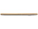
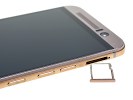
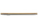
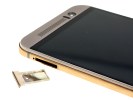
Button-packed right side • Lone SIM card slot on the left
The top houses only the infrared blaster, behind a large black strip reminiscent of TV remotes of old. On the bottom we find the micro USB port, slightly off-center, and the standard 3.5mm headphone jack further to the side.
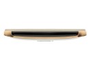
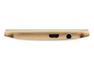
IR blaster on top • Bottom with micro USB and headphone jack
The front sees little change, compared to the One (M8), with reportedly a different number of pinholes in the speaker grilles (one reviewer actually counted 33 columns of 4 holes on the top speaker of the One M9, versus the 38x4 layout of the One (M8), but couldn't muster enough patience to examine the bottom grilles).
You still get front firing stereo speakers on both ends of the display, the top one shorter due to a cutout for a light sensor and the 4MP UltraPixel selfie camera.
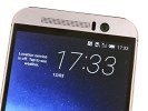

Speaker with sensors and camera beside it • Bottom speaker
The large rectangular piece of sapphire glass on the back, the single most distinguishable design element of the One M9, protects the camera assembly and has the familiar dual-tone LED flash alongside. Gone is the dual-UltraPixel camera arrangement of the predecessor, now replaced by a standard-issue 20MP Toshiba sensor.
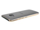
The two plastic antenna strips that allow the antennas to do their radio magic make for nice accents over the scratch-resistant brushed aluminum finish. The top strip also houses the tiny hole for the noise-cancelling microphone.
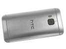
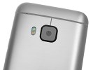
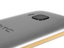
Brushed aluminum back with a sapphire glass bump protecting the lens
Handling
The relocation of the power button works miracles in terms of usability, we can't stress it enough. It was way out of reach at the top on the One M8 and waking up the phone was a less than elegant exercise when operating single-handedly. The double-tap-to-wake feature was a decent compromise, but once unlocked, the phone still needed a press on the top to be put back to sleep.
The sharp edge surrounding the front is another notable difference when comparing the One M9 to the M8. It basically guarantees that the smartphone will never slip out of your hand, but some users may find it uncomfortable to hold it for extended periods of time.
Other than that, it's the typical One experience with an unrivaled upmarket feel. The phone is a joy to handle and the less than stellar thickness is not an issue as the smartphone is markedly thinner towards the edges than those 9.6mm in the middle.
Reader comments
- Bilal Raza
- 30 Jan 2023
- X$x
My phone wont turn on after 3 years and I have angry tired to hold the volume up and down and the power button but still don't work
- Khan
- 06 May 2020
- X06
I am using HTC M-8 since 2016 and so far it is giving the excellent performance except for . . the average Battery time. Rest, its quite user friendly, robust. Keeping in view M-8s performance, I purchase M-9 and for good about 2 years it never ...
