HTC One mini vs Samsung Galaxy S4 mini: Young guns
Young guns
Software and features
Samsung and HTC have done a fine job of equipping their minis with an up to date version of Android - Jelly Bean 4.2.2 is no longer the latest, but it's the best you can get outside the Nexus world. And hopefully, an upgrade to version 4.3 isn't that far away for either of these.
Despite running the same software underneath, the two smartphones feel very different due to the customizations applied by their respective manufacturers. HTC has its Sense 5 in charge while Samsung opts for TouchWiz. And as you probably know those two are quite different - Sense bets on cleaner look and ads some pretty cool visual effects while TouchWiz brings a laundry list of features.
Here are two videos of the devices in action to start you off.
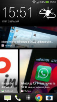
Unlike most Android custom launchers the Sense 5 on HTC One mini relies heavily on vertical scrolling, which can take some getting used to if you're coming from a different brand.
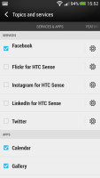
BlinkFeed is the first place you'd encounter it - it's a stream of articles from around the web (HTC has partnered with 10,000 providers), combined with account updates on services like Facebook and Twitter. BlinkFeed is a part of the homescreen - the leftmost pane.
The app drawer is the second place where HTC went with vertical scrolling instead of the more popular horizontal pane interface. The drawer displays a 3 x 4 grip of shortcuts by default (which leaves a lot of padding around icons). You can use folders to group similar apps and make better use of the screen space. The other option is to switch to a 4 x 5 grid in the settings menu.
At the top of the app drawer is a big clock with date and weather info (a big icon and smaller text with more details). This same clock is at the top of the BlinkFeed screen, which makes the two feel very similar.

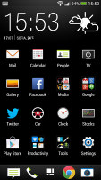
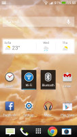
The Sense 5 app drawer and homescreen
The shortcut dock at the bottom holds four shortcuts plus the app drawer button in the middle. These icons are always visible - in BlinkFeed, in the regular screens, in the app drawer, even on the lockscreen.
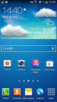
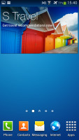
Samsung has provided many of its own custom widgets like Samsung Hub, S Travel, etc, but has kept the TouchWiz homescreen closer to stock in terms of navigation. There's the addition of a wrap-around mode, which lets you scroll homescreens infinitely by always going from the last to the first one.
The app drawer hasn't changer really since the early days of Nature UX. The app shortcuts are presented as a customizable grid, alphabetized grid or list and you can hide shortcuts (good for bloatware you can't uninstall), view only downloaded apps, uninstall apps and add folders.
The HTC lockscreen offers a clock, weather info and four shortcut slots. You can put a folder instead of an app shortcut if you need more than four apps accessible right from the lockscreen. Missed calls and incoming messages are duly displayed too of course.
There's no way to change lockscreen shortcuts independently from the ones docked on the homescreen. Many users may find that inconvenient - the Galaxy S4 mini can do that.
Courtesy of Android 4.2.2 Jelly Bean comes the widget lockscreen. It's disabled by default, you have to toggle it on from the Personalize menu. Unlike the stock variety, you only get to pick a single widget, there are no multiple pages.
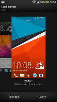
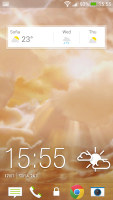
The HTC One mini lockscreen and its settings
Samsung's default lockscreen shows the time along with a personal message overlaid on beautiful photos pulled from TripAdvisor (with text at the bottom about where the photo was taken).
The water ripples have been replaced by a lens flare effect though, if you prefer, you can switch back to the old one or disable it all together.
The lockscreen has multiple panes, each containing one widget. The page to the right of the default one is special and can either be a list of favorite apps (the default TouchWiz setting) or a shortcut for the camera (as in pure Android).
The pages to the left contain different widgets - email, Google Now, Messaging, music player, Yahoo! Finance and News and you can download apps from the Play Store that add new widgets.
There are no app shortcuts at the bottom of the screen by default - the Favorite Apps widget to the right has taken over that role, but you can enable them and have up to five easily accessible shortcuts.

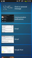
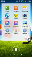
Samsung Galaxy S4 mini lockscreen
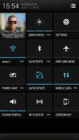
The Sense notification area is pretty much stock Android - it shows only notifications by default (below the top row, which is reserved for the time and date, plus two shortcuts). As of Android 4.2.2, Sense 5 also has the quick settings menu that can either be accessed by pressing the button in the top right corner of the notification area or performing a two finger swipe from anywhere in the UI.
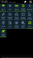
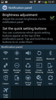
Even so, the HTC One mini doesn't come close to the super functional notification are of the Galaxy S4 mini. There are five (or eight in landscape mode) toggles at the top of the TouchWiz notification area to quickly enable and disable features (that's in the regular notification area, not quick settings).
There are more than you can see, of course - swipe to reveal the rest. Or you can tap the new button that displays a grid of all the shortcuts, 20 in total. You can rearrange this grid (the top row toggles are always visible). A two finger swipe directly opens the grid of toggles. There's no tile with your picture and name on it like in Sense and stock Android.
Although different in terms of basic navigation - one relying on vertical scrolling and one on horizontal both minis offer solid us. There's a notification area full of toggles (customizable in the case of Samsung's mini), an app drawer, homescreens on which to place apps and widgets, lockscreens, the whole nine yards.
What's different are the animations, the icons, system colors, the preinstalled apps, the widgets and most of all, the feeling which you get while using the phones. HTC's way is a more rapid depature from the basic principles of Android, while Samsung has tried to build upon those - there's a homescreen that you scroll the conventional, there's the app drawer, there's no Flipboard-like homescreen pane that can't be undone.
Instead Samsung has invested most of its effort in adding extra features. Stuff like smart stay (which keeps your screen on when looking it even if the sleep timer runs out) and blocking mode (which mutes your phone at pre-set times and lets only selected contacts call you) can certainly make the right kind of difference to some of you.
The rest will probably find them a needless waste of space that only complicates the navigation. Good thing is Samsung lets you keep those out of sight if that's the case, so you really have little to worry about.
Winner: Tie. The Samsung Galaxy S4 mini TouchWiz is certainly the most functional interface, but since neither of these two is targeted at power users we aren't too quick to recommend it over the better styled Sense 5. The Samsung UI isn't ugly by any means, but it's not quite as homogenous as the HTC launcher.
Loudspeaker
Now this is where the HTC One mini has the clear upper hand. Not only does it have two speakers, which give you stereo goodness, but each of those has its own amp and you can be sure they have bigger drivers compared to the Samsung's.
Next up is placement. HTC got it right by placing the stereo speakers at the front of the device as opposed to the back. It works better for both gaming and media consumption device and it's harder to muffle the sound.
Finally let's look at the loudness numbers. The HTC One mini received a Good score while the Samsung Galaxy S4 mini did an average job. However when you look at the ringing score they are actually pretty close so good job by the Galaxy S4 mini here.
| Speakerphone test | Voice, dB | Ringing | Overal score | |
| 60.1 | 58.3 | 61.6 | ||
| Apple iPhone 5 | 66.8 | 66.1 | 67.7 | Below Average |
| Nokia Lumia 920 | 61.6 | 64.8 | 65.8 | |
| 66.3 | 64.8 | 75.1 | ||
| HTC One | 69.3 | 66.6 | 75.9 | |
| HTC One mini | 68.0 | 68.7 | 78.1 | |
| Samsung I9505 Galaxy S4 | 70.6 | 66.2 | 77.3 | |
| 72.7 | 66.6 | 78.1 | ||
| 74.6 | 71.3 | 82.7 | Excellent |
What you cannot see just by looking at the chart above is the quality of the sound, and HTC's One mini is the clear winner there. Music comes out louder but also deeper and clearer. There's also a hint of bass, which is nowhere to be seen on the majority of smart devices out there.
You can read more about the loudspeaker tests here.
Winner: HTC One mini: It's clearly the better performer - it has twice the speakers, they are louder and sound better - clearer and deeper.
Audio quality comparison
The HTC One mini audio output is almost identical to that of its full-sized sibling and everyone who has heard that one play will tell that there's no greater compliment you can pay to a smartphone.
The One mini did great in the active external amplifier part of the test, posting great scores all over the field. In addition it had volume levels higher than just about any smartphone outside the Beats family.
More impressively, there's next to no degradation when you plug in a pair of headphones. The stereo crosstalk rises a tiny bit, but that's the only affected reading. Volume levels remain at the same high level, too.
The Samsung Galaxy S4 mini performed excellently in the first part of our traditional audio quality test, posting great scores all over the field and garnishing them with a decent (if unspectacular) volume level.
There's some degradation when you plug in a pair of headphones, but it is barely noticeable outside of dedicated audio labs. The stereo crosstalk rises notably, but that's about it - the rest of the readings remain unchanged..
And here go the results so you can see for yourselves.
| Test | Frequency response | Noise level | Dynamic range | THD | IMD + Noise | Stereo crosstalk |
| HTC One mini | +0.14, -0.12 | -94.4 | 94.0 | 0.015 | 0.013 | -87.9 |
| HTC One mini(headphones attached) | +0.83, -0.58 | -94.5 | 94.1 | 0.021 | 0.034 | -77.9 |
| Samsung Galaxy S4 mini | +0.06, -0.05 | -93.5 | 92.7 | 0.0090 | 0.056 | -86.2 |
| Samsung Galaxy S4 mini (headphones attached) | +0.08, -0.04 | -93.2 | 91.8 | 0.029 | 0.089 | -53.3 |

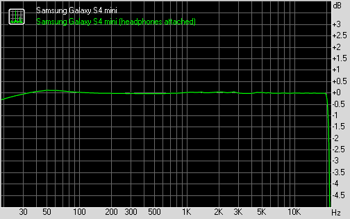
HTC One vs Samsung Galaxy S4 mini frequency response
You can learn more about the whole testing process here.
Winner: HTC One mini. The two smartphone are quite evenly matched in terms of clarity, but the higher volume levels let the HTC One mini take this.
Reader comments
- Anonymous
- 22 Dec 2015
- fu%
S4 is the best as 4 me i wl go 4 it instataneously!
- clive lukas
- 04 Aug 2015
- 9Bq
I believe its better to have a phone that will run real fast....so I will go for the. S4 mini...its a phone and a half
- Anonymous
- 17 Feb 2015
- 7wB
Samsung 4
