HTC One vs Sony Xperia Z: One to Z
One to Z
User interfaces
The Sony Xperia Z and HTC One are on par as far as the underlying Android version goes ,4.1.2 Jelly Bean, but both have extensively customized interfaces courtesy of their makers. Sony tried to stay relatively close to stock Android (more so than most other makers), while HTC continues with the recognizable Sense look.
Before we go on, here are hands-on videos to refresh your memory on what the UI of each phone looks like.
The lockscreen of the Xperia Z is behind the times with no widgets and only unlock and camera sliders. It doesn't work very well either, using the camera slider launches the camera as expected but going to the gallery from the camera (to check your last pic) sends you back to the lockscreen. Also, if you're running the camera and lock the phone, the next time you hit the Lock key you get the lockscreen.


The lockscreen and its options
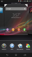
The homescreen is much better and aside from Sony wallpapers and widgets it looks just like the stock Android launcher. Unlike it, however, you can add and remove homescreens, an extra bit of flexibility that even die-hard purists will appreciate.
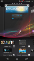
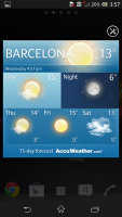
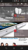
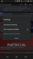
There's a new widget called Socialife (the successor of Timescape), which pools together pieces of info Facebook, Twitter, YouTube and Google Reader to bring you fresh, interesting info. Too bad Google nixed Reader, Sony will need to update the widget with something new.
The notification area has been tweaked with the addition of four toggles - ringer/vibrate, Bluetooth, Wi-Fi, mobile data.

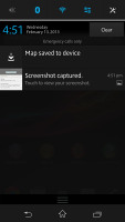
The notification area now has a few connectivity shortcuts
The task switcher has been revamped too, it holds shortcuts for mini apps, small applications that float on top of the rest and allow you to do two things at once. You can only run apps that are specifically made for such use and only one at a time.
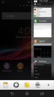
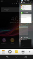
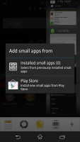
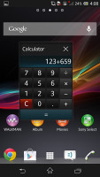
The updated task manager now features 'small apps' • The Calculator small app
The HTC One lockscreen received some visual modifications since previous versions of Sense. It is more functional than the Xperia screen (but nothing close to the Android 4.2 one) - there are several versions, which in effect have one widget each (for messages or for photos). There are four shortcuts too.
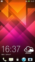
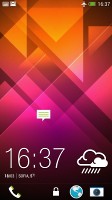
The new lockscreen has no new functionality
There are no camera issues with this lockscreen - launching the camera unlocks the phone properly and if you lock the phone, the next time you hit the Lock key bypasses the lockscreen (unless you have setup a passcode, of coure) and shows the camera instantly.
The notification area in Sense traditionally had toggles but those are gone now. The task switcher has changed, too - it's a 3 x 3 grid, which shows more apps at a time than the previous version with the large side-scrollable shortcuts.
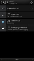
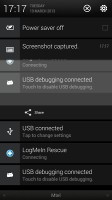
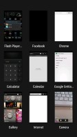
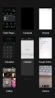
The notification area • task switcher
The homescreen is pretty special - one of its panes, called BlinkFeed, is dedicated to showing you a mix of interesting news and social networking updates. BlinkFeed is similar to Socialife, except it's a dedicated homescreen pane and not a widget and it doesn't rely on Google Reader for news info, HTC has partnered up with hundreds of news outlets.
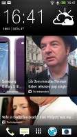
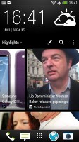
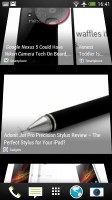

BlinkFeed is the default homescreen pane
If it bugs you, you can set the default pane to be one of the others, which are standard widget-and-shortcut homescreen panes.
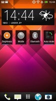
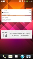
BlinkFeed aside, the homescreen is pretty standard
Here we should note the different control scheme. The Sony Xperia Z uses the official setup of three on-screen buttons (Back, Home, App switcher) while the HTC One has two hardware keys, Back and Home. Home serves a triple purpose - a Home button, a Google Now button (long press) and an App switcher button (double tap).
We have to say we like the Xperia's controls better - traditional Android controls play better with most apps. You get used to the HTC setup eventually, but three functions per key is simply not very intuitive. Also, if you're using an old app (those are getting fewer and fewer) a row at the bottom of the screen will be dedicated to just a virtual Menu button.
Still, HTC has given the One another weapon. The powerful Transfer feature, which will pull the contacts from your old phone over Bluetooth (works for Android 2.3+ and iOS) or even read an iPhone backup file to find the data.
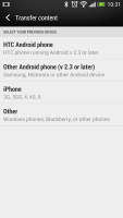
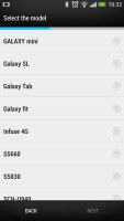
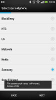
Transferring your data from your old phone to the HTC One is easy
Winner: Sony Xperia Z. Many feel very positive about the stock Android experience and the Xperia Z comes pretty close with a couple of nicely functional and yet unobtrusive additions that enhance the user experience. We would look into installing a third party lockscreen though.
The HTC One does have the better lockscreen, but both should be scrapped soon when the phones get their Android 4.2 upgrades. As for the changes HTC has made to the rest of the UI, we miss the notification area toggles and think BlinkFeed should have been a widget (like Socialife, which is easier to remove if you don't like it).
Reader comments
- smith
- 07 Jan 2019
- guj
HTC one is the best in music playing and body shape unlike the z x I love HTC m7 its a good thin machine
- emmobi
- 28 Jul 2016
- Nue
HTC from de test is beta...
- AnonD-535060
- 08 May 2016
- sS0
I've both Sony xperia z and htc one m7.the most i like Sony but now i rolling with ht because my sony phone is mirror broken 'two time'.:-)
