HTC Radar review: Mango on the radar
Mango on the radar
Windows Phone gets a taste of Mango
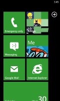
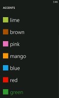
The HTC Radar's user interface is the same Windows Phone one you'll get on any competing device running the OS. The only differentiating thing is the HTC green preloaded as a theme color. The interface is very clean and simple - it's comprised of live tiles that show information like the current date, calendar events, missed calls, unread emails and more, all without the need to open up any of the applications.
Pushing the unlock button reveals the lock screen, which displays the current time and date and shows calendar events, emails and missed calls. The background of the lock screen can be changed from either the settings menu or from the picture gallery.
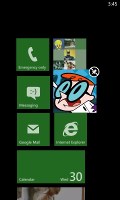
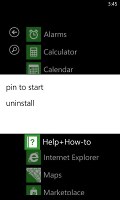
Swiping the lockscreen up unlocks the device and reveals the live-tile Metro user interface. It's a very fluid vertical grid of Live tiles that shows one or two tiles organized in bricked style. Each of these can be reorganized by which ever order you like and you can place almost anything in the grid by holding your finger over it and selecting the Pin to start option.
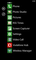
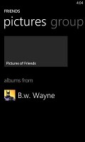
The Live tiles, the basic building blocks of the Start screen of Windows Phone have been revamped. Now they are quicker and offer more info. For example, the Pictures tile shows an animated slideshow of your images. The Group tile (Groups is a new feature to boot) lists friend updates. The application list has grown a virtual Search button, which makes finding apps easier for those with many apps installed.
Here's a demo of the Radar in action.
One of the main novelties brought by the latest WP build - 7.5 Mango - is multitasking. It still isn't true multitasking; things are being done the iOS way. Apps not in the foreground are suspended, but the OS has ways to take over and carry out the task for them.
We only worry that this logic can be too restrictive for some apps, but we'll see how things pan out. Of course, there will be a transitional period when some apps will support multitasking and others won't. We've been there with the iOS, when it first left the realm of single-tasking – it’s not that bad.
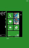
Anyway, to switch between apps you press and hold the Back key (that's right, the Back key, not the Windows key). The app switcher itself looks similar to that of Symbian or WebOS: thumbnail snapshots of the apps, ordered chronologically left to right.
You can scroll the list horizontally to select an app and a tap will bring you back to exactly how you left it. Usually, the last 5-6 apps are here. You can't "kill" any of those apps, this is more of a history of the recently used apps.
Eventually, as you open more apps, the old ones start to drop out of the list. Once an app is gone, you have to launch it again the old fashioned way, which has the drawback of starting it over from the beginning. Finally apps with active background tasks (e.g. streaming online radio) will keep on working.
Multitasking can be disabled from the settings to save battery. There you'll also find a list of all installed apps that support multitasking.
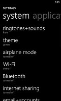
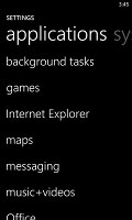
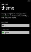
Opening the settings menu reveals two sets of options - system and applications. System covers all the settings you can think of like sounds, color theme, Wi-Fi, Bluetooth, Accounts, etc. The Applications settings enables you to configure individual settings for each app you have installed on the device - the People hub, Phone, Maps and more.
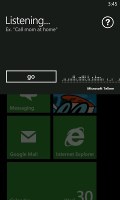
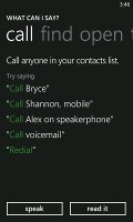
Windows Phone 7.5 can be controlled through voice only - you can dictate a text, have the phone read out the reply, you can initiate searches and so on. Other OSes are doing it too (*cough*Android*cough*) but voice commands are a big part of iOS (and a loudly touted one at that), so WP7.5 can brag about it too.
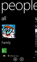
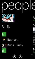
The People hub from Windows Phone 7 was impressive, but the 7.5 update makes it absolutely brilliant. Part of that is due to the better social network support, complete with Twitter and LinkedIn.
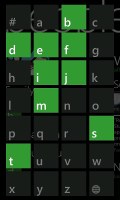
The rest is pretty much the same. You still get the clever way of jumping to contacts starting with a specific letter, the What's new tab that aggregates status updates from all contacts and the Recent tab, which lists only recently viewed contacts.
And deeper social networking support makes things even better. When viewing a contact's profile, you get everything from call, text, send email, write on wall, mention on Twitter and so on. The contact photo, along with the latest status update, are visible on top.
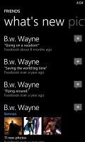
The What's new tab works like its namesake in the People hub, but only shows updates from the specific contact. Pictures is where the contact's Facebook albums are.
The most interesting addition is the new History tab. The complete history of exchange with a contact is in one place listed by day. Everything but status updates is listed here - calls, texts (actually threads from the Messaging hub) and emails.
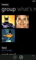
One of the new features of the hub is Groups, a handy way to organize your contacts, with "text everyone" and "email everyone" features. All the status updates from the grouped contacts are pulled in from their various social networks, and you get access to their online photo albums too.
Groups can also be pinned to the homescreen for easier access.
The Me card is your own profile. From here you can post status updates, set chat status, check into locations (there's more location goodness coming on later). You can also change your profile picture (only for Facebook and Live though, not Twitter).
Another tab in the Me card lets you view notifications (e.g. Twitter mentions) and, finally, What's new lets you view your own status updates.
Reader comments
- Anonymous
- 29 Apr 2021
- fu%
Where can I find the battery. For my phone ....with mouty piece...?
- Anonymous
- 09 Aug 2015
- rrp
I can't use the short codes on my phone
- Lauriej777
- 14 Mar 2015
- 4}Z
My battery will not hold a charge any more, what should I do?
