HTC Wildfire review: Desire Mini
Desire Mini
Eclair and HTC Sense deserve a higher-res screen
HTC Sense and Android have had a god run so far. From the Hero to the Desire, users have been treated to a wealth of graphics and features. Even the entry-level HTC Tattoo has the company’s custom interface, which we found to blend well and do a good job. It just didn’t look its best on the QVGA screen.
If you’ve been paying attention, you’d know the HTC Wildfire is having the same problem. And this time, the same number of pixels is stretched over 3.2 inches.
The Wildfire still has a clear advantage over the Tattoo. The capacitive display has excellent response. You’ll find the latest Sense UI too on the HTC Wildfire.
The main differences between this version of the Sense UI and back on the Tattoo are the new context icons, a few new wallpapers and the unified Widget section. Whether you are using the People, Mail, Music or Gallery Tabs, the scrollable icons at the bottom will please you with new color skins. We like it this way – the old ones looked a bit dull against the otherwise graphically rich and colorful UI..
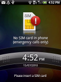
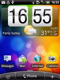
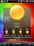
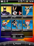
The lock screen • some of the homescreen panes
The left key at the bottom of the screen launches the main menu. This time around you simply tap to get to it, you can't drag the menu out, though you can drag it back in.
The middle key is a shortcut to the Phone app and the right key brings up the "Add to Home" menu. And there's plenty to add to the homescreen but more on that later.
The scrollbar at the bottom is just an indication of which homescreen you’re on - it can't be used for actual scrolling. HTC have extended the homescreen to a total of seven panes instead of the usual three. With all those widgets at hand (which are quite useful too) they may not even be enough.
The HTC Sense UI revolves around Scenes, which are essentially six custom homescreen setups (Work, Travel, Social, etc). Each scene changes the wallpaper and the widgets on the homescreen - for instance, the Work scene has a stocks widget, while the Social offers a Twitter widget.
You can't modify the scenes but if you rearrange the current homescreen you are prompted to save changes as a new scene.
The Clean slate scene lets you start from scratch - it's just the default Android setup with a Clock and a few shortcuts underneath.
Switching between scenes takes a couple of seconds but sure allows wide customization - the business and personal modes that some competing phones offer seem quite limited compared to the HTC Scenes.
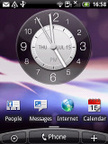
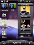
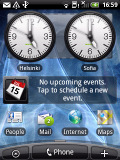
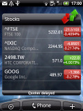
Social scene on the left and Work scene on the right
Now back to the other stuff beyond the homescreen and the available Scenes. The changes brought by the Sense UI go deeper than just the homescreen.
For instance, the main menu has the typical grid layout, but you can switch it to a list similar to in TouchFLO in HTC WinMo phones. With it, you can use an alphabet scroll, which makes locating apps faster.
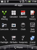
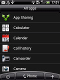
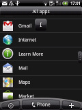
The grid layout • the list layout • alphabet scroll
The widget section has been revamped since the HTC Tattoo and now both types of widgets (custom HTC and stock Android) are placed on one page. There are so many of them that you may find the seven homescreen panes insufficient.
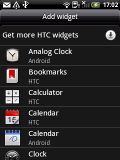
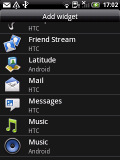
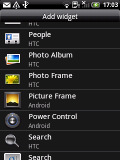
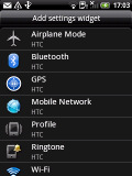
Plenty of HTC widgets • you can even add program shortcuts
When you select a widget you are prompted to choose between several versions – most widgets have at least two styles. The different versions typically offer at least two sizes of the widget and a different look (There are twelve different clocks. That's right, twelve!).
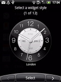
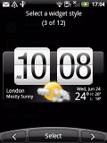
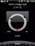
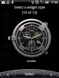
Some different Clock widget styles
And some widget styles even offer different functionality. Take the Twitter widget for instance - one version will show updates for the people you follow, while the other version only lets you tweet from the homescreen. There's nothing stopping you from using both of course.
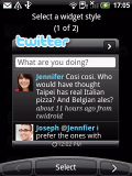

Two versions of the Twitter widget for different functionally
The HTC widgets offer a better level of interaction than the stock widgets – there's a Favorites widget that keeps a list of your favorite contacts you can scroll through, meaning there’s no need to dip into the contacts list.

The People widget and Wi-Fi and Bluetooth setting widgets
The Photo album widget is a "stack" of photos that shows all the photos in some folder and you can flick them to view the next photo in line. This is quite fun but the experience is somewhat ruined by optimization. During the animation of the photo going up and the next one settling in, the widget uses low resolution previews of the photos and it takes a couple of seconds for the next image to load up in full quality. Higher-res photos suffer the most from this, of course.
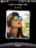
Photo widget is smoothly animated, not smoothly drawn
The Messages and Mail widgets work much the same way, but instead of photos, you flick messages. And you don't get the pixelation issue.
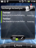
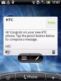
The Mail widget • Messages widget
The Wildfire has the fancy way of accessing any of the homescreen panes without scrolling. With a single tap or pinch, Leap view displays the thumbnails of all seven homescreen panes at once.
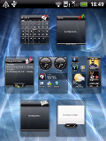
Leap View lets you quickly toggle
You can pinch to “zoom out” on any of the homescreen panes but tapping on a screen will do the trick too.
The Android 2.1 in the Wildfire packs the app sharing application for posting your impressions on mobile applications via Twitter, SMS or email. It’s very simple but helps you share or receive app impressions from various social services.
Leap View was available back on the HTC Desire – it’s nice to have it in the budget package too. However, one thing the Wildfire obviously lacks is Live Wallpapers. The weaker CPU and the QVGA screen just can’t handle them.
Well, that’s about the part of the Sense UI that’s closest to the surface. There’s more to it but we’ll discuss those bits and pieces throughout the review.
The HTC Wildfire UI is fast enough, the only place to notice lags is in widgets that need internet connection to refresh content.
The trackpad is an auxiliary navigation tool here – given the responsive capacitive touchscreen. You can swipe, scroll and precisely select elements with the trackpad but we were barely using it except in the camera app. It serves as the shutter key there but it’s far from essential, as the touch focus works well.
Two more things - most apps won't run without a microSD card inserted and screen vibration feedback works on the virtual QWERTY keyboard but not elsewhere throughout the homescreen.
Reader comments
- Thiza
- 22 Apr 2025
- X5X
My htc phone has a becoming hot
- J
- 28 Dec 2016
- 9F7
Jumped into a swimming pool back in summer 2012 with this phone in me pocket, I thaght it was completely water dammeged but I decided to try n charge and woop woop it works hahaha excellent phone back when I first got it in 2010 but there nothing com...
- math
- 08 Feb 2013
- srr
No, it does lier