Huawei Ascend Mate2 4G review: Value king
Value king
User interface
Huawei Ascend Mate2 4G boots Android 4.3 Jelly Bean with the company's Emotion UI 2.0 on top. You can take a quick look of the device in action in the video below.
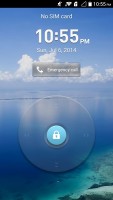
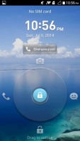
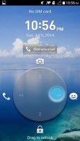
The lockscreen is fairly busy. At its center is a circle with shortcuts in the four cardinal directions: simple unlock to the south, camera to the north, messaging to the east and dialer/call log to the west.
The upper area of the lockscreen displays the time and date. If the music player is running, the time and date are replaced by the music player controls.
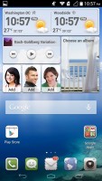
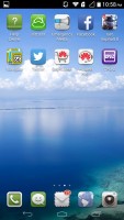
Beyond the lockscreen is the Android homescreen with five customizable shortcuts docked at the bottom. The default selection is phone app, messages, mail, web browser and contacts but you can have any app really, or folders with multiple items, visible on all homescreens.
The homescreen
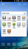
There are nine homescreen panes at most - at least a couple of them will accommodate actual apps. In the absence of an app drawer, anything you install pops up on the homescreen. There're no shortcuts as such -the usual routine of removing icons (dragging them up to a recycle bin at the top of the screen) will uninstall the corresponding app.
The thing is fool-proof and you just can't accidentally uninstall essential apps like the gallery or email client.
The downside of the flat structure is you cannot get rarely used apps out of the way. Folders partially make up for that.
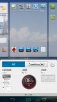
A pinch on the homescreen triggers the familiar Overview mode to let you check out and organize the homescreen panes currently in use, remove or add panes as you please. Alternatively, the overview can be displayed when you hit the Thumbnails shortcut in the menu that appears upon a tap and hold on a blank spot of the screen.
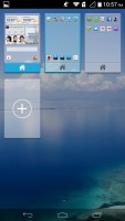
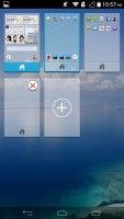
Overview mode
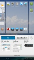
Widgets are available too - tap and hold on the homescreen, then choose Widgets. Of course, you can get third party widgets from the Play Store.
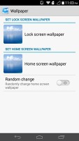
The menu displayed upon a tap and hold on the homescreen also lets you set wallpaper and homescreen transition effects.
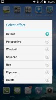
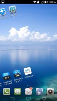
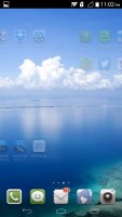
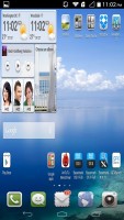
There are different transition effects
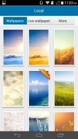
Live, static and scrollable static wallpapers are supported. You can activate the Shake to change wallpaper setting, or turn on Random change and set a specific time interval (5 min, 15 min, 30 min, 60 min, and every day).
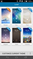
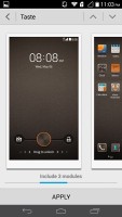
Themes are available as well. A theme will change your homescreen wallpaper, lockscreen style, system icons, system font and the sound profile. There are different lockscreen styles with different unlock gestures, time widgets and shortcut style and layout.
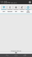
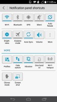
The notification area features up to nine toggles on a single side-swipeable row. Hitting More will reveal all the available toggles and you can choose which of the 15 toggles in total will feature on the top row.
The standard Android notifications stack up below the toggles. The notifications can be expanded or collapsed with a pinch gesture. You can also swipe to dismiss a notification.
A shortcut to the Settings Menu and a Dismiss All button are available in the top right corner of the notification area.
If the Music Player or FM radio apps are running in background, media player controls will be available in the notification area too.
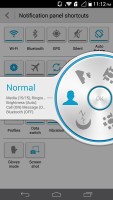
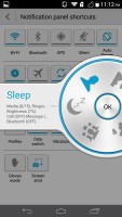
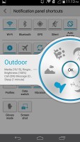
The first toggle on the notification area is Profiles. Upon a tap, a virtual dial appears to choose the setting you need: Normal, Outdoor, Meeting, or Sleep. Each of them has predefined settings - you can't have your own presets or customize the available ones.
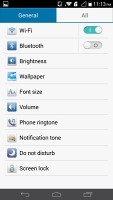
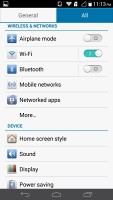
The Settings menu has two tabs. The first one is called General and offers only a limited set of settings Huawei thought you'll use most often. The other tab - All Settings - has the default Android list of settings plus a few extra additions by Huawei.
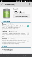
Another new setting is the Power Manager. It has three customizable modes - Smart, Normal and Endurance. You can configure each of those modes, setting up what apps run at startup, as well as which are allowed to run in the background and which aren't.
One hand operations allows you to move the screen unlock, dialer, and the keyboard left or right on the screen, depending on which hand you are using. It's a handy feature to have on such a big device.
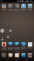
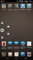
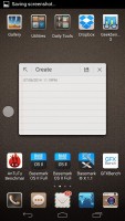
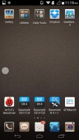
The Suspend Button will give you a semi-transparent shortcut dial you can place wherever you like on the left or right side of the screen. The shortcuts available are calculator, gallery, messages and notes. The gallery and messages shortcuts will open the full-screen apps, while the calculator and notes launch a tiny widget-like application on top of the app you are currently running.
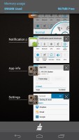
The task switcher's interface is the same as the stock Android Jelly Bean solution, but offers a few extra options. Each app thumbnail now has a dedicated close key (in addition to the default swipe to close gesture). There is also a "Kill all" key at the bottom that will terminate all running apps.
Users who find the default homescreen too busy can opt for a simple layout. The latter essentially turns the phablet into a glorified feature phone with large, easy to ready menu layout.
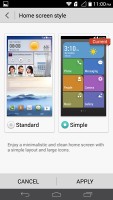
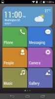
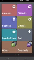
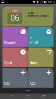
The simple layout is for those who don't like clutter
Overall, the user interface of the Huawei Ascend Mate2 4G is as feature-rich as we expected it to be. However, we can't help but frown at the look of Android Jelly Bean out of the box. Having such an outdated OS out of the box is inexcusable for the company with the size and the resources which Huawei has on tap.
Reader comments
- jlayneman
- 07 Jan 2019
- 8HY
Had this phone for four years, it has been great. Battery still last for days. Just ordered a Mate SE, hope it is as good a phone. May be the best phone I've ever owned.
- AnonD-750714
- 08 Apr 2018
- kAW
I have had the phone for a couple years now and love it with its big screen but why would I ever buy another Huawei when they don't offer any updates for this phone? Makes me aprehensive on buying another Huawei which I probably will never do cuz of ...
- AnonD-354514
- 21 Jan 2015
- rRS
How's does it stand up to LG's G3?
