Huawei G8 review: Elegantly relegated
Elegantly relegated
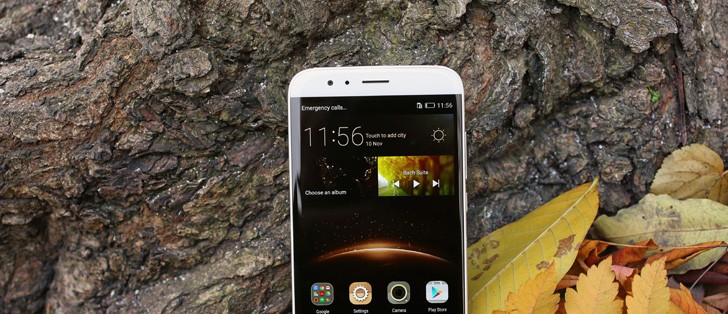
Huawei G8 360-degree spin
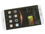
The Huawei G8 has a gorgeous profile and looks beautifully solid all around. The metal edges really add to the premium feel, despite being thicker than the Mate S.
Design and build quality
As already mentioned, the G8 took a lot of cues from all around the Huawei device lineup, especially design-wise. We can't help but notice that the handset looks quite similar to the Mate S on the front and consequently to the Mate7 before it. Its display is also quite wide, leaving almost no side bezels and comes to an end with a nice 2.5D curvature of the glass.
The speaker grille on the top and the Huawei logo on the bottom complete the picture.
The Back is also quite reminiscent to the Mate S, but you can also see a lot of the Mate7 thrown in the design mix with the flash on the left side and perhaps even the Honor 7 with its dual LED setup.
The same can be said about the overall control placement, with the side buttons positioned similarly to the Mate S, but missing the obvious plastic antenna lines, more like the Mate7. Overall, the Huawei G8 carries an unmistakably Huawei design, but retains a look of its own instead of simply copying one of its higher-end siblings.
Despite aiming for a more budget-friendly price segment, the G8 is still almost entirely made of Metal and its build quality is superb. As far as color options go, it has a few of those and they all go well with the metal finish. They include the classic Golden, Gray and Silver.
When compared side by side with the Mate S, the G8 does undoubtedly appear a bit bulkier. It feels the same way too, but that is a slightly deceiving observation to make, as, in reality, it is only slightly bigger and heavier and still retains a pretty slim profile.
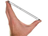
It is pretty slim and the sensation is only intensified further by its double sloping edges, both on the front and the back. The curve on the back side also improves handling greatly and helps the unit sit snugly in the hand.
The phone's body measures 152 x 76.5 x 7.5mm, which, as already mentioned, is just a bit bigger than the Mate S, but still a lot smaller than the Mate7. The same goes for the weight as well. The extra battery inside the G8 make it tip the scale at 167 g, or about 10 more than the Mate S, but still far from the 185 g of the aforementioned Mate7.
Controls
As already mentioned, the G8 offers a nice amalgam of different Huawei traits. The same goes for the controls and their layout. Buttons are laid out conveniently and everything is within easy reach. The buttons are also quite responsive, so we are definitely glad that Huawei hasn't been changing things too much.
The design is really minimalist. Nothing is really out of place or out of measure. Huawei has opted for a 5.5-inch FullHD panel. It is noticeably bigger than the one in the Honor 7, but also quite smaller than the whopping 6.0 inches on the Mate7. The panel itself is the exact same size as the one in the Mate S, only a cheaper IPS models, instead of AMOLED. Still, it might look somewhat smaller due to the bigger bezels (71.7% screen-to-body ration, compared to 73.9% on the Mate).
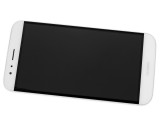
Huawei's current design of choice employs black bezels beneath the front glass with the ultimate aim of an edge-to-edge appearance, at least from a distance. That does work to some extent when the display is off, but the slightly different shade of the LCD and the fact that said bezels are broader on both sides do take away from the G8's premium appearance and are one of the more obvious tell-tale signs of its mid-range nature. Still, that is more of an observation than an actual complaint. But more on that in the display section.
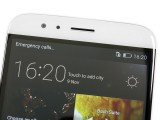
With the main controls on the actual screen, the only thing underneath is a company logo. It is also worth noting that the front is covered by a very light dotted pattern.
There is not much else in plain sight on the front of the device. There is the earpiece and the 5MP front-facing camera, tightly packed next to it. No front-facing flash on this one though. .
There is also a proximity and a light sensor beside the earpiece. A status LED is also included, although it is practically invisible when off.
Going around the device, we find the left side almost entirely bare. It only houses the SIM card/microSD tray (yes, one of the slots doubles on the Dual SIM model).
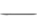
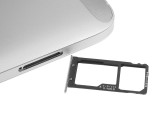
Left side view • SIM card tray
On the right side is where it gets busier. It still doesn't feel cluttered and it really shouldn't be, considering there is only the power button and the volume rockers. Both have a nice oval shape and precision cut design.
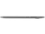
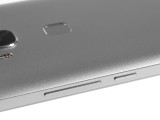
Only a couple of controls on the right side
The power button has a grippy pattern, but we can't imagine you could really mistake it for anything else as it's quite shorter than the volume key.
The 3.5mm headphone jack is placed at the top of the device. Next to it is the secondary noise-canceling microphone. As you may or may not know, the Mate S actually has a third microphone, next to the primary one on the bottom. It allows for some really neat advanced directional recording, which is absent from the G8. That is just one example of how Huawei has went about shedding cost off the G8 - from rally premium features that you are likely not going to miss.
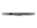
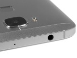
The top hosts the 3.5mm headphone jack and a noise-canceling mic.
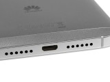
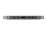
The bottom of the Huawei G8 has two symmetrical grilles, but only one of them houses a speaker. The main microphone is hidden under the other. Unlike the Mate S, there are no screws present on the bottom, which could mean that the G8 is held together by glue rather than a more advanced assembly, making it a bit more difficult to service.
The back side of the Mate S offers a sloped design for improved handling and an even thinner edge. There are two plastic antenna inserts to facilitate radio reception.
Oddly enough, Huawei has went with two quite large and obvious patches on the top and bottom - one for each of the phones pair of antennas. The Mate S and Mate7, as well as the Honor 7 all utilize a much more non-intrusive line design. This approach is more similar to the Huawei P8 or the Nexus 6P and while it might appeal to some, we feel that it does stand out as somewhat of an eye-sore.
The 13 MP camera module is also quite familiar with its square shape. With the dual-tone LED flash on the side, it is much more reminiscent of the Honor 7. The only other control on the back is the new and improved fingerprint reader. It may look unchanged on the outside, but it's actually better than the previous generations in every way.
Another neat feature of the new sensor is that it can double as a touch-based input. We already saw this feature debut on the Mate S. It recognizes swipe gestures and can be used to bring down the notification shade and dismiss notifications. However, interestingly enough, the Mate S also utilized side swipes to navigate through photos in the gallery, which seems to be missing from the G8. Hopefully it will appear in a later software update, as it should be easily implementable considering the hardware is present.
Another interesting aspect about the fingerprint reader is that it remains active even when the screen is off. This is an awesome feature and lets you unlock the device instantly.
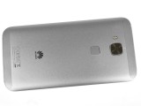

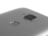
A nicely rounded back side with a small camera bump and convenient fingerprint reader
Reader comments
- Troubo
- 04 Aug 2022
- y37
Now is 5th day from when I bought my Huawei G8 but only problem is the battery runs fast
- Gordon
- 25 Oct 2021
- p7A
Ur mobile is the low version of the G8 actually the mobile has upto about 5Gb I got the 5GB version but that one not much if a price hyke and that version has a better chipset too
- Conable
- 19 Jul 2020
- CGH
My Huawei G8 has an entire internal memory of 2Gb. Please what is wrong with the phone but I can't install apps.
