Huawei G8 review: Elegantly relegated
Elegantly relegated
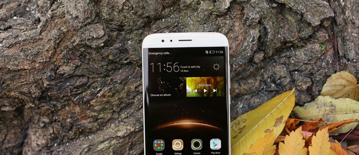
Emotion UI v3.1
The Huawei G8 boots the company's own EMUI, no surprises there. The custom ROM adopted Android Lollipop fairly recently, but judging from past experience with the Mate S, the migration from KitKat to the new core has been mostly problem-free.
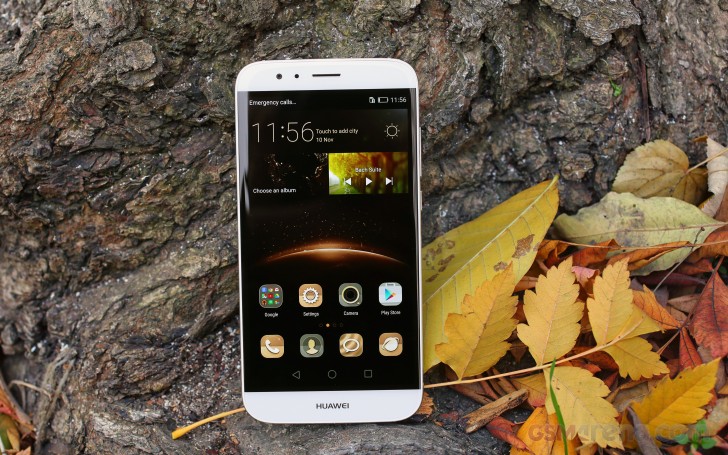
The G8 runs on the latest EMUI 3.1 and just like the Mate S, it utilized Android 5.1.1 and reaps all the benefits from Google's improvements. This is an important note to make, as we have seen Emotion UI 3.1 work on top of Android 5.0 in the past. Huawei has made sure to provide the latest platform it has for the G8 and keep it up-to-date.
There are, however, some notable software differences between the G8 and the Mate S, often not easily justifiable, but more on that later. Still, from an interface and UX point of view, little has changed and Huawei users will feels right at home thanks to impressive level of continuity, while new users of the brand can rest assure they get (almost) the same treatment on the G8 as with the higher-end Mate S.
The EMUI 3.1 is based on Google's new platform and yet, it is the similarities with previous Emotion UI versions that seem to stick out, rather than the differences.
What Huawei has done, in a nutshell, is adopt Android Lollipop, without Google's new material design. The user interface has remained flat with almost no traces of Google's latest aesthetics. EMUI 3.1 remains true to its style and has preserved the user experience mostly intact.
Fans will also be happy to know that the OS is still packed full of various extras and additional functions, baked right in. Some of them we found to be quite useful.
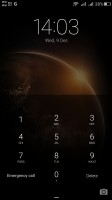
The default lockscreen features a nifty "sunshine" effect as you drag your finger across. The theming interface suggests that more animation options can be downloaded as well. You can also have widgets on the lockscreen, iOS-style shortcuts, and even dual clocks when roaming.
If you use the fingerprint reader for unlocking, then you can skip the lockscreen interface altogether. If that is the case, there is also a nifty option for whether you want the password keyboard to be displayed as soon as you turn on the screen or after a swipe. The latter, of course is the only way to enjoy the unlock animation as well as the row of four quick shortcuts hidden away at the bottom of the interface.
In previous versions of the OS, these lockscreen graphics used to be referred to as Covers and have a pretty rich collection of customization options, including a dedicated download center, complete with channels, subscriptions and auto-updates. All that seems to be absent from the Android 5.1.1-based EMUI 3.1, or perhaps it's only the G8 (as well as the Mate S) that lacks this nice feature.
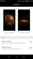
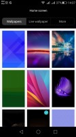
Still, some of the functionality remains and it is spread out between two interfaces. One is found within the settings menu, under Display options, where you can set the lockscreen and homescreen wallpapers separately. The rest of the tweaks are found in the extensive theming interface, but more on that later.
Swiping from the bottom of the lockscreen reveals a very iOS-like quick shortcut menu. It holds shortcuts to a recorder, calculator, flashlight and the camera.
Beyond the lockscreen we find a fairly standard Android homescreen with four customizable shortcuts, which are docked at the bottom and are visible on all homescreens.
There can be up to nine homescreen panes in total - and at least a couple of them will be populated by the preinstalled apps.
As is customary for Chinese Android UIs, there is no app drawer like there would be on vanilla Android.
Anything you install pops up on the homescreen, just as it would on an iPhone or a Xiaomi. While this means that you don't have to bother creating shortcuts to your apps on the homescreens, it also means that you cannot effectively hide any of your installed apps either. You can, however, group them into folders.
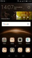
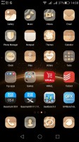
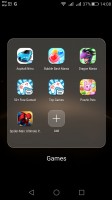
The homescreen keeps all your apps with only folders available for organization
A pinch on the homescreen triggers the familiar Overview mode to let you check out and organize the homescreen panes currently in use, remove or add panes as you please. Widgets are available too - it's mostly the stock Android ones, but Huawei has thrown in some of its own as well.
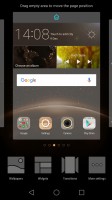


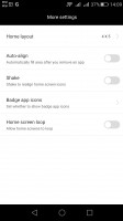
The overview mode • changing the layout grind and pane effects
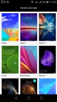
Themes are available as well. A theme will change your homescreen wallpaper, lockscreen style, system and app icons, system font, system color and the sound profile. You can also adjust things like homescreen transition effects, and even change your wallpapers at random or specific time intervals.
The theming engine is so powerful that it can basically transform the UI and offers incredibly varied looks. It even offers access to a vast online library of ready-made themes. Anything you download can also be customized further to your liking. Interestingly enough, the Huawei G8 came preloaded with a very different set of themes compared to the Mate S and for some reason, we couldn't find the Mate S default theme anywhere on the list.
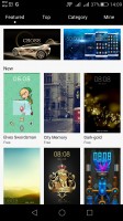
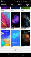
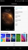
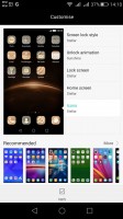
Powerful Theming engine with an online store
The notification area has two pages - one that hold all notifications sorted in a timeline, and another for all of your quick toggles. You can swap around the ones you want visible on the first three rows.
The shade has undergone some degree of modification in MIUI 3.1. It is now transparent and creates a blur effect underneath, quite reminiscent of iOS.
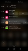
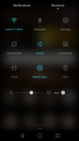
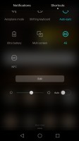
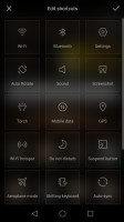
The notification area with toggles
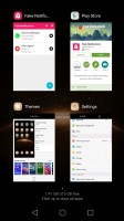
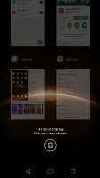
The Huawei G8 features a task switcher that lets you swipe away unwanted apps. A swipe from the bottom of the screen clears everything and tells you how much memory you've freed up.
But the Huawei G8 isn't just big on eye-candy. Huawei has invested quite a lot of effort in various usability and accessibility features and most things that are not customizable through theming can still be rearranged and moved around. The phone comes with features, such as a customizable navigation bar, a simple homescreen, a Do not disturb mode, and even one-hand optimizations for system apps.
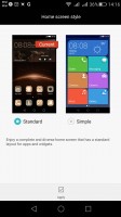
Simple homescreen with a Windows Phone style tiled interface
The Do Not Disturb mode is self-explanatory - you can schedule it when to turn on and off, and you can add a list of exceptions. Going through the Huawei G8's specs we instantly noticed that it has two antennas, a feature promptly showcased on the official website as well, so, we naturally assumed that just like the Mate S, the G8 would have advanced connectivity features for both network and Wi-Fi. The antenna switching is even mentioned on Huawei's website, yet, the aforementioned options, dubbed Link+ are entirely missing from the G8 settings page. This might be a case of missing hardware from the cheaper G8, but everything hints at the feature missing, which is somewhat disappointing.
Various display options are also accessible on a system-wide level. The UI can be tailored to your needs and the lockscreen can be as secure as you would like.
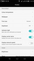
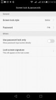
Display and lockscreen options
Huawei's EMUI 3.1 offers class-leading granular control over app permissions and their access to various system functions, such as network data and notification areas.
The G8 features a notification center, from which you can control which apps can send you the three types of available notifications - the shade notifications, the lockscreen notifications and the banner style notifications.
This level of control is also employed when it comes to the app access to network data. The user can control the rights of each application to access either Wi-Fi or mobile data. This can save a lot of traffic and help you optimize your data plan and consumption in an easy and convenient way.
Huawei has given battery management an equally thorough treatment. EMUI has a dedicated interface for managing what it refers to as protected apps. The notion is that only applications that are deemed necessary by the user can be left to run in the background and consume battery and possibly network data, when the screen is off. Any app not on the list has no such privileges. This level of control is astounding and we really wish that other manufacturers would adopt similar mechanisms to give back users granular control of their mobile hardware.
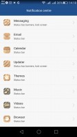
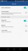
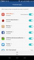
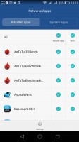
Extensive app permission management engine
The bottom navigation bar with the default Android controls is customizable - you can swap the task-switcher and back keys, or even add a shortcut for the notification area. You can hide the navigation bar and bring it back with an upwards swipe from the bottom. There is also a one-handed UI mode, for easier menu surfing on the go.
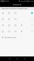

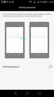
Navigation bar settings and single-handed mode
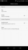
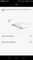
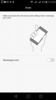
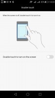
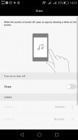
Motion control is another area where the Mate S excels. It is still present on the G8, but a lot of the options have been dropped. Once again, we doubt that it is due to a software limitations, so, perhaps it is a purposeful decision, aimed at widening the gap between said devices. Still, not enabling a raise to year gesture, whilst leaving the turn to mute one, just seems unjustified.
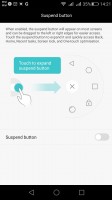
You can enable the so-called Suspend button - it's a virtual key you can move anywhere on the screen, allowing you to expand it to the primary Android keys - Back, Home, Task Switcher, Lock and Close all running apps. It will help you control your phone with just one hand.
Another big Mate S accessibility feature, sadly absent from the G8 is the Speech awareness. This time around, however, we are a lot more inclined to believe that there is a good hardware reason why it is missing.
Like we already mentioned with the fingerprint reader, such always-on interactions and hardware typically rely on some sort of specific low-energy controller or sub-system to operate properly, like the i3 co-processor in the Mate S. The Snapdragon 615 inside the G8 sadly has no such thing at its disposal. And whereas Huawei has deemed it necessary to find a workaround for the fingerprint reader, the always on voice trigger and consequent voice operations have obviously been scrapped.
Sadly, the dual window mode from the Mate S is missing.
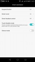
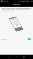
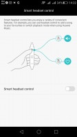
Others accessibility features that deserve mentioning include: glove mode, smart cover and smart headset control.
Finally, we should mention Huawei's excellent fingerprint technology implementation. It is superb on both hardware and software level. After quite a few one-on-one races with various handsets in the office, we can definitely say that the Mate S currently has one of the fastest, if not the very best sensors to date and the G8 is just as accurate and just a few microseconds slower.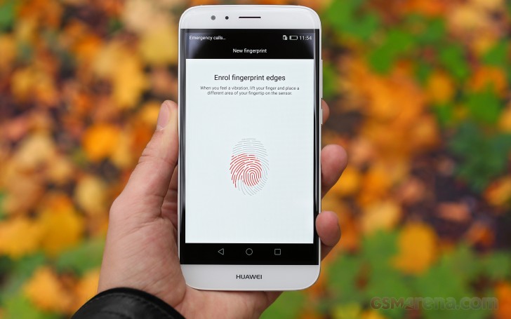
The fingerprint reader works like a charm and managing fingerprints is also a breeze. There is a maximum of 5 fingerprint that you can have stored and the security feature can also be used for locking apps or multimedia content.
And just when you thought there wasn't anything else you could possible want from a fingerprint sensor, it turns out there is, as Huawei's new added touchpad functionality gives it yet another interesting twist.
It recognizes swipe gestures and can be used to bring down the notification shade and dismiss notifications. However, interestingly enough, the Mate S also utilized side swipes to navigate through photos in the gallery, which seems to be missing from the G8. Hopefully it will appear in a later software update, as it should be easily implementable considering the hardware is present.We admit, it is more of a gimmick, but it does have some potential and possible use cases. We just wish Huawei hadn't inexplicably deprived the G8 of the side swiping gestures, pointless as they may be in their current state.
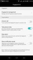
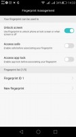
The G8 comes with an excellent fingerprint reader implementation
Reader comments
- Troubo
- 04 Aug 2022
- y37
Now is 5th day from when I bought my Huawei G8 but only problem is the battery runs fast
- Gordon
- 25 Oct 2021
- p7A
Ur mobile is the low version of the G8 actually the mobile has upto about 5Gb I got the 5GB version but that one not much if a price hyke and that version has a better chipset too
- Conable
- 19 Jul 2020
- CGH
My Huawei G8 has an entire internal memory of 2Gb. Please what is wrong with the phone but I can't install apps.


