A month with the Huawei Mate 40 Pro
Design, build quality, handling
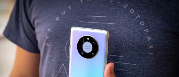
In a sea of very similar-looking glass sandwich construction smartphones, the Mate 40 Pro still manages to stand out so much that it's striking. That's down to a few of its particulars - the curvature of the screen and its effect on the frame and the buttons, the pill-shaped cutout for the selfie cameras, the round ring-like camera island on the back, as well as the rear glass finish itself and the way it feels in the hand.
It's definitely no small feat to accomplish this, as this reviewer sort of thought he'd seen it all when it comes to glass sandwich devices, but no. The Mate 40 Pro goes its own way in a lot of regards, and while some of that could be controversial (or not useful) to some (see the Software section), in terms of design it's definitely easily recognizable as both a recent Huawei flagship as well as a thing onto its own.
There's no need to mince words when it comes to build quality and overall feel in hand. This phone is premium through and through. The curvature of the screen is very striking, as is the positioning of the power and volume buttons, which is caused by that - they're way towards the back of the handset, but at least this time around we get actual buttons, so Huawei rectified one of the main complaints people had with the design of the Mate 30 Pro. For the same screen-related reason, the metal frame itself is incredibly tiny, but still lends a feeling of sturdiness to the phone.
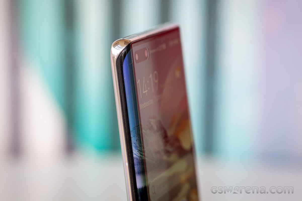
The pill-shaped hole-punch cutout for the selfie camera and face unlock sensor is big and definitely one of the least pleasing aspects of the phone's design, even if it does contribute to it being more recognizable on the street and in someone else's hands. It's an eyesore, but one that at least gives you more framing options than usual for selfies, as well as the most secure face unlock in the Android world (see the Biometrics section for more on this). The pill is technically not a notch as it's not centered, but it's also not very close to the left edge (because of the screen curvature), so it just sits there, awkwardly, in a puddle of asymmetry. You can of course 'hide' it in software, but then you basically engineer a huge black bezel at the top of your usable screen space, which feels like going two steps back instead of one.
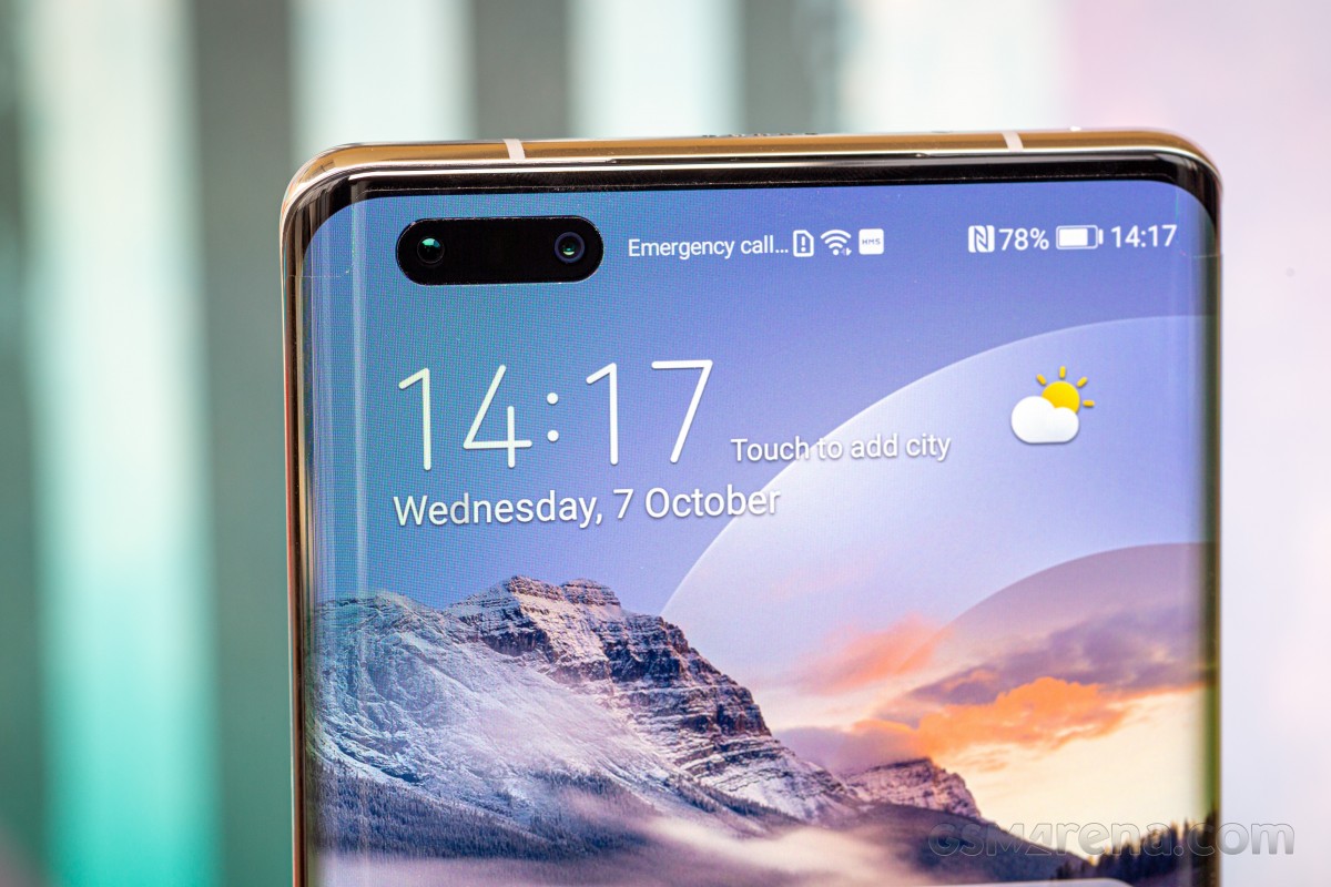
The screen's top and bottom bezels, on the other hand, are almost symmetrical, which is definitely a rare sight to see. They're not, but they're close enough that you won't be able to tell unless you actually measure them. The side bezels are weirdly also almost symmetrical to the top and bottom ones, which is another thing we aren't used to - side bezels are generally slimmer in flagships, but that's not the case here. This is another thing you're not likely to notice unless you really want to, and that's because the curvature of the display hides the size of the side bezels really well. When you're looking at the screen head-on, you don't see any bezels at all on the left and right.
The Mate 40 Pro is big and it's heavy and that also contributes to the premium feel, although it may be slightly too much for some people, especially those with smaller hands. The size was fine for this reviewer, but the weight is at the limit of what feels tolerable if you're going to use the device for more than a few minutes at a time. Handling is great, though, in part because there are zero accidental touches registered on the curved side of the screen, so you can get a very comfortable grip.
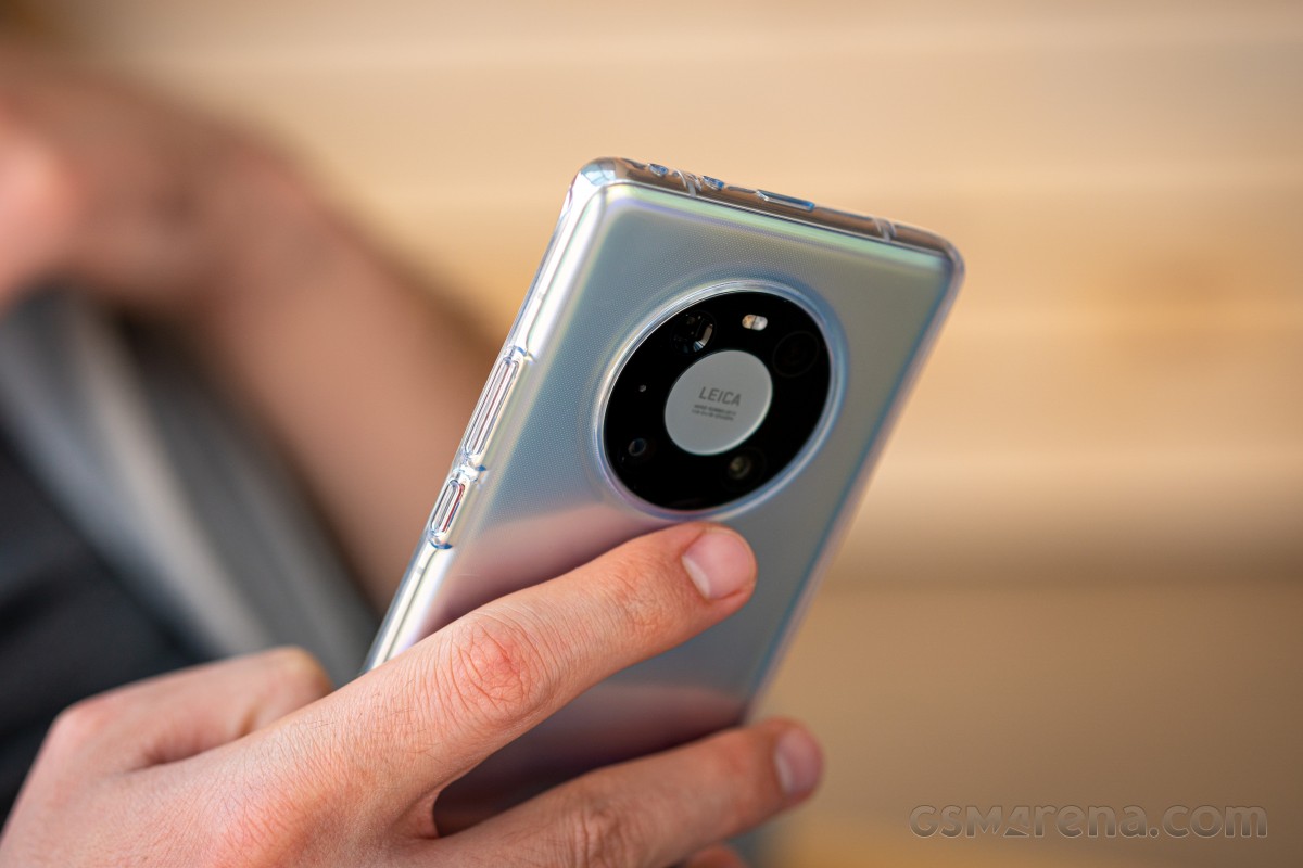
The back has, dare we say it, the best looking camera island we've ever seen, with the ring-like design taking things in a much better and less tacky looking direction compared to the Mate 30 Pro. Sure, if you turn it upside down it might sort of look like an iPod, but that point is moot. Good design is good design, no matter what. As the ring is centered horizontally, there's symmetry too, which is enhanced by the positioning of the sensors inside the ring. Because the ring is so huge, there's no wobbling if you type while the phone rests on a desk, but because the ring is so bulging there will be much wobble if you try to hit the upper left or right parts of the screen.
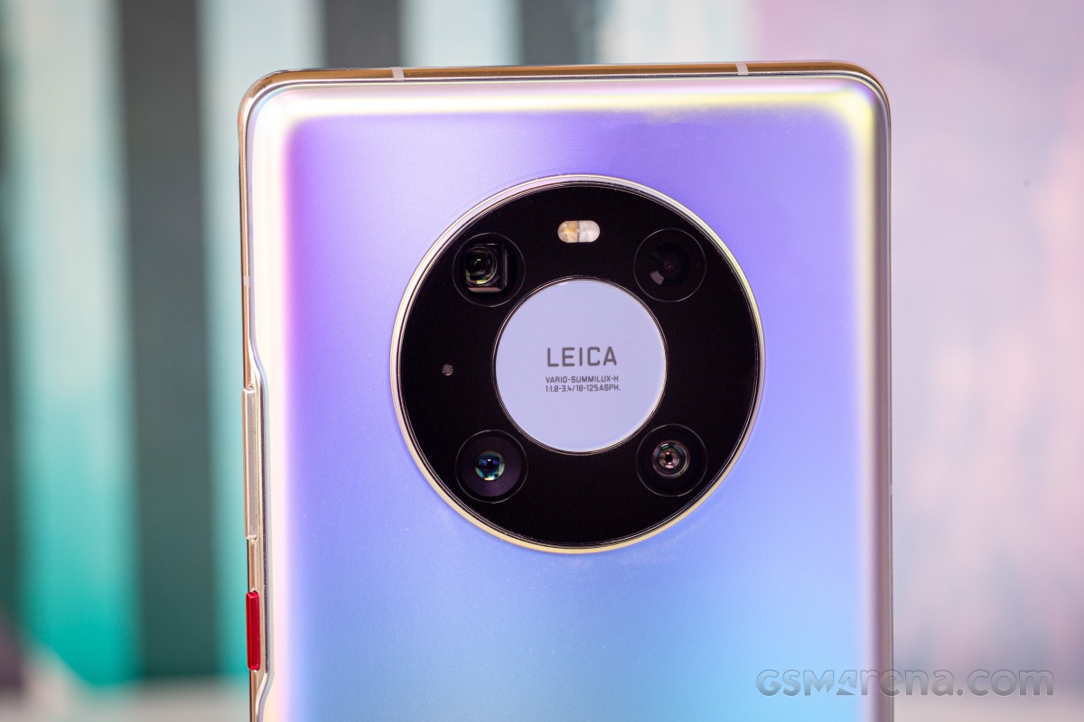
The bottom part of the ring is very useful to rest your finger against when you hold the phone, and this is amusingly made easier by how thick the bulge is. The back of our silver review unit feels like metal, which is no small thing to pull off considering the material in use is still glass. It doesn't show many fingerprints and while slippery, we've definitely seen worse with some matte finishes out there.
The back also looks the part with Huawei's interpretation of the "all the colors" mantra at work here based on the various light reflections. These give you a ton of different shades, but you still have an overall color to look at most of the time, in contrast to what Samsung had done for its Galaxy Note10 family. We'd say this design looks more mature and less flashy, while being almost equally appealing. That is, of course, unless you throw a case on the phone, then missing a lot of what makes it special.
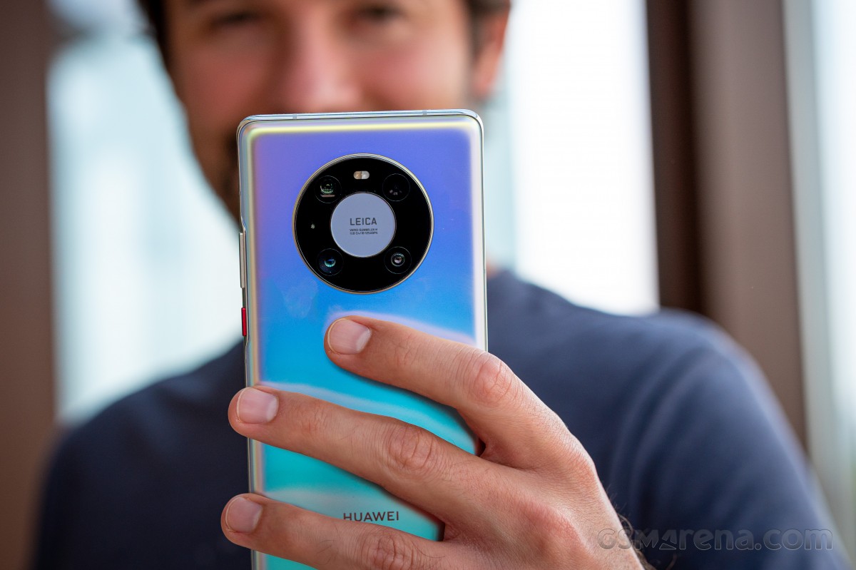
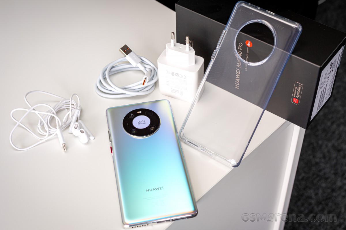
But that's a normal aspect of life for most people given how brittle glass is, and Huawei helpfully provides a simple jelly case in the box. This is definitely a case, but it's flimsier than in-box cases for much cheaper devices provided by some of the company's Chinese competitors, so while it's a good gesture it could have been harder and more protective. The screen edges are understandably not protected at all, which means if you're unlucky enough to drop the Mate 40 Pro, you need to hope that the front glass is sturdy enough to take that impact without shattering.
Overall, the Mate 40 Pro looks and feels incredibly premium, as it should, given its price point. From the design, build quality, materials and construction points of view it's definitely where it needs to be to even begin to justify its asking price. There aren't any competitors out there that are better built, and when it comes to handling it's among the best big phones, if you don't mind the weight and heftiness.
Speakers, buttons, vibration motor
The Mate 40 Pro has two stereo speakers, and their output is great. They get loud and are very high quality considering the small space they have to work with inside a smartphone. We'd definitely say these are among the Top 4 best speakers on a smartphone right now, alongside those seen in the Xiaomi Mi 10 Pro, Oppo Find X2 Pro, and Samsung Galaxy Note20 Ultra. Which exact pair is the most satisfying for you will be a matter of personal preference, the point is you can't go wrong with any one of these.
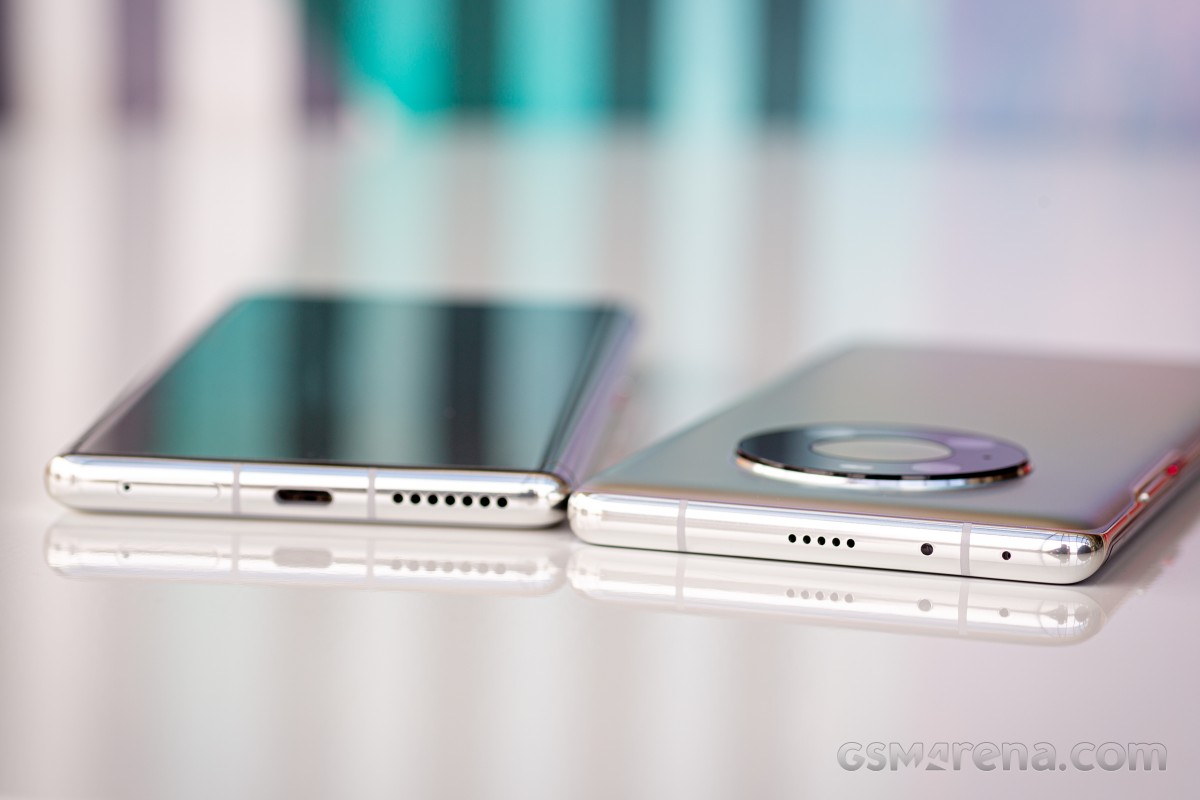
In this reviewer's subjective opinion, the Mate 40 Pro's speakers are very slightly behind the Find X2 Pro's and Mi 10 Pro's in clarity and the Note20 Ultra's in top volume. But again, the deltas are small and the quality you're getting is top notch. It's amazing to see how far we've come in this regard with flagships in 2020 making any memories of cupping a phone with your palm to hear what's played just distant nightmares from a weird past.
The Mate 40 Pro has actual physical power and volume buttons, unlike its predecessor, and they're very welcome to have, but will take some getting used to because of how close they are to the back of the phone. This is inevitable on the account of the screen's curves, but it's still a point to note.
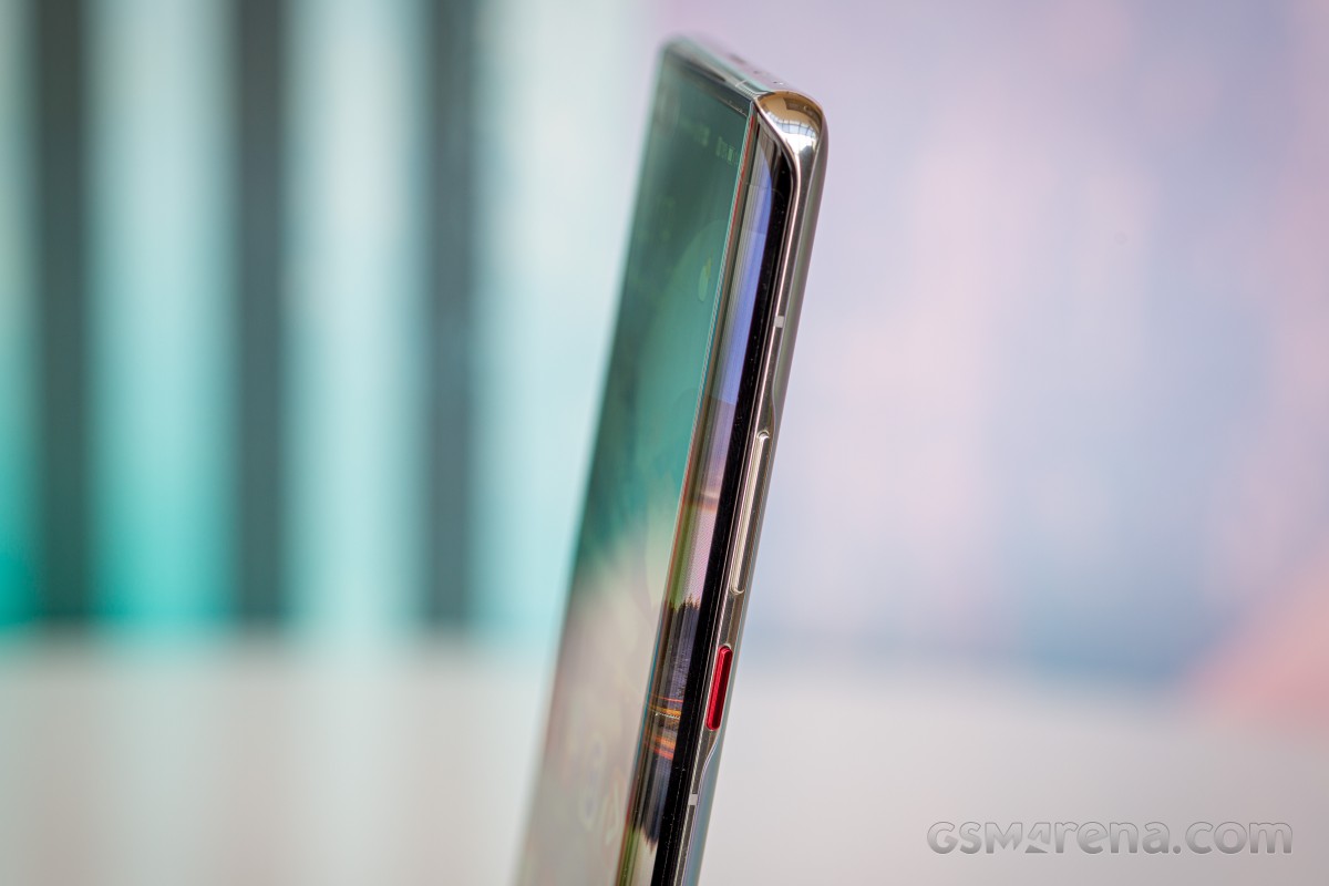
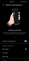
The buttons themselves are metal, and very nice feeling to use, despite the fact that they're incredibly narrow. We got used to them in a couple of days and never looked back. You do also have an alternative way to change volume, by double tapping either curve of the screen in the top side - you then get a software slider that you can swipe up or down. This works too, and much better than we expected by the description, but the reality is our fingers have so much muscle memory from always having used hardware buttons for this purpose that we ended up doing that most of the time.
There's not a lot we can say about the Mate 40 Pro's vibration motor, other than it's one of the best around in any smartphone right now. Again, which is the perfect one for you is a matter of personal preference, but this is up there with the best of them, easily Top 5 (if not Top 3).
If you ask us, the Mi 10 Pro's still takes the cake, but that may be down to how MIUI 12 intelligently uses gentle vibrations throughout the UI more than the actual quality of the hardware itself. Rest assured, you won't be disappointed on this front if you pick the Mate 40 Pro. That said, after having used MIUI 12 a lot this year, we have become sort of spoiled and wish more companies would get inspired by what Xiaomi has done and use gentle nudge-like vibrations as a way to enhance the user experience by making touches and scrolls feel more physical.
Reader comments
- Waiz
- 09 Aug 2023
- UUK
I love this phone, Camera is awesome. I wish someone will replace my mate 10 pro with mate 40 pro.
- AAA
- 03 Nov 2021
- gL8
One of the best in this category Camera battery life and touch is amazing Only problem is we don't have many applications in Huawei app
