Huawei Mate S review: Precision styled
Precision styled
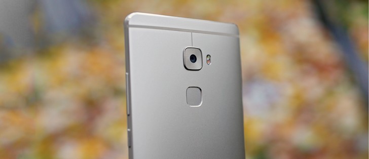
Huawei Mate S 360-degree spin
The Mate S has a gorgeous profile and looks incredible all around. The thin metal edges really make for a premium feel.
Design and build quality
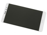
When we said the Mate S took a lot of cues from all around the Huawei device lineup, we definitely meant it, especially design-wise. We can't help but notice that the handset looks almost identical to the Mate7 on the front. Its display is also quite wide, leaving almost no side bezels and comes to an end with a nice 2.5D curvature of the glass.
The speaker grill on the top and the Huawei logo on the bottom complete the picture.
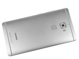
On the back, however, the Mate S is a mixture of the aforementioned Mate7 with its antenna lines and the Honor 7, as far as the camera and fingerprint size and position is concerned at least.
The Mate S is almost entirely made of metal, it has premium looks and its build quality is superb, quite fitting for the Mate series. As far as color options go, it has quite a few of those and all looks good with the metal finish. They include - Luxurious Gold, Titanium Grey, Mystic Champagne and Rose Gold.
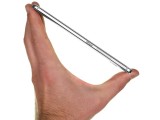
The Mate S is a really thin device and the sensation is only intensified further by its double sloping edges, both on the front and the back. The curve on the back side also improves handling greatly and helps the unit sit snugly in the hand.
The phone's body measures 149.8 x 75.3 x 7.2 mm, which is even thinner than the Mate7, not to mention the Honor 7. The Mate S is also surprisingly light and tips the scale at 156 grams, just about what the overall smaller Honor 7 weighs.
Controls
As already mentioned, the Mate S offers a nice amalgam of different Huawei traits. The same goes for the controls and their layout. Buttons are laid out conveniently and everything is within easy reach. The buttons are also quite responsive, so we are definitely glad that Huawei hasn't been changing things too much.
The design is really minimalist. Nothing is really out of place or out of measure. Huawei has opted for a 5.5-inch FullHD panel. It is noticeably bigger than the one in the Honor 7, but also quite smaller than the whopping 6.0 inches on the Mate7. It seems to sit in the ideal middle ground at least as far as current trends go and apart from the compact size, it has one potential advantage over both of its siblings - the AMOLED screen. But more on that in the display section.
With the main controls on the actual screen, the only thing underneath is a company logo.
There is not much else in plain sight on the front of the device. There is the earpiece and the 8MP front-facing camera, tightly packed next to it, along with a front-facing flash. Well, more of a flashlight actually, but it is enough to bring some light on night-time selfies. The LED in question is covered by a light gray finish, presumably for filtering purposes, but it does stand out as a sort of an eye-sore, but that is just nitpicking. There are also proximity and light sensors beside the earpiece.
Going around the device, we find the left side almost entirely bare. It only houses the SIM card/microSD tray (yes, one of the slots doubles on the Dual SIM model).
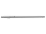
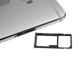
Left side view • SIM card tray
On the right side is where it gets busier. It still doesn't feel cluttered and it really shouldn't be, considering there is only the power button and the volume rockers. Both have a nice oval shape and precision cut design.
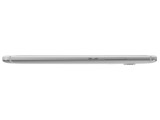
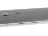
Only a couple of controls on the right side
The power button has a grippy pattern, but we can't imagine you could really mistake it for anything else as it's quite shorter than the volume key.
The 3.5mm headphone jack is placed at the top of the device. Next to it is the secondary noise-canceling microphone. Well, actually it could be considered the third, as there are two more on the bottom.
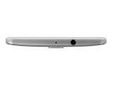
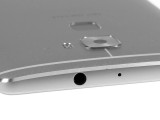
The top hosts the 3.5mm headphone jack and a noise-canceling mic.
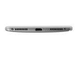
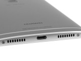
The bottom of the Huawei Mate S has two symmetrical grilles, but only one of them houses a speaker. The aforementioned pair of microphones is hidden under the other.
Here we also find a pair of screws for the main body assembly and, of course, the micro USB port.
As already mentioned, the back side of the Mate S offers a sloped design for improved handling and an even thinner edge. There are two plastic antenna inserts to facilitate radio reception. Their shape and placement is almost identical to the Mate7 - one on the top and the other at the bottom.
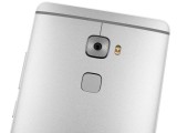
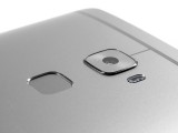
The camera module is also quite familiar with its square shape, but with the dual-tone LED flash on the right-hand side, it is much more reminiscent of the Honor 7. The only other control on the back is the new and improved fingerprint reader. It may look unchanged on the outside, but it's actually better than the previous generations.
It is truly among the fastest and most accurate implementations we have seen. It rarely introduces any delay to the user experience and thanks to the tiny co-processor inside the Kirin 935, it can stay always-on and unlock your device seamlessly even with the screen off. It is a joy to use and its placement also makes a lot of sense.
Interestingly enough, in the Mate S, said sensor now doubles as a touch control as well and recognizes simple swipe gestures. It can be used to bring down the notification shade or scroll through photos in the gallery. That will surely be useful to some, but it does take some getting used to.
Reader comments
- Waqar Masood
- 01 Dec 2020
- 6Ph
Huawei''s old models were bringing beauty.
- J.P
- 02 Apr 2017
- 0wa
hello every body, i need your support, i bought a Hawaii mate S 5 months ago, and until 2 weeks ago everything is going in a good way, suddenly the battery life is 50 % less then before and i have to charge my phone twice per day, and previously ...
- Sam
- 25 Nov 2015
- HsE
Every latest device of Huawei looks extremely gorgeous (P8, mateS) but onsceen bezels makes it look a lot cheaper . 1-2 mm of hardware bezel won't harm the beauty but 3-4 mm of onscreen bezel makes it worse . I don't understand are Huawei deaign engi...

