Huawei MatePad 11 (2021) review
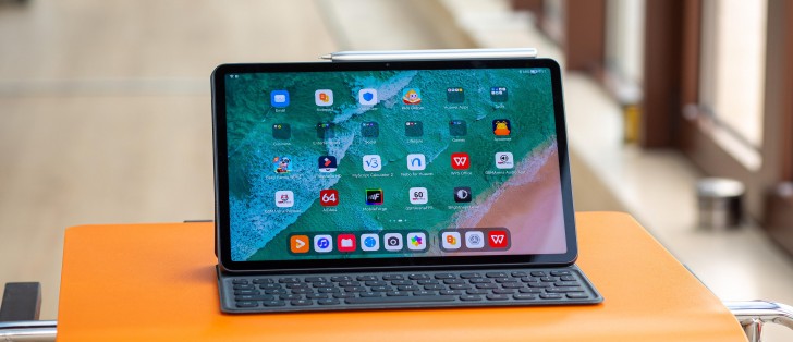
Brand new HarmonyOS 2.0 that feels familiar
MatePad 11 is one of the first Huawei devices to officially launch with the latest iteration of the company's in-house HarmonyOS 2.0. There are some phones currently getting the OS in China, and most of them are still in the beta stage. And although Huawei wants you to believe that HarmonyOS has nothing to do with Android, which has a legal side, that's not actually the case. Digging deeper reveals that the software is based on Android 10, and even Huawei representatives say that there's a Linux kernel beneath HarmonyOS, among others.
But that's not a bad thing by any means. Seemingly, the company worked really hard to bring advanced features, re-design the UI and even implement its own services into HarmonyOS to make a self-sufficient and rich ecosystem. And perhaps the most important thing here is that it runs standard Android APKs, unless those apps rely on Google Services, in which case you can't run them normally. For instance, you can install Google's Chrome browser for Android, but syncing your account with other devices won't work.
Since we are on the topic of apps, let's get this out of the way. The default way to get apps on HarmonyOS is to download them via the official AppGallery store, but in case you can't find the apps you are looking for, the so-called Petal search engine will redirect you to other APK stores like APKPure, Aptoide, APKMirror, etc. What we found annoying with AppGallery are the obligatory ads whenever you open up the app. We understand that those ads are about apps, and Huawei is trying to promote developers' apps.
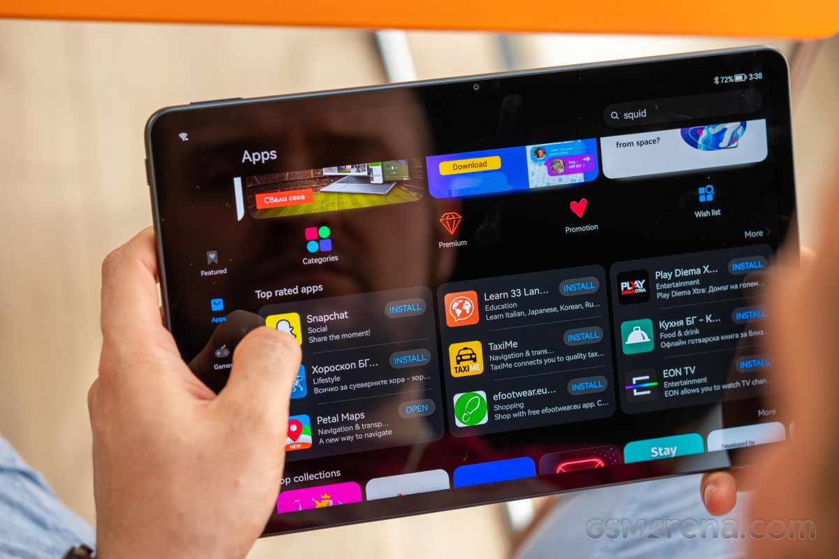
And for Google's alternatives, HMS-powered apps should have you covered like Petal Maps, Petal Search and Celia, Huawei's virtual assistant. For maximum convenience, searching for an app using Huawei's default Browser will offer you suggestions and a button for direct installation.
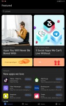
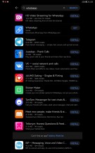
Huawei AppGallery, Petal search and app suggestions
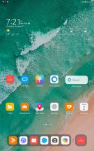
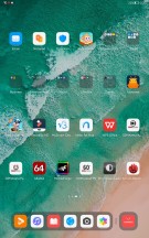
Once you start up the device, you will be greeted with numerous folders on the home screen, and each one represents a different category with suggested apps that you can download from AppGallery. These apps are not actually installed, and the suggestions are based on the region you've selected. We found a couple of useful suggestions relevant to our country, such as local banking apps.

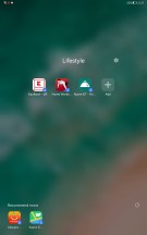
App suggestions on the home screen
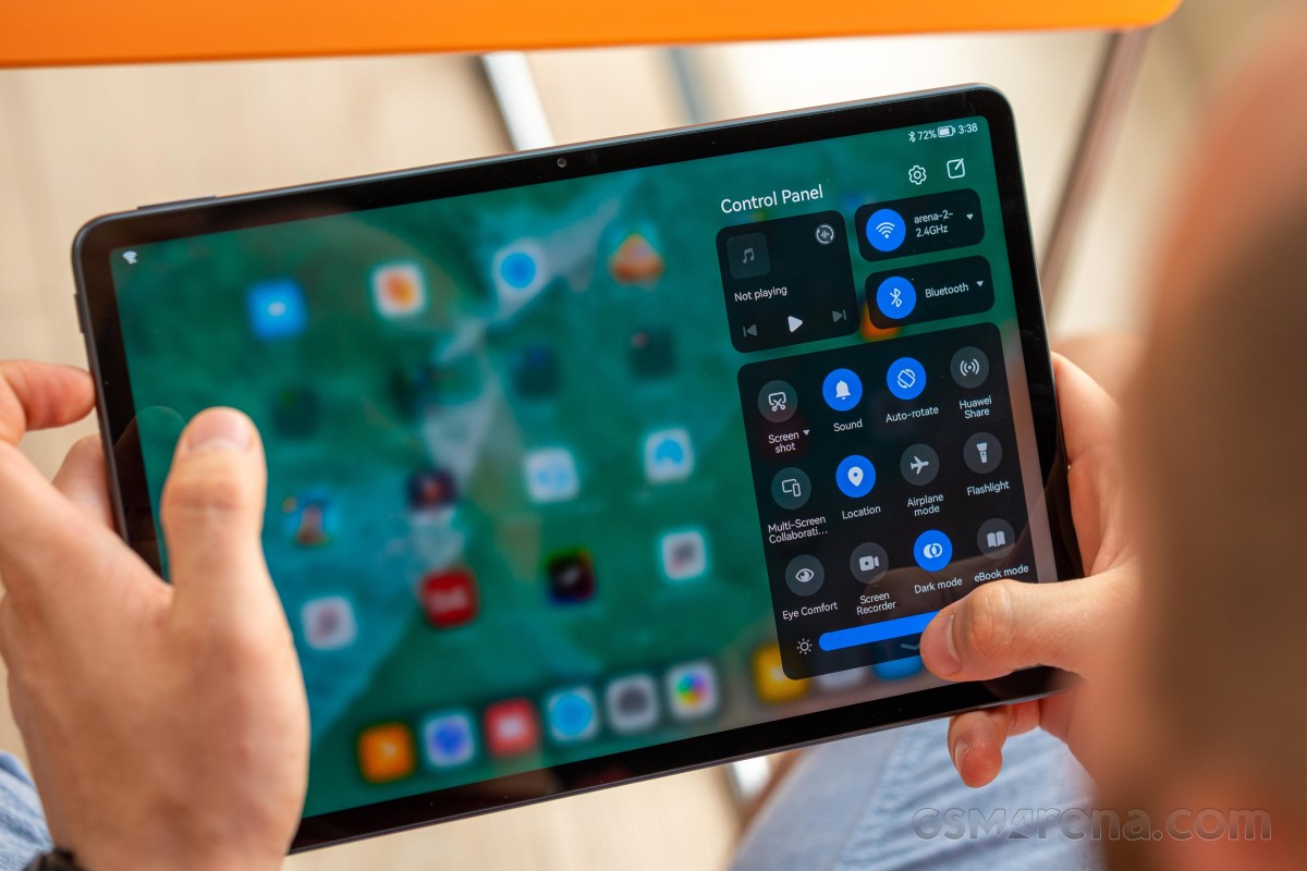
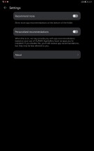
As far as user experience goes, it will feel most familiar to those used to Huawei's EMUI, but it's still essentially Android. You may also find some similarities between Apple's iPadOS and iOS when it comes to navigation and UI. For instance, the notification shade and the quick toggles are separated from one another (Xiaomi is doing this too with its MIUI). Imagine the top bar is divided into two halves - swiping from the left one opens up the notification cards while swiping from the right side will summon the quick toggles along with the brightness slider.
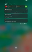
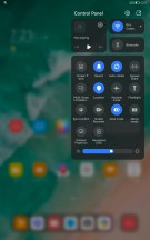
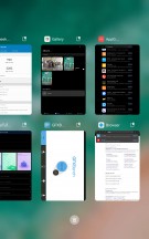
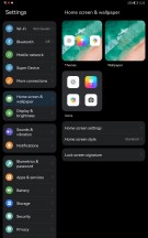
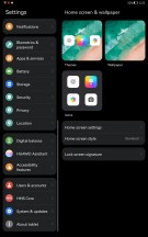
Notification shade, quick toggles, recent apps, general settings menu
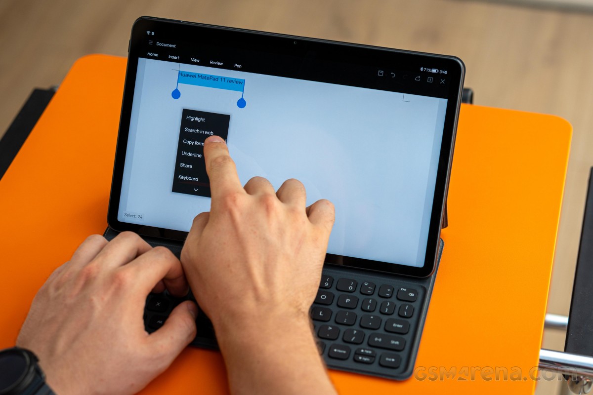
We were also pleasantly surprised by the keyboard shortcut support that makes the navigation so much easier and similar to that of Windows. Alt+Tab and Ctrl+C/Ctrl+V among others are supported while the keyboard's layout allows you to control things like sound and display brightness using the shortcut keys.
All apps are positioned on the home screens but the app drawer is still an option. The home screen has a dock on the bottom with your favorite apps and on the other side of the divider you will find three app shortcuts for the apps you've used last. Recent apps menu doesn't bring anything out of the ordinary, though.
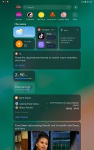
Going left from the main home screen opens up the Assistant Today section, which is basically a customizable infotainment corner. You can put widgets there, get your daily dose of specifically tailored to your reading habits news, AppGallery suggestions, etc.
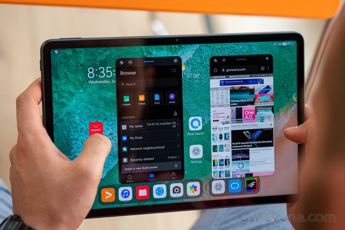
Multitasking on this thing is a joy. It's not just split-screen apps, floating windows are also supported as long as the apps you are using play well. In either case, you are limited to just two apps opened at the same time but there's a neat feature in the floating windows mode. As you start opening up apps in windows, those that are opened last will dock in on the left edge so you can quickly jump back to those windows if needed.
Navigation is simple - you can go with software buttons or gestures that are well-known for a couple of years now. Swiping from the bottom bezel brings you back home, swipe and hold opens up the recent apps and swiping from the left or right side serves as a back button. Swiping down anywhere from the home screen opens up the global search, again like Apple's iPadOS.
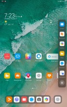
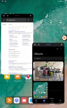
Multitasking with floating windows and sidebar
Keep in mind, though, that swiping from the left or right edge and holding for a second will open up a pop-up containing the apps that support floating window mode. The support is rather limited for now, mostly to system apps but should expand over time.
Arguably the more impressive features of them all are the ones related to the Multi-Screen Collaboration. You have three modes to choose from - Mirror, Extend and Collaborate modes. Those are available as long as you are invested into Huawei's ecosystem, of course and that includes not just a smartphone but a laptop too. Sadly, the MatePad 11 seems to support only the Collaborate with a Huawei laptop where you can share files seamlessly.
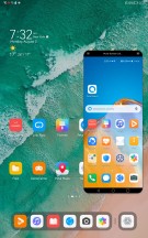
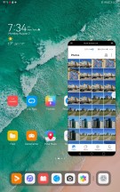
MatePad 11 paired with Huawei P40 Pro+
Screen mirroring is possible only when paired to a compatible-Huawei phone. The rest are exclusive to the MatePad Pro tablets..
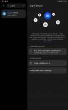
For a complete ecosystem experience, Huawei has also included a feature called Super Device. Turning your tablet into Super Device would grant access to all Huawei smart devices - TV, smart speakers, FeeBuds, your Huawei smartwatch,, etc. You can control pretty much everything from the command center on your MatePad 11.
A simple example would be to switch the audio source coming to your FreeBuds from your Huawei phone to the TV with a single touch. That's a really nice alternative to having to pair your headphones with the TV.
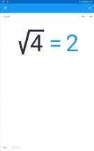
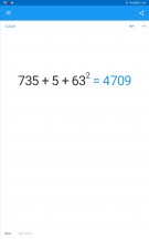
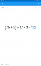
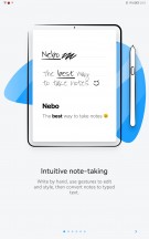
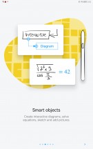
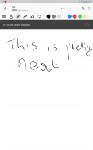
About three apps are specifically optimized to work with Huawei's M-Pencil - Notepad, Nebo for Huawei and My Script Calculator 2. They can work with M-Pencil's low-latency of 9ms and it feels like you are writing on an actual paper. Response-wise, that is.
The Notepad is pretty self-explanatory, Nebo comes as a more advanced alternative also used for drawing and My Script Calculator 2 can come in handy to those of you solving math problems. The system recognizes the equation or the given math problem and calculates it.
Performance
The MatePad 11 comes with last year's Qualcomm flagship SoC, the Snapdragon 865 without the 5G connectivity. Perhaps the modem is still inside the chip but it's disabled. Anyway, the SoC is based on the TSMC's 7nm+ manufacturing process incorporating an Adreno 650 GPU and an octa-core CPU in a 1+3+4 core cluster configuration. The main Kryo 585 core (Cortex-A77 derivative) ticks at 2.84 GHz, the other three Kryo 585 Gold cores (again based on the Cortex-A77) run at 2.42 GHz and the energy-efficient cluster of four Kryo 585 Silver cores (Cortex-A55 derivatives) are clocked at 1.80 GHz.
Memory-wise, the tablet offers 6GB/64GB combo as a standard but can go as high as 6GB/256GB while the storage remains expandable via a standard microSD card.
GeekBench 5 (multi-core)
Higher is better
-
Apple iPad Pro 12.9 (2020)
4709 -
Huawei MatePad 11
3282 -
Samsung Galaxy Tab S7+
2690
GeekBench 5 (single-core)
Higher is better
-
Apple iPad Pro 12.9 (2020)
1121 -
Samsung Galaxy Tab S7+
959 -
Huawei MatePad 11
920
AnTuTu 9
Higher is better
-
Huawei MatePad 11
639631
GFX Car Chase ES 3.1 (offscreen 1080p)
Higher is better
-
Samsung Galaxy Tab S7+
54 -
Huawei MatePad 11
51
GFX Car Chase ES 3.1 (onscreen)
Higher is better
-
Huawei MatePad 11
26 -
Samsung Galaxy Tab S7+
24
GFX Aztek Vulkan High (onscreen)
Higher is better
-
Huawei MatePad 11
20 -
Samsung Galaxy Tab S7+
16
GFX Aztek Vulkan High (offscreen 1440p)
Higher is better
-
Huawei MatePad 11
21
The Snapdragon 865 SoC appears to perform as expected with no major deviations from other devices running the same hardware, namely the Galaxy Tab S7+. The small difference in graphic tests is due to the resolution difference. And in case you are wondering why the offscreen and onscreen test results are almost identical, it's because the offscreen tests aim for 1440p resolution, which also happens to be the resolution of the MatePad 11's display.
Reader comments
- Anonymous
- 20 Sep 2023
- MnQ
Finally... Someone that speaks ... I'm not against Apple in anyway, but just the so "close" ecosystem the skyrocket prices, together with the grazy idea of not having expansion for memory card in any device... Not to mention the way th...
- Huawei matepad 11
- 20 Sep 2023
- MnQ
Hey, I have to say it performs excellent in all areas, really all! the construction is very good, the display more than fine, the speed super fast, the sound maybe the best of ALL tablets and phones (you can check on measurements or in a store), th...
- Anonymous
- 02 Feb 2022
- t7s
You basically have to just downlpad gspace and download every google play app that you want to use. Easy as 123. :)
