Huawei MediaPad 7 Vogue review: Budget extravagance
Budget extravagance
A standard phonebook
Many of the native apps on the Huawei MediaPad 7 Vogue come straight from Jelly Bean. The phonebook is just our first stop - it's laid out across three tabs that can be navigated by swipes.
The one in the middle is the default tab, listing all contacts. Contacts are displayed with a name and a picture to the left. They can be sorted by first or last name and displayed with the first or last name first.
There's a permanent alphabet scroll on the right to jump straight to contacts starting with a certain letter. There's a regular search too.
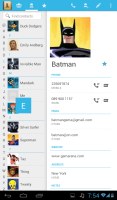
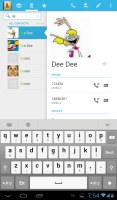
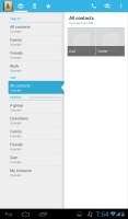
The phonebook • Alphabet scroll • Searching for a contact
Tapping on the contact image now brings up a tabbed popup. The tabs are phone and email with a list of the available numbers/addresses. These tabs can be swiped sideways too.
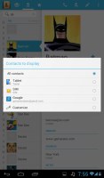
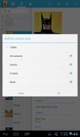
Quick contacts with a tabbed design
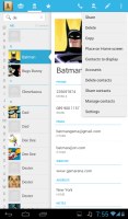
The single contact view top row has a star to favorite a contact, a pencil to edit it, and a Settings button that lets you share, copy or delete a contact as well as set the phone to redirect calls from that contact straight to voice mail.
Underneath is a list of all contact info sorted by category: phone numbers, emails, events, notes and so on.
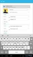
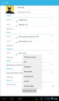
While editing a contact, you can add new fields of different types to fill in more contact details. You can link contacts too, if you've added the same person on multiple services.
The contacts can be filtered by service (e.g. hide all Facebook contacts) and even by group (so you can hide all contacts not in a group, for example).
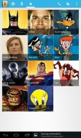
Anyway, the other two tabs in the phonebook are Groups and Favorites. Groups are listed by service (e.g. your Gmail account), while favorites are a listed as a grid of large contact photos, which is really thumbable.
Telephony
We already mentioned that the Huawei MediaPad 7 Vogue flaunts a SIM card slot, which allows it to place and receive regular calls. Thanks to the earpiece above the display you can easily use it just as a normal smartphone. Sure it's not the most comfortable experience, but it Huawei has decided to give the users this option as well.
The in-call sound was good and loud and we had no issues with reception. The Huawei MediaPad 7 Vogue doesn't feature a secondary microphone for active noise cancellation.
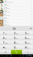
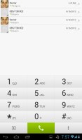
The dialer and the call log share the same screen. The dialer offers smart dialing and it works both with names and numbers.
The dialer offers a shortcut to the Contacts app and vice versa.
We put the MediaPad 7 Vogue through our traditional loudspeaker test and it managed an Average score. We found its speaker to be reasonably loud, but it's not as good as its predecessor, which scored a Good mark. As a result, you might not be able to hear the MediaPad 7 Vogue in noisy environments which could result in missed calls or notifications.
| Speakerphone test | Voice, dB | Ringing | Overal score | |
| 64.3 | 72.8 | 67.1 | ||
| 66.6 | 74.4 | 62.3 | ||
| 60.1 | 58.3 | 61.6 | ||
| Apple iPhone 5 | 66.8 | 66.1 | 67.7 | Below Average |
| Nokia Lumia 920 | 61.6 | 64.8 | 65.8 | |
| HTC One X+ | 64.6 | 65.8 | 74.6 | |
| 64.3 | 66.3 | 75.7 | ||
| 67.0 | 66.6 | 75.0 | ||
| Oppo Find 5 | 70.7 | 67.7 | 73.0 | |
| 66.5 | 66.1 | 77.3 | ||
| 68.5 | 66.6 | 80.7 | ||
| 66.8 | 65.7 | 75.7 | ||
| HTC One | 69.3 | 66.6 | 75.9 | |
| 67.2 | 69.8 | 75.7 | ||
| Samsung I9505 Galaxy S4 | 70.6 | 66.2 | 77.3 | |
| Samsung Galaxy S III | 75.1 | 66.5 | 75.0 | |
| 74.6 | 71.3 | 82.7 | Excellent |
You can find more on the testing procedure here.
Messaging
The messaging section is business as usual. All SMS/MMS communication is organized into threads - which can be mass-deleted - and each thread is displayed like an IM chat session, the latest message at the bottom. You can manage individual messages (forward, copy, delete) and even lock them (to prevent deletion). You can use search to find a specific message in all conversations.


Viewing all threads • Quick contacts are available here too • Batch delete • Viewing a single thread
You can set the Huawei MediaPad 7 Vogue to delete older messages (by default, it keeps 200 texts and 20 MMS per conversation). You can activate delivery reports, as well as read reports.
You can add multimedia (photos, videos, sounds, etc.), which will convert the message to an MMS. If you need multiple slides or multiple attachments, you can go to a full-blown MMS editor as well.
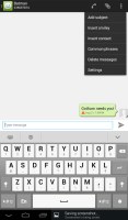
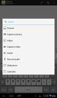
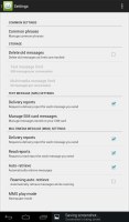
Options for a specific message • Attaching multimedia • Settings
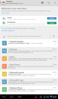
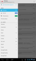
Moving on to email, the first thing you'll notice is that Google has done away with the bottom bar that hosted buttons for new mail, search, labels, refresh and menu. Three of those have now been moved to the action bar on top and refresh has been integrated into the UI, in the shape of pull to refresh.
The new Gmail app now displays contact images in mails. If an email has multiple recipients, they're shown in a grid similar to the Hangouts app. If there is no contact image, it just shows the first letter of the sender on a color background. You can disable sender images in the email app if you wish.
Gmail v4.5 also includes the four new inbox options. You can have your mail sorted by Primary, Social, Promotions and Updates as you can on Gmail web, which makes it easy to keep track of your mail.
There is also a generic email app for all your other email accounts and it can handle multiple POP or IMAP inboxes. You have access to the messages in the original folders that are created online, side by side with the standard local ones such as inbox, drafts and sent items.
Unlike its Gmail counterpart, this app supports a combined inbox view. It color codes the inboxes so you can easily tell where each message came from. Unfortunately, there's no moving between messages with sideways swipes here.
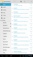

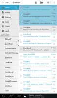
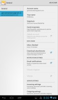
The generic email client doubles a lot of the functionality of the Gmail app but has combined inbox
Hangouts, the ex-GTalk client, handles the Instant Messaging department. The new app is a massive update over the old GTalk and offers group video chats, emojis, photo exchange, history sync across multiple devices, and completely new UI design. It's available on iOS as well.
The Huawei keyboard is quite comfortable to type on. You can switch to the default Android keyboard if you prefer, but Huawei's is bigger, making it easier to type.

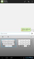
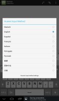
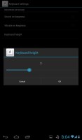
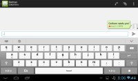
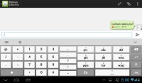
You can configure keys' height on the Huawei keyboard
The Huawei keyboard has a few very useful options. First, you can change the keys' height - there are four different settings available and you can make the keys really big.
Finally, if you swipe left or right on the keyboard you'll access the old-fashioned keypad.
Sadly, Huawei hasn't included handwriting support for its keyboard on the MediaPad 7 Vogue. However, there are plenty of third-party alternatives on the Play Store that will give you such functionality.
Reader comments
- jef
- 24 Oct 2013
- 0ZE
I bought the table MediaPad 7 Voguet, but I can not run on the TV using the Link Micro USB to convert HDMI Is the device supports MHl?
- Sam.. Ng
- 16 Sep 2013
- thu
Good tablet and good price...
- henrymakoi
- 11 Sep 2013
- thi
Why can't manufacturers create tablets with thinner bezels
