Huawei P10 Plus review: Eyes wide open
Eyes wide open
EMUI 5.1
As expected, the Huawei P10 pair runs on the company's own EMUI ROM. It is now up to version 5.1, groomed to accompany the new lineup. The OS is not only based on Android 7 Nougat, but has also been refreshed in a number of ways. Design-wise, there is a clear stylistic progression from the previous generations of the skin. There are now different colors and themes crafted from the ground up by Huawei's design team.
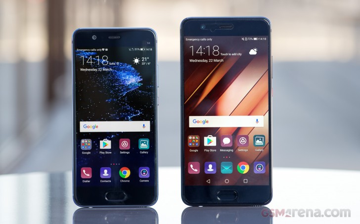
Most of the Emotion UI 5.1 upgrades reside under the hood and offer boosts in various performance aspects. There are some relatively simple things, like improved mis-touch detection, better dictation algorithms, and Moments, for more convenient photo organizing. There are a few major new background systems put in place.
Ultra Memory is a new algorithm with a focus on recycling and freeing RAM faster. It learns from your app habits and speeds up app launching/resuming by keeping what you consider important in the RAM.
Ultra Response, on the other hand, allows for faster touch response, thanks to a new driver. It works towards lowering touch latency and support for predictive finger tracking. According to Huawei, their screens are now as fast and accurate as the iPhone's.
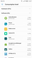
Huawei also talks a big talk about advanced machine learning, designed to catalog and predict your behavior and allocate CPU, GPU and I/O resources to the apps you use accordingly, making them more responsive. This is closely tied to SmartPower 5.0 - the latest installment of Huawei's intelligent power management platform. It promises up to 7% improvements in battery efficiency or as much as 3 hours of extra battery life.
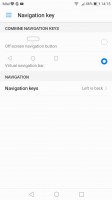
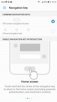
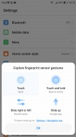
Circling back to something a bit more tangible, the new Home key single navigation scheme also comes courtesy of EMUI 5.1. You can get rid of the touch-sensitive Back and Tasks keys, and use the hardware Home key as a multifunctional tool instead. Once enabled - you tap for Back, hold for Home, or swipe for Tasks. There is also advanced gesture support on the key, where available, where you can assign some custom actions per gesture. It works pretty well and is easy to get used to.
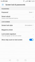
Back to UI then, the lockscreen is one of the elements being carried over from previous versions of the ROM. Still, it was already quite functional. The Magazine unlock style greets you with a different wallpaper every time you wake up the device, with new ones being downloaded when you connect to Wi-Fi and an option to delete the ones, which are older than three months.
The lockscreen itself is minimalistic at first glance, with just a large clock, the date, and a shortcut to the camera. You can also quickly start the camera by a double press of the Volume Down button with the option to take a snap right away, or just go to the app.
While still at the lockscreen, you can pull up an iOS-style menu from the bottom, where you get a ton of functionality. The top row lets you manage the wallpapers - you can remove, favorite, share, or pause on the current one. In addition to that, you get a row of handy shortcuts for basic apps - voice recorder, calculator, flashlight, timer, and QR code reader.
If you opt for a fingerprint unlock method, you probably won't be seeing much of the lockscreen anyway. Almost a shame, considering all the effort that Huawei has put into making it unique. Still, the reader is blazing fast and using it is a no-brainer.
On top of the multi and guest user support that comes standard with Android, you can also set up a so-called Private space, which you can access with a different fingerprint. The data accessible there is independently encrypted, Huawei says, and is inaccessible to the other users. Only one Private space can be set up per device.

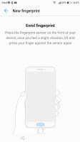


Fingerprint settings • enrolling a fingerprint • Twin app • A couple of Facebook accounts • Slightly odd prompt
In addition to that, you also get App twins for multiple instances of a single application. Sadly, in its current state the feature only works with Facebook and WhatsApp.
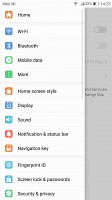
But, we got a little sidetracked again. That's just the thing with EMUI 5.1. It is so jam-packed with features left and right that you can't look at a screen without stumbling onto at least a few things worth mentioning. Still, despite all the customization freedom and the powerful feature bundle, on the surface the ROM manages to maintain a clean and usable UX.
Beyond the lockscreen, we're treated to a pleasant surprise - on top of the usual all-apps-on-the-homescreens approach Huawei now gives you the option to pick the standard Android two-tiered interface with homescreens for your most-used apps and an app drawer for all of them. Kudos to Huawei for letting the user choose.

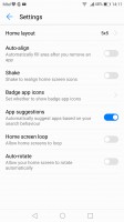
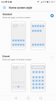

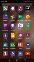
No app drawer by default • Layout settings • but you can opt for one • app drawer shortcut • app drawer
There are a few other interesting homescreen and general layout tweaks to check out as well. The app drawer, if you opt for it, is a vertically scrollable list of all your apps, 4 in a row, with a search field on top.
And if that wasn't enough customization already, EMUI 5.1 has Theme support. As previously mentioned, Huawei's design team put a lot of effort into re-imagining various shapes and colors in the UI. The theme store offers a wide selection and some really artsy options that fit in well with the general high-design image of the P10 Plus. Of course, you can always keep things simple and only customize the wallpaper and possibly transition animations.

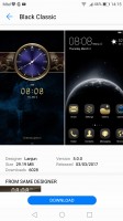
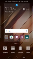
Powerful Theme engine • The Theme store has some good options • General UI tweaks
The notification area is a 50/50 mix between stock Nougat and Emotion. Huawei has tweaked the look of the quick toggles and added the auto-brightness switch, which Google so stubbornly refuses to keep in plain sight. The notifications themselves look just like the Pixel's.
The task switcher is rather straightforward, but again with added functionality over Google's own - apps in the rolodex can be locked by tapping on the padlock icon, so killing all apps will spare the locked ones. The kill all button is readily available too, not up in the right corner as Google does it.
There are a few other interesting tweaks you can apply to the status bar. For example, notification icons can be replaced by a simple numerical counter. You also have control over whether the notification LED and display should react to a new notification.

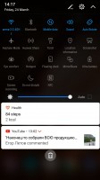
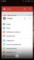
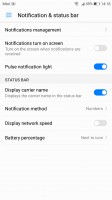
Notification shade, step 1 • step 2 with more toggles • task switcher • Status bar tweaks
The P10 Plus features granular notifications control - Huawei had that even before it was a part of vanilla Android. You can control which apps can send you the three types of available notifications - the shade notifications, the lockscreen notifications and the banner style notifications.
This level of control is also employed when it comes to the app access to network data and permissions. The user can control the rights of each application to access either WiFi or mobile data. This can save a lot of traffic and help you optimize your data plan and consumption in an easy and convenient way. You can also rest assured that there is no unregulated access to your personal data or phone sensors.
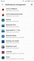
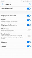
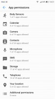
Notification management • Notification permissions • App permissions
But Huawei have even managed to go one step beyond that. EMUI 5.1 implements a really approachable way for managing what it calls App links. In other words, URL associations with certain apps. The same goes for default file type associations. Last, but not least, there is a dedicated menu for controlling really crucial permission on a per-app basis. It's a great addition, since you definitely don't want a random app ignoring the system's attempts to optimize its power consumption, or drawing over other applications.
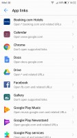
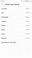
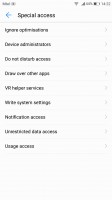
App links • Default apps • Special access permissions
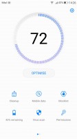
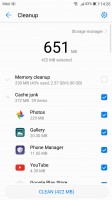
While these are options accessible from the settings menu, most of them are also featured inside the Phone Manager app. In there you'll also find a one-touch optimization button (which may make you feel better, but we see no reason not to let Android do it for you). A virus scanner powered by Avast is on board as well.
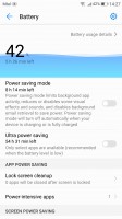
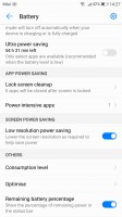
Two battery saving modes are available from the Power manager. There's Power saving, which imposes some minor limitations on hardware and software, and then there's Ultra power saving, which condenses your entire phone's functions to a single black homescreen with six shortcuts. You can customize those shortcuts, and you can pick from any app on the phone, so this mode is more of a psychological constraint to prevent you from using many apps simultaneously than anything else.
By Huawei's estimates, that should triple your battery life, so apparently, there's more going on under the hood. Ah, there's no task switcher in this mode, you only get one app at a time, though judging by the loading times, they have to be in the RAM. Screenshots are disabled.
A large portion of Huawei's optimization efforts seem to have gone into usability and navigation, and it shows. Throughout the interface, you get contextual menus with relevant options right at the bottom of the screen above the navigation bar - hugely convenient for single-handed operation. The universal drawer that pulls out from the left side of Google apps is a lot better suited for left-hand use than right-hand, and even for lefties some of the higher-placed options are still too far away.
You can also enable the so-called Floating dock - it's a virtual key you can move anywhere on the screen, allowing you to expand it to the primary Android keys - Back, Home, Task Switcher, Lock and Close all running apps. It will help you control your phone with just one hand. There are other interesting alternative controls as well, like the ability to map the buttons on your headphones to various actions.
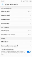
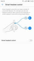

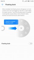
Smart assistance • Smart headset control • One-handed UI • Floating dock
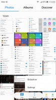
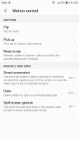
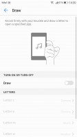
Motion control also plays a significant role on the Huawei P10 Plus as it did on previous Huawei models. There are flip gestures, as well as picking up, tilting and even things like knuckle detection and drawing. All of those are extensively customizable to your liking.
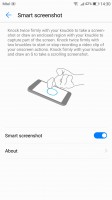
You can start recording a video of your interaction with the UI by the intuitive double knock with two knuckles while drawing an S with a single knuckle launches the scrolling screenshot. The latter is available from the regular Power/Volume down shortcut.
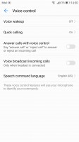
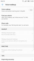
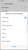
Voice commands are constantly getting better as well. Talking to your phone is still pretty weird around other people, but otherwise, you could potentially operate the P10 Plus entirely hands-free. The functionality boils down to the ability to trigger a voice command even when the phone is locked and its screen is off.
Huawei does this by always listening for a "trigger word", which by default is... "Okay, Emy." Once triggered, the phone wakes up and awaits for further voice instructions, like placing a call. Speech awareness is also customizable. The wake-up phrase can be changed, and you can also train the device to recognize your voice better.
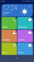
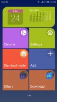
For certain scenarios, like in-car use, you can enable a Simple homescreen mode, which features large tiles for easy tapping. It's not particularly consistent, though, offering a simpler version of some menus, but not others - the dialer is the same size as in regular mode (in all fairness, it's fairly oversized to begin with).
Reader comments
- Apolit
- 18 Feb 2024
- piR
Almost same here, i have the same problem unfortunately. I have been using my device for about 7 years and i never thought to change it coze it is a great phone. I went to the local service center for the sudden restart problem. they told me that its...
- Kamya Moses
- 14 Jan 2024
- fuf
My Huawei p10 plus suddenly blacks out and then reboots, then blacks out again and then reboots even when the battery is at 50 - 40%. Why is this the case?
- Germanjuice
- 23 May 2020
- r3H
Hello guyz,am using Huawei 6x for uber as a driver,it works very well fast in Google map no signal lost for once and has fast charging 3gb ram/32gb but now the Ram is getting full and disturbing Google map. What kind of Huawei good in Google map like...
