Huawei P20 Pro review
Design and 360-degree spin
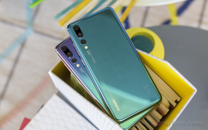
It's quite the stunner, the Huawei P20 Pro. It may not have 'dazzling' in the official color scheme names like the last generation, but dazzling it sure is.
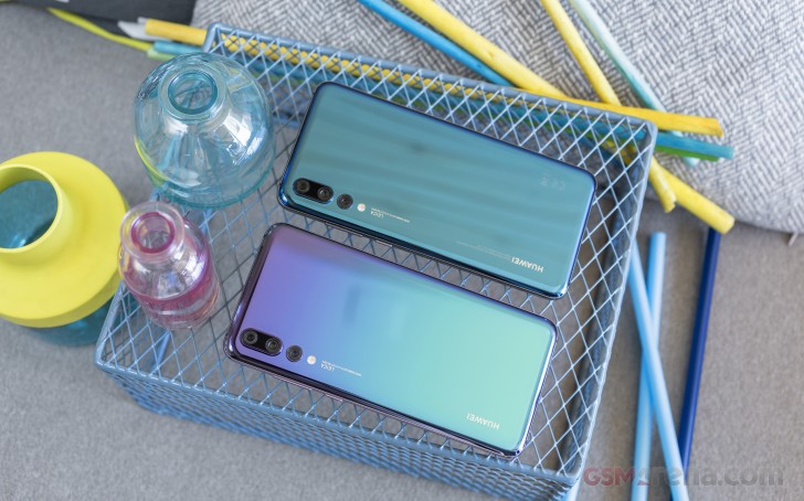
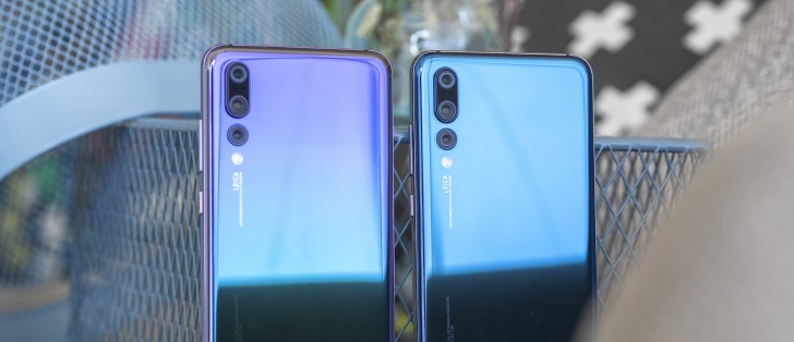
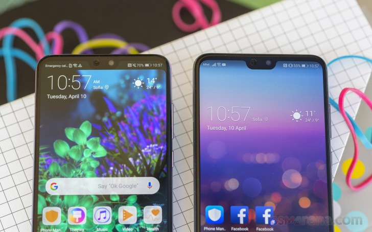
Huawei embraced glass with the latest Mates, and the company has chosen to stick with it for the P20 Pro. The smartphone will be available in a choice of four colors and here's a side-by-side shot of the two you're likely to crave.
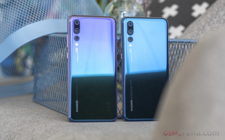
Midnight Blue is the plain one (right) if you can even call the shiny attention grabber that, while the even more striking dual-tone version (left) goes by Twilight. The other two options are the mandatory Black and Pink Gold.
Both paint jobs are in essence mirrors shifting reality into bluer tints depending on what's reflected off of them, so you rarely get the same color twice. The downside is that the moment you lay your fingers on the phone's back, it turns into a crime scene investigator's dream. The smudges are reasonably easy to wipe - it is glass, but it's only for a brief instant that the P20 Pro remains clean. But, boy, is it pretty during that instant.
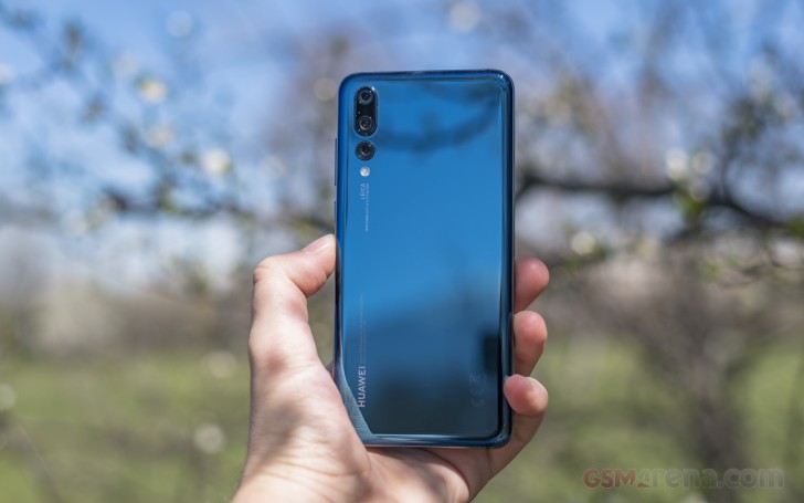
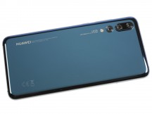
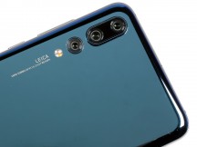
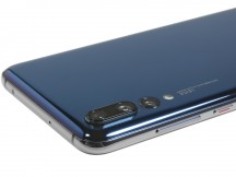
There's a lot going on on the back. First up, obviously, the three cameras. The primary 40MP unit has a huge (in smartphone terms) Type 1/1.7" sensor with stabilized f/1.8 optics. Then there's the smaller 8MP cam with a telephoto lens pushing 3x zoomed images.
Both these cameras take up physical space, so Huawei figured if they're making a camera bump, they'd best put them together. This dual-cam setup sticks out quite a bit, but at least you know why. Oh, and there's a laser transmitter and receiver between the two lenses, so they don't have to have their own, separate windows somewhere (like they do on the P20 non-Pro).
Under the meaty 40MP module, the humbler 20MP monochrome camera rests, its front element barely protruding from the glass back. Further down there's the dual-tone flash and a light temperature sensor.
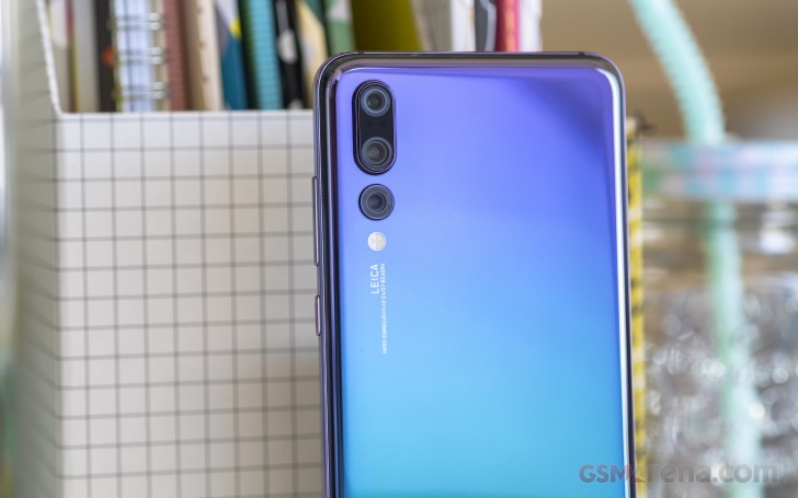
There's quite a lot of text on the P20 Pro's back - a bit too much, actually. The Leica badge next to the flash, complete with lens names and specs, the Huawei name in bold capital lettering alongside some finer text, and then the regulatory markings on the other side - when is enough enough?
Let's find salvation from text on the front - there's mostly display here, so no room for letters. No room for much of anything actually, so Huawei's gone for a notch. The 6.1-inch AMOLED display has got a cutout at the top to house the usual top-bezel stuff - earpiece, selfie cam, ambient light and proximity sensors, and even a tiny status LED.
The fact that what's left of the top bezel is thicker than the side bezels irks some people and we can see where the sentiment is coming from - the iPhone X's bezels are the same all around. The thing is though, you can enable a virtual top bezel of sorts which ends up symmetrical with the physical bottom one, but with the added benefit of having information in the display parts on top. Sort of like the definition of having the cake and eating it.
There's a proper chin below the display to house the fingerprint sensor - the Mate RS Porsche Design might have an under-display reader, but let's not forget it's more than twice as expensive as the P20 Pro. The sensor is always-on, super-fast to unlock, and can also substitute the on-screen navigation bar by using gestures.
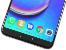
In the hand • Top bezel • Home key/fingerprint sensor on the bottom
The polished aluminum frame of the P20 Pro is home to the power button and the volume rocker on the right side. The power button has an indentation that is painted red - the P10 and P10 Plus had a red accent too, only around the button.
On the opposite side of the frame you'll find the card tray. Or, to be precise, the SIM card tray - there's no microSD slot for storage expansion on the P20 Pro. You do get 2 nano-SIM bays, though. The tray also has a gasket to help with the dust and water protection - you don't want stuff coming in through the card slot and compromising that IP67-rated weather sealing.
The USB-C port is on the bottom of the phone, the primary speaker to its right. On the other side, behind the near-most hole, is the primary mic. Nope, no 3.5mm jack around here, and there isn't one on top either - just a secondary mic and an IR emitter (yay! for the latter).
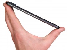
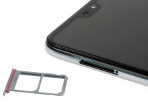
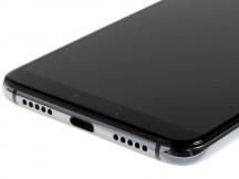
Power button in red • A couple of nano SIMs, no microSD • USB-C port, primary speaker.
The P20 Pro measures 155 x 73.9 x 7.8mm, which is 3mm shorter than the Galaxy S9+, 0.1mm narrower and 0.7mm thinner. The 6-inch Mi Mix 2s is a mil wider and 0.3mm thicker than the Pro, but some 4mm shorter. The iPhone X is noticeably more compact with its 143.6 x 70.9mm footprint and it's also 0.1mm slimmer.
Apple's Ten is lighter than Huawei Twenty Pro, but the 6-gram difference isn't all that much. Meanwhile, both the Galaxy S9+ and the Mi Mix 2s are heavier than the P20 Pro, by about 10g.
The P20 Pro is just too good-looking to not bring it up once more, just like that, with no connection to the narrative whatsoever.

All that superficial appeal checks at the door of our lab, where numbers rule. Display, battery, sound - it's all on the next page.
Reader comments
- Anonymous
- 27 Dec 2023
- gDf
"It would be entirely wrong, however, to judge the 40MP images, as they weren't meant to be used that way. For a more technical perspective you can check out our article on the topic, but let's just say that the entire point of the 40M...
- Anonymous
- 27 Dec 2023
- gDf
No, it doesn't.
- I-troll
- 15 Mar 2023
- t@T
Seems a bit pointless arguing over a 5 year old phone. In any case, the OIS is disabled because the massive issues involved in combining images from 4 lenses was not feasible.
