Huawei P30 Pro long-term review

Software
The P30 Pro we have runs Android 9 Pie with EMUI 9.1 on top, and boy oh boy has Huawei's skin grown up in recent years. Don't get us wrong, it still looks quite different from anything resembling 'stock' Android, and it still has quite a bunch of small idiosyncrasies, but overall it's really not a pain to use anymore.
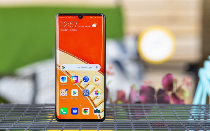
On the contrary, dare we say it - EMUI is now one of the best Android skins out there, if you can look past a few things. Obviously number one on that list is the fact that its design language is far removed from anything else on the market. Then there are oddities, such as the font size in Settings, which is smaller than we're used to. Or the network icons being on the left of the status bar, with the clock and battery on the right. These are all things you can get used to rather quickly, but they may have you head-scratching at first.


Home screen, app drawer, Quick Settings
The Quick Settings icons have a design language that's... well, unique, and not necessarily in a good way. It's great to see the built-in launcher have the option for an app drawer, but you can't swipe up on a home screen to bring that up - which is something that's now a part of most Android skins out there. Thankfully though, the Quick Settings icons are getting a huge revamp in the next version of EMUI, that will make them look very much like Google's. And you'll also have the swipe up gesture to open the app drawer when EMUI 10 based on Android 10 arrives for the P30 Pro in November. So, even if these things might turn you off, it won't be long before they're 'fixed'.
Speaking of the launcher, Huawei is one of only a few companies that show you the Google Feed to the left of the leftmost home screen. We're pleased that it didn't choose to reinvent the wheel here, as others - OnePlus and Xiaomi come to mind. You may find the OnePlus Shelf or the Xiaomi App Vault more useful than we have, but overall just putting the Google Feed there is more consistent with what the search giant itself has been doing.
There's also no swipe down gesture on a home screen to reveal the notification pane, instead if you perform this gesture you get a search interface that lets you quickly find apps and contacts. Again, this idea might have its fans, but for us, it would have been much more useful if Huawei went with the prevailing trend, which is using that gesture to invoke the notification panel, no matter where the swipe originates on the home screen. In our experience, this small detail makes tall phones like the P30 Pro more of a joy to use, because let's face it - we all pull down the notification shade many, many times each day.
Dark Theme
Like some other companies, Huawei moved faster than Google to add a Dark Theme to its UI, although it is housed in the Battery section of Settings, which makes some logical sense - as it's supposed to help with endurance on phones with OLED screens - but could be confusing as we're used to having such options in the Display section. Anyway, it's there, and it works, turning the UI dark as you'd expect. There are some dark gray elements, but mostly it's a pure black theme.

Dark theme option is in Battery settings
It can't control the behavior of third party apps though, including Google's, which means you'll most benefit from the darkening of the system UI and not much else. This should also change in the next version of EMUI, provided that Huawei doesn't mess with how Google envisioned the new Dark Theme to function in Android 10. That's not a given, but here's hoping.
Gesture navigation
It's a 2019 phone, so of course it has gesture navigation built-in. Huawei's system works very well and doesn't require any weird compromises in how you access the slide-out navigation drawers in apps that have those, unlike Google's latest system. On the P30 Pro, you can pick between gestures and the three-button navigation bar, and that's it. Huawei didn't include Google's previous gestures, that debuted in Android 9 Pie like some other companies have done, and we think this is for the best. That system doesn't have the main benefit of gesture navigation, namely freeing up screen real estate, so we're not sure why it exists in the first place.
The gestures on the P30 Pro are intuitive to perform, and they're very smooth, with no stutters or lags no matter which you employ. Like most other such systems, you swipe from the bottom to go Home and pause if you want the app switcher. Going Back is accomplished with an inward swipe from either the left or right side, but only the bottom 75% of those sides. The top 25% is reserved for in-app gestures, like the aforementioned slide-out drawers. This takes a day to get used to, tops, and then it just works with no confusion whatsoever.
If you're wondering how you might quickly invoke Google Assistant while using this system, the answer is swiping up from the bottom left or right corner. And you can also enable a setting that will activate it if you press the power button for one second (in this case the power menu comes up after 3 seconds).

Google Assistant invoked by pressing power button
A specific gesture for quickly switching back to the previously used app isn't available, but, when you swipe up and pause to get the Recents menu, the previous app comes into focus. This is still slower than if you had a dedicated swiping motion (like in OxygenOS), as you need to swipe and then tap, but it's good enough. And what really helps is that there's zero jankiness when the previous app is brought into focus in the Recents menu - which is something we were frustrated with in Samsung's One UI on the Galaxy S10+.
Settings
The Settings menu is big and comprehensive, but at least you don't get multiple tabs. Things are spread through various top-level categories, and while you can easily waste a couple of hours going through every option, it's also possible to leave most things be, as they are as defaults.
Perhaps the main exception to this has to do with the (in)famous aggressive killing of background tasks, which EMUI is still guilty of, even in the 9.1 iteration. Thankfully though, it's less obnoxious than before, and it's easier to manually allow apps to do whatever they want in the background, including auto-start. You may not actually need to give such lenience to most, if not all, the apps you have on your phone though. And rest assured that there seems to be some kind of secret whitelist at work, because we had zero issues getting notifications from all of the main messenger and email apps and the likes. Basically the only app we had to manually tell EMUI to leave alone was Garmin Connect, which is what you use if you have one of that company's smartwatches. Otherwise, the default settings (with the assorted secret whitelist) were fine.
Philosophically we may be opposed to the entire concept of manufacturers selling phones with huge amounts of RAM, only to then not actually allow those amounts to be fully utilized, but if we're realistic, such an aggressive background task killing system can work well enough, provided there's a decent whitelist - so that you don't have to dig into Settings to allow messages from WhatsApp or Facebook Messenger to come in. And you get the added benefit that, if you have installed some less than amazingly coded apps, those won't be able to run amok and eat your battery. Finally, we had no issues with notification delivery - as in, these have not arrived with delays on the P30 Pro compared to other phones. That's not something one usually thinks about, but after some perplexing past experiences we decided we had to check.
Bugs
We've encountered a very small number of bugs in our use of the P30 Pro. Some of these may turn out to be quite off-putting for you, which is why we're quickly listing them here. First off, and most concerningly, the long-standing brightness reduction bug that we've encountered in past versions of EMUI many moons ago is unfortunately still present, which makes us wonder whether this is supposed to be a feature of some sort - though we can't ascertain what the point would be.
Here's what we mean. In specific apps, the worst offenders being browsers including Chrome, the brightness level is slightly lower than everywhere else. This is most obvious when you click a link in, say, Facebook, which takes you to Chrome. Depending on the ambient light values around you, this may or may not be noticeable, but we've reproduced the behavior every single time. Note that this happens without any change in ambient lighting of course, and when you go back to another app that doesn't suffer from this the brightness will instantly go back up by a bit. It's a baffling bug, this, as is the fact that it's survived for so long, and you will see it a lot. That is, if you're as sensitive to slight brightness changes as we are. If not, then this obviously won't bother you.

Next up, there's the behavior of stacked notifications. Say that, over time, you get a bunch of new email notifications without acting on them. These get 'stacked' as one notification, and in 'stock' Android if you want to 'unstack' them and see each individual notification you simply swipe down, whereas if you tap on the stacked items then you'll be taken to Gmail inside the conversation list. In EMUI 9.1, however, tapping only 'unstacks' the items and doesn't take you to the app. This will not affect you in any way if you aren't used to the way Android has been doing things in this regard in recent years, otherwise you might get mildly frustrated as we did, expecting one behavior because of muscle memory and getting something else instead.
Speaking of notifications, and this is unfortunately not unique to EMUI, if you have a bunch of them piled up, then unlock the phone without acting on them, after the display re-locks you will not see those notifications on the lock screen ever again (nor the corresponding icons on the Always On Display), even if they're still waiting for you in the notification area once you unlock again.
Finally, a very weird bug likes to randomly turn the combined ringtone/notification sound volume all the way down, to a point where sounds are barely audible. This has occurred across three different EMUI 9.1 versions, and it's still present in the latest update we got on our review device.
Reader comments
- Nolan
- 04 Apr 2025
- YUU
Hello guys can tell me your point of view bout this phone. I wanna to but this next something.. i need to know your point of view
- Anonymous
- 10 Jan 2024
- 0w7
Yes
- Anonymous
- 30 Jun 2023
- fXs
Does it have a finger print


