iPhone 6s vs. Galaxy S6 vs. Xperia Z5: Monster Brawl
Monster Brawl
Software
Android and iOS are pretty even on basic features, but Samsung and Sony have tweaked vanilla Android to give their flagships standout features. Apple's innovation in UI design has slowed down, but its commitment to a polished experience hasn't wavered.
Anyway, we won't go into details here, we'll just compare the standout software features of three phones.
Interface
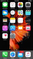
iOS is struck with the Jony Ive-approved look. While the Apple mobile OS has opened up to widgets, it still dumps all apps into a single drawer and offers only folders as the way to bring order to the whole thing.
Android is much more open in this regard, there are even widget kits that allow users to create a unique look (and share it with others if they feel like it).
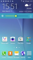
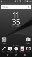
Both the Galaxy S6 and the Xperia Z5 support custom themes, which allow you to customize the look and feel of the OS more extensively than just changing the wallpaper. Themes can change even third-party apps for a more consistent experience.
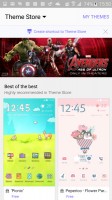
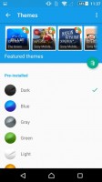
Themes on the Galaxy S6 and Xperia Z5
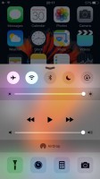
For notifications and toggles, Android lumps them together in the notification shade on top, while iOS splits them into two shades. This doesn't mean the iOS notification shade is less busy, it has to house widgets.
Customization is again on the side of Google's OS, letting you chose which toggles are available.
3D Touch
3D Touch has no analog on either the Xperia Z5 or the Galaxy S6, but it's important enough to merit its own section. Currently it only works with some system apps, but it will be adopted by third-party apps too.
Pressing on an app's shortcut harder than usual takes you to a half-open state - a small window pops up with just a few key features. This allows you to do the majority of interaction without opening the app. For example, you can create a new contact or call someone you talked to recently, all without digging through the Phone app.
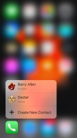
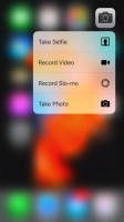
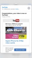
3D Touch brings out additional info and controls
Samsung had something sort of similar with Air View - getting additional info by hovering over things, say viewing photos in a folder or additional details for a calendar appointment. This was dropped in recent Galaxys though, leaving only the S Pen features on the Notes.
Security
All three phones feature a fingerprint sensor for secure unlocking. They are seamless and fast, but Android has a way to relax the security in safe conditions. Smart Lock can disable the fingerprint lock when the phone is connected to a trusted network (e.g. your home Wi-Fi) or a trusted Bluetooth device (e.g. your smartwatch).
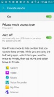
Samsung takes things a bit further. Private mode is a special folder in the internal storage that is only unlocked with your fingerprint. This is a safe area to keep sensitive documents from work or private photos (so people can't just swipe through your gallery, even if you give them your Galaxy S6).
iOS has encrypted its storage for years now, while Android is yet to make the jump. It will be mandatory with Android 6.0 Marshmallow, but on Lollipop it is optional and turned off by default on phones like the Galaxy S6 and Xperia Z5.
Multitasking
Apple has been timid in adopting multitasking features, while Samsung has often been at the forefront. The Samsung Galaxy S6 is the most flexible device yet in this regard, rivaling even Windows 10 in this regard (at least as far as Modern UI apps are concerned).
You can have two apps share the screen with easy interaction between them, like copy/pasting text or dragging an image from one to the other. As an alternative, you can move apps into floating windows that you can resize and move freely.
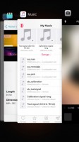

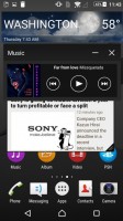
iOS app switcher • Multi Window on TouchWiz • Small apps on Xperia UI
Sony Xperia Z5's take on things is more similar to the latter - small, floating apps to augment the main app that covers the whole screen below. Of course, only supported apps can pull this off. Samsung has more in its stable, but Sony lets you turn widgets into small apps to make up the numbers.
The Apple iPhone 6s meanwhile allows only one app on the screen at any time. The iPads can split the screen, but Apple still doesn't feel that even the 5.5" iPhone 6s Plus is ready for this.
Search and digital assistants
Spotlight on the iPhone 6s mirrors the Mac OS experience with advanced search functionality. It can find files obviously, but it's a general-purpose search tool - it will show relevant contacts, Wikipedia articles, IMDb pages, look through news sources and through Apple's digital stores.
The Androids have Google Now for such tasks. It's geared more towards searching the web and surfacing results with as few taps as possible, but third-party apps can provide search results. Local results from the phone aren't always as good as what Spotlight can turn up, but search is a great way to interact with apps you've installed.
Google Now is also the default digital assistant. Yes, the Galaxy S6 also has S Voice, but you have to launch it from the app drawer. Anyway, Now is intended to show the info you need even before you ask for it. When you do ask, Google's knowledge engine kicks in and brings summarized info found on the web. Now will also execute voice commands.
Google Now on Tap is coming to improve the basic experience by making querying easier. The new feature just looks at what's currently on the screen (e.g. a news article in the browser) and offers handy shortcuts to discover more. Eventually it will do more, like pop up buttons to reserve a table if you're checking out a restaurant.
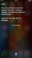
Siri can look for answers too, but its strength lies in doing rather than knowing. You can converse with it, asking it to toggle settings, send messages and yes, even book a restaurant.
Working with computers
Apple and Microsoft are coming up with new ways to smooth out the transition between mobiles and desktops, but Google is surprisingly lagging behind. Samsung had to come up with its own solution, Sony doesn't have one.
Apple's Continuity syncs what you're doing between apps on the phone and your Mac. Typing an SMS on the iPhone 6s? You can finish it on the MacBook. Reading a web page on the laptop, but have to head out? Safari will remember how far you read, letting you continue on the phone. This works with Mail, Pages, Numbers, Keynote and Maps.
Samsung's SideSync is similar as much as it is different. It handles the transition by showing a virtual copy of your Galaxy S6 on your computer's screen. You just continue using the app on the phone - except now with a handy keyboard and mouse - and even copy/paste text and files between devices.
Winner: Samsung Galaxy S6. It allows extensive customizations with themes and the most advanced multitasking options. It also has good interaction with computers and added security with Private mode.
Runner-up: Apple iPhone 6s. You don't get to decorate, but 3D Touch is an innovative feature, while the rest of iOS already offers a solid base. Continuity is a more elegant solution than SideSync, but multitasking can use more love.
Sony are behind Android's recent adoption of themes, but other than that Sony doesn't go a long way to provide features Google will not. This allows for quicker software updates for the Xperia Z5, but it's behind on attention-grabbing features.
Reader comments
- BIG DESTINY
- 01 Oct 2023
- 84G
in what way pls explain
- Kidmoney
- 04 Sep 2023
- xjH
I just love d buit in iphone 6s is strong and better camera than the samsung s6
- Olubaba
- 16 Jul 2022
- XBA
I’ve been using iPhone since 2014 and I’ve no regret using it . I bought S6 sometimes ago and sold it back because †ђξ screen replacement it on †ђξ high side compare to iPhone . S6 Ȋ̝̊̅ڪ great when it come to camera and speed . And iPhone 6S is goo...
