Apple iPhone 6s Plus vs. Samsung Galaxy S6 edge+: Double positive
Double positive
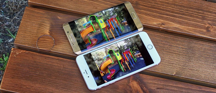
3D Touch vs Edge screen
3D Touch
The support for 3D Touch on the Apple iPhone 6s Plus allows for another level of interaction, press the screen for a bit longer (and harder). This gets you access to extra actions and contextual options and we can't wait to see how say, game developers put that to use in the months to come.
Currently 3D Touch gestures are available only on selected system app. You can use it on the lockscreen, the homescreen and within apps. We already talked about the lockscreen gimmick, let's see what it does on the homescreen.
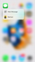
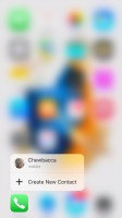
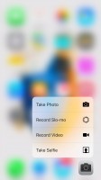
Force pressing on a supported app icon pops up a balloon. For example the Messages app gives you a New Message shortcut and a short list of your most recent messaging contacts. Force clicking on the Phone app gives you a - Create New Contact key and a short list of recently contacted people.
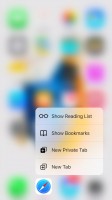
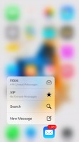
Continuing on Safari - you get Show Reading List, Bookmark list, New Private tab and New tab; Mail offers shortcuts to Inbox, VIP, New message and Search; Music has Play Beats; and Notes - New Note, New Sketch and New Photo note.
As you can see those force taps on the homescreen are indeed useful sometimes, but are hardly something you can't live without. What really matters is what you can do within the apps with 3D Touch.
3D Touch is meant to allow you to get more content than you normally get on a screen, so that you can give it a quick glance and let it go - all of this with just one firm long press.
If you press hard on an email within the Mail app, first it will be selected by blurring all the others. Applying slightly more force will pop its contents into a balloon for you to see it. Here you can either apply more force to open the whole email, or release your finger thus you'll be back on the email list.
This logic of opening content in balloons and eventually discarding or expanding it works on quite a few apps such as Photos, Messages, Notes, Calendar (events). It works in Safari as well - just hit a link firmly and you get a pop up with the linked page and if you like what you see you can press harder to open it, or just release it for discarding.




Pressing on: an email • a contact • a day in the Calendar • a photo • a link
Finally, one of the most meaningful uses of the Force Touch is selecting text. If you do a standard tap and hold on text you'll begin scrolling through the words. And when you apply force to activate the Force Touch, you begin text selection from this very moment. This eases the entire text selection process tremendously - just scroll to your desired place and force touch from there and continue scrolling until you're done.
That's basically all of it at the moment - it's not much and certainly most of the functionality feels, if you pardon the pun, forced rather than intuitive and helpful. However, we get the feeling that Apple is simply trying to give hints to developers with those. Those are just ideas with the hope that developers will actually pick it up and will put the feature to great use in their apps.
Given the chance, 3D Touch may turn to be a breakthrough that will shape smartphone usage for years to come. Similar to what Apple did with multi-touch or the fingerprint sensor.
Edge screen
Just like its more compact relative, Samsung Galaxy S6 edge+ offers the cool Edge screen functionality. One of the highlight modes is the so-called Night clock. It shows the time and date on one of the edge strips during the night (or for any interval of the day you choose, but up to 12 hours). You don't need to do anything to wake this strip up - it's always on.
The edge strip, no matter if the Night clock is active or not, can be awaken with a short swipe and then swipe down gesture and it will light up brightly. If Information Stream is active, you can scroll between the different info strips.
People edge, another proprietary feature, is really cool as well - when you have missed notifications from one of your favorite contacts, you will get a tab of their respective color on the side of the edge. You just need to drag it to the left to see what it's about.
Another swipe from the people edge screen brings a row of customizable app shortcuts. The feature premiers on the Samsung Galaxy S6 edge+ and offers cool, quick, and convenient way to access commonly used apps.


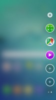
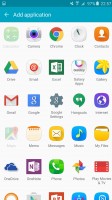
People edge • The customizable app shortcuts are quite convenient
You can choose the edge strip position - there is no scenario where you can use both edges for notifications. The exact area to swipe for access to the edge strip can also be tweaked on the large screen of the S6 edge+.
Edge lighting is activated by a notification from one of your favorite contacts, it will even light up in their specific color. You can even reject a call with a pre-defined message by placing a finger on the heart-rate sensor for 2 seconds. The phone must be lying on its screen for those features.
Winner: Apple iPhone 6s Plus. While Samsung has the cooler edged design, 3D Touch offers a lot more useful features and massive potential for evolution. We get the feeling that Apple is simply trying to give hints to developers with the examples in the iOS 9. Those are just ideas with the hope that developers will actually put the feature to great use in their apps.
What does add more fuel to the 3D Touch fire is that other manufacturers began announcing phones with similar tech shortly before Apple's event, so there will be more companies that want to see it succeed and in turn more developers willing to give it a proper consideration. We can't say the same for the edged display though, which looks more like a gimmick rather than a technology breakthrough.
Reader comments
- Mwesigwa Noah
- 31 Jan 2025
- XBp
For real to be sure and iPhone can't be compared to an Android phone iPhone using IOS ad Samsung using Android u can't compare the two Samsung remans behind the Mighty iPhone
- EllyKhan
- 14 Apr 2022
- fuZ
Yeah Samsung s6+ is more powerful u can't compare with I phone 6 Samsung all the way
- Anonymous
- 09 Feb 2022
- r3a
That's right!!
