Lenovo K6 Note review: Noteworthy
Noteworthy

Hardware
Lenovo's "K" series has a nice physical progression to boast through the generations. As already mentioned, some hardware segments tend to appear or disappear from model to model, but, at least from a purely dimensional standpoint, the devices have clearly been shrinking over the years. This is all done while maintaining the same 5.5-inch display size.
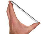
The Vibe K4 Note, measured 153.6 x 76.5 x 9.2 mm, which the K5 Note slimmed down a bit. Now the newest K6 Note, with its slick unibody, comes in at 151 x 76 x 8.4 mm - a tad slimmer than its predecessor. Moving to the scale, however, we see the K6 Note is noticeably heavier than its older sibling at 169 grams. The good news is that most of this seems to be due to the bigger 4,000 mAh battery. This is by no means an exceptional capacity for this form factor, but is still a nice improvement.
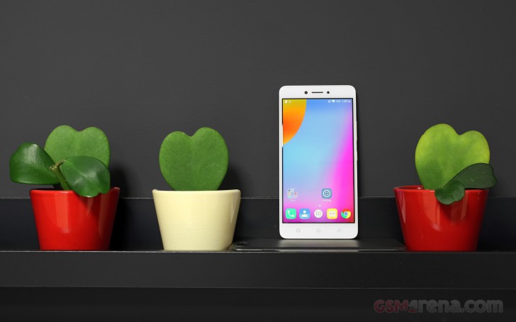
From a purely aesthetic standpoint, the K6 Note ticks a lot of boxes. Its metal finish looks and feels nice. Lenovo could have, perhaps, done a little better in color-matching the top and bottom plastic parts on the back to the metal in the middle. However, that is only noticeable under good light and quite-frankly, it's nitpicking on a budget device.
Truth be told, we can live with the color shades perfectly fine, but the slippery nature of the handset is a whole other story. Lenovo has went for very smooth and rounded lines, which look great, but provide little grip. Perhaps some chamfering would have been a good idea. We often found ourselves struggling to get a proper grip, which is worth noting.
Taking a quick tour around the handset, we see a lot of things have changed in the K-mix, as we mentioned earlier. Some long-time fans might miss this or that, but, overall, there seems to be an upward progression in design.
The plastic look, for one, is now long gone, with a second iteration going for metal. It makes up the better part of the back. The remaining top and bottom parts are still plastic and necessary to accommodate a good signal for the various internal radios. The grooves separating the two materials are now wider and a bit rounder and more pronounced than on the K5 Note. This is definitely in tune with the similar detailing used by other manufacturers and it does give the K6 Note a modern look.
The shiny silver accents in the grooves also nicely match the rings around the camera and the back-facing fingerprint reader.
The fingerprint reader is snappy and very accurate. We had no problem with it and are also happy to report it is always on so touching it can wake the phone from standby.
Our OCD is a bit less happy about the selfie camera and ambient light and proximity sensor on the front of the device. They differ in size, but then again, appear quite evenly spaced, flanking the earpiece on either side. We are happy to report, there is a notification LED on the far right.
The rest of the front is very clean. Just like with the K5 Note. Lenovo hasn't officially mentioned any Gorilla Glass or similar protection for the panel. There is just a slight 2.5D effect at the edges of the glass - nothing fancy, but potentially, just enough to make edge-to-edge tempered glass screen protectors a no-go.
Lenovo has also made sure to include capacitive touch buttons underneath the display, which Lenovo K Note fans have come to expect.
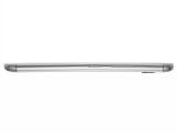
Moving on to the bezels, the left-hand side is mostly empty. It only houses the SIM card tray. In it, you can place two nano SIM cards or exchange one for a microSD. We hope the Moto design, featuring a dedicated SD cradle makes its way to Lenovo's main line as well, as it is an immensely better arrangement.
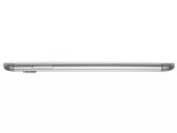
On the opposing side, you get the standard three-button layout. That includes the volume rocker and power button underneath. These could have been positioned a bit higher and we found them a bit inconvenient, but your mileage may vary, depending on preference and hand size.
The situation is also pretty standard on the top of the K6 Note. Here you have a 3.5mm audio jack and a little hole for the secondary noise-canceling microphone.
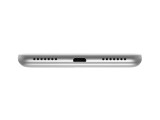
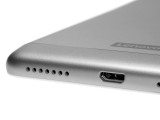
Symmetry is strong on the bottom side as well. Lenovo opted for the older USB 2.0 interface and standard USB Micro-B connector, to go along with it. There are two grills here as well. Only the left actually houses a speaker, while the right is, presumably, responsible for hiding the microphone.
We're not quite sure how the single speaker fits with Lenovo's premise of an enhanced multimedia experience, nor the Dolby tweaks included in the software. But, more on that later.
The Vibe K4 Note did have the benefit of a stereo setup. Sadly, that appears to be one thing Lenovo decided to sacrifice for something else in the K5 Note. The trend has carried over to the K6 Note. On a more positive note, at least the speaker is now mounted on the bottom, which is not ideal for multimedia, but is still better than rear mounting.
Reader comments
- Anonymous
- 22 Mar 2021
- akp
Install volume booster goodev
- Shav
- 26 Dec 2019
- U@$
Switch the Dolby atmos toggle to on. Select match volume/ level volume to "on" in the Dolby atmos application (preferably, in the custom mode). Your problem of loudness in headphones will be solved to some extent.
- Vishal
- 09 May 2019
- U@y
I have Lenovo k6 note. But this mobile volume is very low. So, please help me for increase volume.

