Lenovo Vibe K5 review: Base line
Base line

User interface
The Lenovo Vibe K5 runs on a heavily customized Android 5.1. It's named Vibe OS, but you won't find that advertised throughout the interface like other makers do. The overlay isn't too consistent, and there are hints of Material design here and there, mixed up with remnants of older concepts.

The lockscreen is a rather standard affair. The default layout consists of a clock widget with a date, followed by a list of notifications. You also get shortcuts for quick access to the dialer and camera.
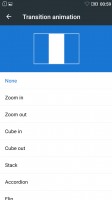
In typical fashion for a droid coming out of China, there's no app drawer - all your apps reside on the homescreens. New ones can be added with ease, existing ones can be rearranged and any homescreen tab can be set as default home. Screen transition effects can be selected, and you can choose whether to be able to cycle back to the first one after reaching the end or not.
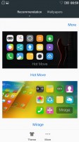
There's a wide selection of themes available too, complete with icon packs, and these can change the vibe of the Vibe K5 completely. Some of them look better than others with non-system icons - the more customized the theme, the more out of place Google Chrome looks, for example.
The capacitive keys below the display are Recent tasks/Home/Back, left to right. The recent tasks one doubles as a context menu button and that's a bit odd in truly Material design apps, which have the three-dot menu in the top right. Making things even less intuitive, the context menu and the three-dot menu often contain different options.
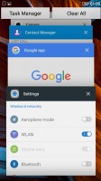
Thanks to the ambiguous nature of the left capacitive key, getting to the recent tasks requires a long press, instead of a tap. Naturally, that adds an extra bit of waiting to an action you'd be doing constantly. There's a "Clear all" button, in the diagonally opposite top right corner, so you'd be stretching your thumbs a bit.
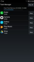
Additionally, there's a task manager that gives you more detailed information on what resources each app is using.
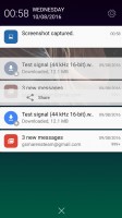
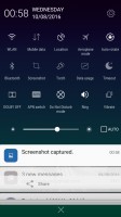
The notification shade works in two stages. Pull down once with one finger, and you get notifications only, pull down a second time and you get the entire list of quick toggles, with notifications squished below. There's no priority row of toggles that gets opened on the first pull, it's none or all.
Reader comments
- tubu
- 16 Jul 2022
- Dk5
I am using this since 2016 it's still working but 2to 3 days back its display was damaged now I changed the display it work properly it's a very good phone and gaming porfonance is very good
- Anonymous
- 12 Jun 2021
- Hkr
Still using since August 2016 Two k5
- androidfan10963
- 05 Apr 2020
- 7t$
Got this phone in June 2016 and still rocking it with an Android 10 custom ROM. There are a few mistakes in this review: All K5 and K5 Plus supports upto 128GB sd card, I have tested it myself with a samsung 128GB micro SDXC. The Adreno 405 used ...


