Lenovo Vibe X3 hands-on: First look
First look
Design
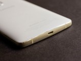
The design of the Vibe X3 will be no stranger to those who have seen the K4 Note. The two phones are pretty much cut from the same cloth, with minor visual differences, most notably the aluminum frame on the Vibe X3.
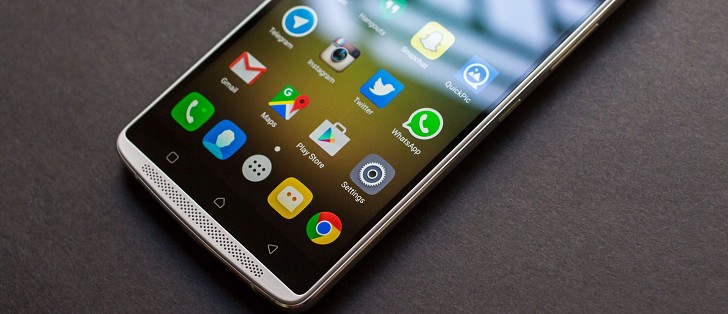
The front of the device has the stereo speakers at the top and the bottom, which are particularly noticeable on the white Vibe X3 due to the white color bezel. And white, by the way, is the only color option available.
Between the speakers is the Gorilla Glass 3 panel covering the display in the middle, the front-facing camera at the top, and the three capacitive buttons below. The buttons aren't backlit, which has become an increasingly common cost cutting measure among manufacturers. It's not a huge inconvenience but having the keys backlit takes out some of the guesswork when using the phone in the dark.
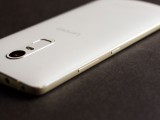
The aluminum frame runs all around the phone but on the right, it hosts the power and volume buttons. The buttons are sensibly placed, and the power button, in particular, falls well within easy reach.
On the opposite side is the SIM tray. The tray can hold either two nanoSIM cards or one SIM card and one microSD card. The hybrid slot is a fairly typical arrangement these days and makes the dual SIM claim somewhat disingenuous as there is no way to have two SIM cards if you also want to use a memory card. Vice-versa, a memory card is out of the question if you choose to use two SIM cards, forcing you to rely on the limited 32GB internal memory.
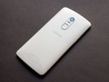
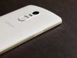
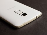
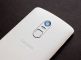
The back of the phone is a smooth matte plastic surface, with the camera surround being made out of metal and slightly sticking out. It also houses the two-tone LED flash, along with the fingerprint sensor.
Unlike the lightning quick fingerprint sensor on Vibe P1, the one on the Vibe X3 is decidedly older gen and takes a while to unlock the phone. The back panel is non-removable.
The metal frame and the sealed body gives the phone a very sturdy and well-put-together feel. The Vibe X3 feels considerably more premium than other phones in its price range, such as the Nexus 5X and the Moto X Play.
The Vibe X3 is on the bulky side, however, and is also quite large, meaning those who prefer a small and light phone will have to give this one a pass. The lack of any other color option is also perplexing.
Display
The Vibe X3 has a 5.5-inch 1920x1080 resolution IPS LCD, with a claimed 100% coverage of NTSC color gamut and 1500:1 contrast ratio. The display is big, bright, and beautiful. Colors look vivid and brightness is plenty indoors and outdoors, but if you need more there is a higher brightness mode that you can activate manually on particularly sunny days. You can also adjust the display color and temperature although the default settings are quite usable.

The display does have dynamic contrast enabled, which cannot be disabled by the user, meaning it will continuously vary the representation of black and white. This fluctuation can become annoying while, say, scrolling down your Instagram timeline, as the different images make the display brightness bounce up and down. It's not a drastic change, but it's noticeable and can be distracting, especially while watching videos, detracting from the otherwise excellent display.
Reader comments
- Umair
- 20 Feb 2017
- PEZ
Hi, I am using LG v10 and its battery sucks and heating up, so just want to change my phone, is Lenovo x3 a better option in battery and performance perspective ?
- IMRAN KHAN
- 15 Jan 2017
- fCZ
Nice look
- rocks
- 17 Nov 2016
- pu2
after updation there is a problem with the Bluetooth i.e not connecting some times connecting and within seconds disconnecting any suggestions please

