LG BL40 New Chocolate review: Chef’s best
Chef’s best
Widescreen S-Class
The S-Class UI has already made a name as one of the major mobile platforms today. Since the first S-Class device - the LG KM900 Arena - the next implementations in the Viewty Smart and the Crystal did not bring any significant visual or functional updates. The New Chocolate though promises to change that and take full advantage of the 4" super wide screen.
LG have got it just right and the visuals of the S-class interface are spectacular - everything from homescreen to dropdown menus rolls, sweeps in, unfolds and rotates extra smoothly with a responsiveness that suggests some powerful graphic acceleration.
Lifting the curtain
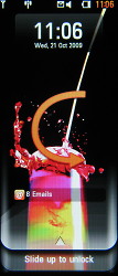
The lockscreen has also been changed and we like it much more this time. Slide to Unlock is what you get on the iPhone and on the Android bunch but the New Chocolate throws that in a upwards direction. You press at the bottom and lift the lockscreen up and it reveals the homescreen as a curtain.
Quite conveniently, the lockscreen notifies of recent events too.
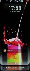
The lockscreen • sliding up to unlock
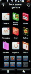
The BL40 New Chocolate S-Class boasts lockscreen gestures too - similar to Samsung's Smart Unlock. Touch gestures are more of a gimmick really, but some may find it a cool enough. There are nine fixed applications you can assign touch gestures to for a quick start from the lockscreen - contacts, call history, alarms, messaging, email, gallery, FM radio, organizer and memos. There are 12 predefined gesture patterns to choose from too.
Getting that Cube spinning
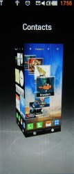
The Cube interface is still the base of the whole setup though technically it's not a Cube anymore. The four homescreen panes correspond to the four sides of a tall 3D block as an actual cube would've looked tiny on this 21:9 widescreen. For the purpose of this review, we'll continue to refer to that interface as the Cube.
The first of the Cube sides hosts the Widget homescreen. It offers a bunch of widgets we've seen on previous LG handsets - there's a notification widget, an analog clock, calendar, world time, WeatherBug, games shortcut, FM radio widget, memo, cell info and a calculator. As you might expect, with the larger screen, there's now more real estate for widgets and shortcuts. Unfortunately, you can't download new widgets. That is the main disadvantage compared to the competing Samsung TouchWiz interface.
Next up on the Cube, LG have swapped the rather impractical Multimedia homescreen with a new Browser one. There you can bookmark your favorite web pages just as you can on the iPhone.
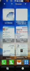
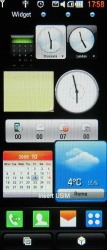
Widget and Browser homescreens
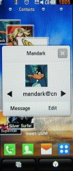
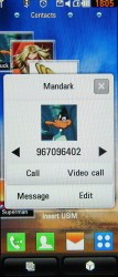
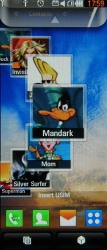
The third Cube wall accommodates the Contact homescreen, which displays your favorite contacts on a rotating reel and offer quick access to SMS/call options. All numbers and emails are easily available, and users get one-touch access to voice and video calls, and editing options.
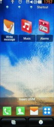
And finally, the Shortcut homescreen offers free space for shortcuts to various apps. We admit that the wonderful main menu is somewhat overcrowded, so the shortcuts homescreen seems quite practical for your everyday needs.
Tapping the Status bar at the top of the screen launches a semitransparent menu that can be used to toggle Wi-Fi and Bluetooth on and off, change profiles and view recent events.
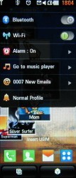
Easy access to common settings
There's some new stuff as well
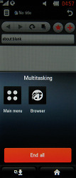
This time around, the task manager is a little bit more user-friendly and quite resembles the one in Symbian S60 smartphone OS. You press the button, and a pop-up appears to display the currently running apps, so you can terminate or switch between them.
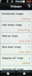
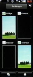
The non-negotiable homescreen wallpapers have been fixed as well, sort of. In the Screen Settings menu you'll find various options to set background images. And while you can enable or disable the wallpaper for each of the four homescreens, you cannot pick different wallpaper images for the individuals screens.
Getting to the essence
The LG New Chocolate main menu is accessible via the dedicated shortcut on the home screen. It has the typical layout of four side-scrollable rows of menu items. In this flat structure, all menu items are accessible simultaneously without jumping tabs.
As usual, if you turn the phone sideways, the landscape menu will fit all icons on screen with no need for scrolling (but with no text labels either).
The New Chocolate's menu icons have a bit of 3D-styling with some visual effects, but you can also use the old 2D menu if you so prefer. The alternative 2D theme is the black and white Prada 2 variety and we like it better at times. The 3D menu just looks too busy with color - but it's definitely the flashier one demonstrating the vibrant AMOLED color capabilities.
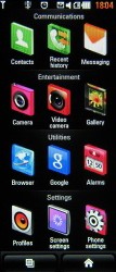
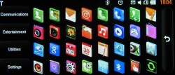
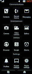
The BL40 New Chocolate main menu in portrait and landscape mode
Reader comments
- AnonD-328771
- 08 Nov 2014
- Hkt
Accept your rews for LG BL40 choclate.And irequest you itsgorilla glass .because,ineedoneforreplace theglassformyset.Is it avalable.
- Chris
- 15 Sep 2011
- S3f
Awesome device and it works perfect! I think there is no other phone out there with such styling, cool LG! You should get the Nobel price for that styling. The hardware works exellent, i have also a Iphone and i am used to speed, suprising fast t...
- Rakesh
- 24 Oct 2010
- vIh
Hi Vineet, I think your observation about lash timing is right. I bought it 2 months back and I have puzzlied finding that despite such strong flash light, when photo is captured, it shows poor lighting condition. After reading your post, I real...
