LG E900 Optimus 7 review: Lucky seven
Lucky seven
Paving the homescreen with Live tiles
The LG E900 Optimus 7 is the second Windows Phone 7 mobile we’ve reviewed and we have a review of just the OS. So, if you’re curious about the OS rather than a specific phone you should check it out.
Update, October 7, 2011: The Windows Phone 7.5 update is out and it brings new functionality and resolves some of the issues that we've mentioned in this review. Check out our Windows Phone 7.5 review here.
The software part of Windows Phone 7 reviews feels like a book you’ve read – that’s because all WP7 phones run the exact same software, with just a couple of preinstalled apps that make some difference. So don’t get surprised that we’ve reused some texts from our previous Windows Phone 7 reviews. We want you to be sure that even when we reuse portions of the texts, we always take care to check our facts with the review unit thoroughly.
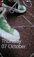
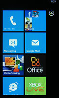
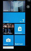
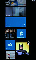
The lock screen • the homescreen • reorganizing the homescreen
That’s a good strategy – Microsoft’s rules mean that each and every Windows Phone 7 device will be very, very similar to the rest regardless of manufacturer. The basic software and user interface are fixed, at most each manufacturer can preload a few extra apps on their device.
In the case of the Optimus 7, those include a panorama shooting app, a Layar-like augmented reality app and DLNA connectivity. The rest is almost exactly the same as you would expect (though the Marketplace surprised us, more on that later). The camera app has grown Intelligent shot and Beauty shot capabilities too.
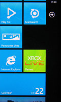
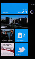
The new apps from LG • We tried out the official Twitter app too
The old Today screen has gone the way of the dinosaurs and it won’t be missed – the new homescreen is one of the most flexible ones we’ve seen. You’ll notice just how many useful things you can put on it as this review goes on. The iconic Start menu is gone too and there’s no trace of honeycombs.
We like the look of the new interface – the negative comments about it stem from the fact that the Metro UI doesn’t look very good in static screenshots. You really have to see it on video in order to appreciate the smoothness, graphics and animations provided by the design team. Despite the lack of shadows and 3D volume to the UI elements, the interface is in no way dull.
The Windows Phone 7 Metro UI has two main parts that live side by side – the homescreen (referred to as “Start”) and the main menu. You can switch between the two by sideways swipes or using the arrow button.
The homescreen is a square grid of Live tiles. Live tiles fit the broad concept of “widget” but, unlike most widgets out there, they are very uniform with clear labels that indicate what each one of them does. They also show some quick info (e.g. number of messages, the date) but they are also the Windows Phone 7 equivalent of homescreen shortcuts.
The color theme of the interface is customizable – the background can be dark or light and the color of the elements (e.g. the fill color of Live tiles) can be any one from a long list of available options.
The main menu is a traditional list – this is where all the hubs and installed apps are listed in alphabetical order. A press and hold reveals a context menu, which lets you “pin” items to the homescreen (that is put their Live tile there) along with uninstall and also rate and review the app (if it’s an installed app).
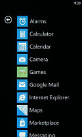
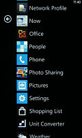
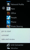
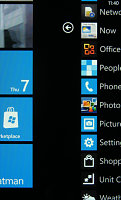
The main menu • pinning something to the homescreen • swiping halfway through
There are no folders in the main menu – so the more apps you install, the longer the list will get. This could make finding rarely used apps quite a challenge.
The interface is quite simple – sideways swipes navigate a sort of tabbed interface and there are on-screen soft keys. This will covers the most commonly used features, but for advanced features you can tap the “...” symbol.
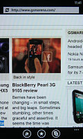
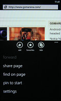
The on-screen soft keys • the extended “...” menu
It opens an extended context menu (and also reveals a label under each soft key, if the icon wasn’t descriptive enough). A press and hold on an item will reveal a menu to manipulate just one item.
What Windows Phone 7 has lost since the 6th iteration is multitasking. It handles a lot like a pre version 4 iOS. The Start key (the one with the Windows logo) gets out of the app and brings up the homescreen. Alternatively, you can exit an app using the Back key. That gets you back to the app last used.
That last app will continue from exactly the same point from where you left it. Getting back into an app is done by tapping its live tile or shortcut in the menu or by using the back button, which returns to the previous screen (even if it was from a completely different app).
There’s no “recently used” type of list to make going back to the app you need easier – so you might have to search for it in the main menu or keep hitting back until you see it. So, no multitasking is not a complete loss, but not quite as comfortable as true multitasking OSes either.
However, lack of multitasking means you can’t, say, run third party music players (e.g. last.fm) in the background. A curiosity is that apps (in general, not just music players) can continue to work even after you lock the screen – but you have to allow it. The phone will ask permission the first time you start the app and later you can change that setting from the app’s menu.
Microsoft will lift that restriction, but only for the apps that prove battery-efficient – the phone must be able to work at least 6 hours with the app running if it’s a music player and 120 hours otherwise. They didn’t specify what their test phone is though (not even battery capacity).
Still, all the other apps get suspended when you lock the phone – unlocking the phone will cause the app or game to reload, which can be slow and you usually lose your progress. This can be very annoying even to casual gamers.
Reader comments
- winor
- 03 Apr 2017
- Nv$
This phone can't update n cannot access watsapp,why is it lyk that
- AnonD-463919
- 15 Nov 2015
- 3sE
It was actin like that,coz of the battry,it needed to b replaced with a new 1.
- Romuald
- 01 Oct 2014
- fm}
How can I on my front cameraon my LGe900?