LG G2 vs. Samsung Galaxy Note 3 vs. Sony Xperia Z1: The triumvirate
The triumvirate
Three takes on Android
The LG G2 and Sony Xperia Z1 are rocking Android Jelly Bean 4.2.2 while the Samsung Galaxy Note 3 offers the latest version, 4.3. The advantages of the newer OS version include OpenGL ES 3.0 for higher-quality graphics support, Wi-Fi localization, better memory management but not too much in terms of new core functionality.
We have demo videos of all three running their custom software atop Android. The LG G2 offers its Optimus UI, Samsung has its TouchWiz and finally, Sony's got the Xperia UI.
LG G2
The LG customizations run deep and there's a rich selection of themes, changeable icons and custom apps.
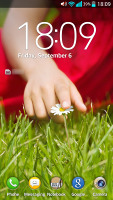
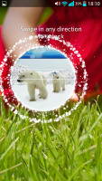
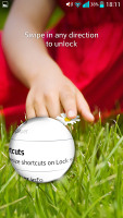
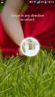
The cool LG lockscreen that lets you peek beneath is onboard. There are five animations for the peek hole type - the familiar dewdrop, ripple, while hole, crystal and the default particle. All of them are really cool and we honestly had a hard time deciding on which effect we like best. You can also place up to five shortcuts on your lockscreen that will unlock the phone straight into an app.
The LG home-baked tweaks and enhancements are by no means limited to the visuals. The Q Slide option makes it possible for you to use widget-like resizable small apps while using other full-screen apps. The system-wide Quick Memo integration allows you to take a screenshot anywhere in the phone and take notes over it.
The LG G2 also comes with some cool options like Guest Mode, Slide Aside multitasking, KnockON lock/unlock, lockscreen widgets and more. We'll get to all of them further down.
Since LG has put the Lock/Unlock hardware key at the back of the G2, the company has come up with another idea that can potentially make this key redundant if its placement is not to your liking. You can wake the screen with a double tap. It works flawlessly once you get used to applying a little more force compared to how you'd tap if you were actually using the phone. To lock the phone you don't need to use the hardware key either. You just double tap on an empty area of your homescreen or on the status bar no matter where you are - it will lock your G2.
The lockscreen now has multiple panes, each containing one widget. The page to the right is special and fires up the camera, but you can easily disable it from the widget menu.
Thanks to the multiple account support that premiered with the Android 4.2, LG was able to support the so-called Guest Mode. To activate it, you use a custom unlock pattern, which is different to your regular one. In Guest Mode the user only has access to a pre-defined set of apps.
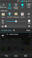
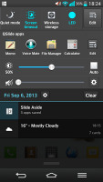
We've already mentioned the Q Slide shortcuts that are found in the notification area. They launch pop-up widget-like versions of the video player, web browser, phone, messages, calendar, email, memo, voice recorder, file manager and calculator.
The Q Slide feature is very similar to Sony's small apps but supports only two windows opened simultaneously. You can resize the mini app however you like, there is a dedicated shortcut that'll take you to the full screen app. There is also a transparency slider.
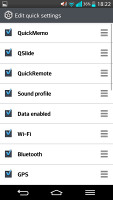
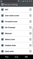
The notification area has also been tweaked by LG to let you rearrange the toggle buttons available. You are also free to add and remove toggles from the edit menu. You can add an insane amount of shortcuts here, and don't have to worry about whether they'll fit on the screen - the row becomes side-scrollable so you can still access them all.
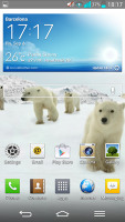
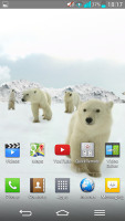
By default you get three homescreen panes to fill up with widgets and shortcuts, but you are free to add more (up to seven) or delete any that you don't need to speed up navigation. You can also set any of the homescreens as default.
There's a set of different icons to choose from and you can even make custom ones.
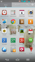
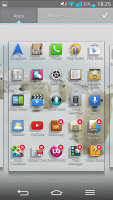
The app drawer lists all your available apps and widgets, with a dedicated tab for user downloads. There is a button in the top right corner, which triggers edit mode and lets you to easily reshuffle or uninstall applications.
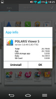
You can opt to make the icons in the app drawer bigger, too. If you select an app whilst in edit mode, a pop up will let you see information like storage usage.
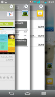
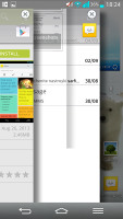
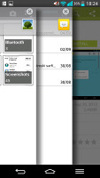
LG has implemented a new multi-tasking feature called Slide Aside. You can use a three-finger swipe from the right side of the screen to add the app into the Slide Aside UI, while three finger swipes from the left will switch between the running apps.
Slide Aside supports up to three apps, which get into a sort of frozen state and you can access a preview of all the three apps either form the notification area's dedicated shortcut or via a three-finger swipe to the left on the homescreen.
And here is the recap of the LG's Optimus UI key strengths:
- Q-Slide and Slide-Aside multi-tasking and app switching
- Quick Memo and Clip tray for saving various content across the UI
- Guest mode
- Customize virtual on-screen buttons background and function
- Knock on
Samsung Galaxy Note 3
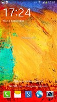
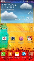
Next comes the rundown of the Samsung Galaxy Note 3 UI. We start with the lockscreen, which features the widgets introduced with Android 4.2.2 on the Galaxy S4. The default lockscreen shows the time along with a personal message overlaid on beautiful photos pulled from TripAdvisor (with text at the bottom about where the photo was taken).
You can choose what effect to add to the unlocking. The options include Oil paint and watercolor, which blur the color on screen as if you were dragging a wet paint brush through the screen. You can also opt for the well-known ripple and light effects.
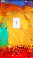
The lockscreen has multiple panes, each containing a single widget. The pane to the right of the default one is special and can either be a list of favorite apps (the default TouchWiz setting) or a shortcut for the camera (as in pure Android).
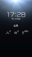
Another nice trick is the Quick glance option we first saw on the Galaxy Note II. It uses the proximity sensor to detect you reaching for the device and it lights up the screen and shows the time, missed call and message counters, battery charge and music track info.
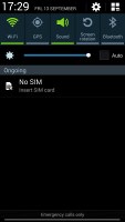
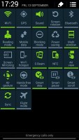
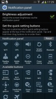
The notification area features five (or eight in landscape mode) toggles that can quickly enable and disable features. There are more than five toggles, of course, you can swipe horizontally to get to the others. Or you can tap the expand button, which reveals a grid of all the shortcuts, 22 in total. A two finger swipe directly opens the grid of toggles.
Below the toggles is the display brightness slider complete with an Auto toggle. You can remove this slider to get more room for notifications.
On the homescreen, Samsung has provided many of its own custom widgets like Samsung Hub, S Travel, etc. There's the wrap around feature, which lets you scroll homescreens in a loop.
You can pinch zoom to get into overview mode with all homescreen panes visible simultaneously. There can be up to 7 and you can easily add, remove and rearrange panes from here.
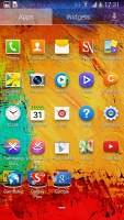
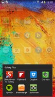
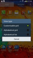
The app drawer shortcuts are presented as a customizable grid, alphabetized grid or list and you can hide icons (good for bloatware you can't uninstall), view only downloaded apps, uninstall apps and add folders.
The Galaxy Note 3 comes with Multi-window, which now allows launching two instances of the same app - i.e. you can have two Chrome windows next to each other. There is also dedicated shortcut that lets you switch the places of the two opened apps.
Copying stuff from one of the opened apps to the other is now available and is done in just three taps. It's a definite improvement and something the multi-window feature needed badly.
We noticed there is pretty decent app support for the multi-window service at launch with even more supported apps on the way. It's a feature that will be used really often and we are happy to see Samsung extending its support.
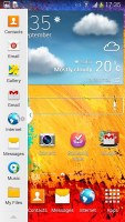
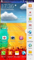
You can move the small arrow that brings up the drawer with the Multi-window apps to make it easier to reach with your thumb. You can also move the whole drawer to the other side of the screen.
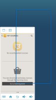
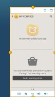
A particularly cool feature, exclusive to the Galaxy Note 3, is one-hand operation. Unlike previous versions of the feature though, it is not limited to the keypad and the calculator. This time you can minimize the whole interface with a simple double swipe and you are effectively making the Galaxy Note 3 use only a corner of its screen. The volume buttons are also brought to the tip of your fingers so you can operate the handset as if it was a 4-inch screen (or slightly more - custom resizing is available) rather than a 5.7-inch one.
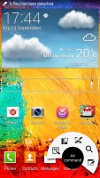
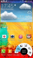
Once you pop the S Pen out of its holster, you'll be greeted by the new Air Command menu. The new menu is available throughout the interface, and can be opened at any time by just pressing the side button on the S-Pen.
The Air Command menu is a virtual ring with five shortcuts - Action Memo, Scrap Booker, Screen Write, S Finder and Pen Window.
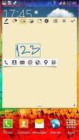
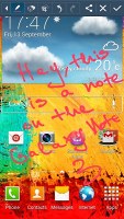
The Action Memo lets you write stuff and then use it to initiate an action - i.e. add a contact name and number to your phonebook, or check out an address on Google Maps. You just need to mark a part of the text and send it to one of the relevant apps. The handwriting recognition is impressively fast and accurate - it handles just about everything you throw at it.
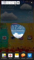
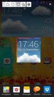
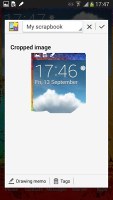
Scrap Booker lets you add pieces of your screen to... well, a Scrapbook. You don't need to take a full screenshot - just mark the stuff you need. The Scrap Booker will automatically extract pictures and text from the selected area and will save them to one of your Scrapbook categories. You can then add an optional memo to every scrapbook entry you create.
Screen Write allows you to start writing on the display no matter what screen you are on. You can either use a clean sheet or use a snapshot of the screen you are currently using. It's the best tool for taking quick memos.
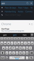
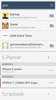
The S-Search is a local search that'll browse through all the content on your Note 3 with preset filters. It can search in all S-Pen content you've added (including notes, scrapbook pages, etc.), messages, multimedia, settings, phonebook, even the internet. Naturally, all handwritten stuff is an easy job for the S-Search. You can even search for symbols you've drawn with the S-Pen. That last one seems to work quite slowly, however, and unless you actually use the scrapbook quite a lot you probably won't need it that often.
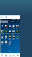
The last element of the Air Command menu is Pen Window. It lets you launch a mini window with one of the supported apps by drawing a rectangle on the screen. The Galaxy Note 3 will then fit the floating app in the said rectangle (in the correct aspect, of course).
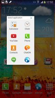
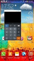
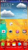
Placing mini apps anywhere on the screen
There's more but you get the idea. The Samsung Galaxy Note 3 has what neither the LG G2 nor the Sony Xperia Z1 have - a stylus with impressive software backing that lets you get the best out of it.
Here's what the advantages the Galaxy Note 3 holds over its peers.
- Multi-window multitasking
- One-handed operation mode
- The most highly customizable lockscreen
- Quick glance
- S Pen
- Air Command: Action Memo, Scrap Booker, Screen Write, S Finder and Pen Window
Sony Xperia Z1
The Xperia Z1 gives you the option to add or remove homescreen panes (you start with five) and set any of them as default. You can't have more than seven panes at any given time though, nor can you change the order they're in.
The background for the virtual on-screen buttons is black when you are running an app and completely transparent when you are browsing homescreen panes and menus.
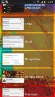
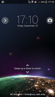
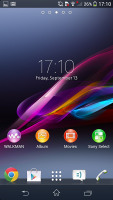
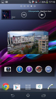
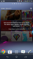
The lockscreen has multiple panes, each containing one widget. The rightmost pane is special and fires up the camera. The other panes can accommodate various widgets: Email, Gmail, Google Now, Calendar, Google+ posts, TrackID and Digital clock. You can download apps from the Play Store that add new widgets.
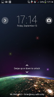
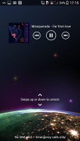
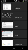
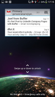
The lockscreen and its options
The notification area features a few toggles (Sound, Bluetooth, Wi-Fi and Brightness by default). There's also a quick shortcut to the settings menu. This time around, the toggles are customizable. You can choose between 16 different quick toggles and have up to 10 of them visible in the notification area across two rows of shortcuts. You can even opt out of having the Settings key.
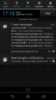
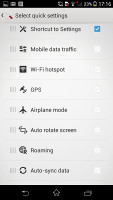
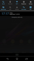
The notification area offers two customizable rows of quick toggles
Along the bottom, there are four docked shortcuts (two each side of the app drawer shortcut). These are visible across all homescreen panes and are user configurable: they can be either single icons or folders with multiple items, in which case you get smaller icons of the first four shortcuts in them.
The app drawer is laid out across multiple pages and you can sort the apps manually, alphabetically, by the most used or most recently installed. The menu with those settings is accessible via a swipe from the left edge of the screen and you can also search and even uninstall apps from there. If you tap and hold on an app, a green Add to Homescreen field will appear on top of the app drawer. Just drag the icon and drop it there and you will go back to your homescreen and place a shortcut.
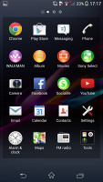
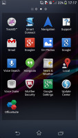
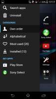
The app drawer and its swipe-able settings
The Sony Xperia Z1 also has mini apps that pop up tiny widget-like applications on your homescreen, which you can move around and use without having to open the full-fledged app. So far, there's a default set of nine: Active Clip, Chrome Bookmarks, Browser, Calculator, Calendar, Gmail, Timer, Notes, and Voice Recorder.
Here go the Sony Xperia Z1 key software strengths:
- App drawer with side-swipeable settings
- Album, Walkman, Movies apps
- Mini apps
- Stamina mode
- Most consistent design
Winner: Samsung Galaxy Note 3. The Galaxy Note 3 has the most functional custom launcher, running on top of the the most recent Android release. Its multitasking is second to none in the mobile world, while the S Pen and its apps add a whole new dimension to the smartphone experience.
Runner-up: LG G2. The LG G2 is following closely with another very rich home-baked launcher, offering a bunch of exclusive features.
Third place: Sony Xperia Z1. The Sony flagship has probably the best looking UI of the bunch, but lags behind in terms of functionality and customization options.
Reader comments
- amberaac
- 07 Sep 2022
- 7A7
What phone do have a note 3 I hope
