LG G3 vs. HTC One (M8): Duel duo
Duel duo
User interface
Having indulged in skeumorphic UIs, both LG and HTC switched to modern, flat designs. HTC did it a few versions of Sense UI ago, while LG is debuting its flat look with the G3. Comparing the two side by side you'll find plenty of similarities.
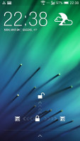
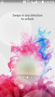
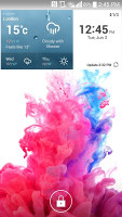
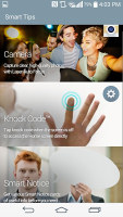
Starting with the lockscreen, the similarities become apparent. Both can be unlocked by a double tap, but the HTC also accepts a swipe up. LG instead promotes Knock Codes, which are similar to pattern lock but with tapping instead of swiping.
Each lockscreen also supports widgets by default and have a row at the bottom containing several app shortcuts.
Before continuing to the homescreen, a few words about the on-screen buttons. HTC ended its affair with the two-button layout and went back to a standard Back / Home / App switcher setup. This is the default for LG too, but you have the option to add a fourth button and reorder them. Unlike previous Optimus UI iterations, you get a lot more freedom in selecting a custom button order (previous versions just offered four presets and no user-defined setups).
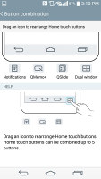
Highly customizable on-screen buttons on the LG G3
The homescreens look fairly similar, stock Android for the most part, and they do share the feature of having a special pane on the left. On Sense that's the BlinkFeed pane, which pulls info from news outlets, social networking updates and notifications from apps.
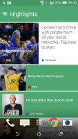
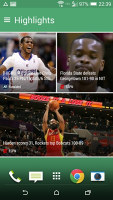
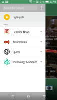
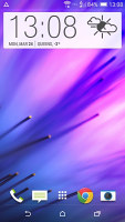
BlinkFeed • a regular homescreen
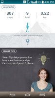
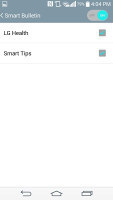
In LG's Optimus UI it's the Smart Bulletin on the leftmost pane. It's more restricted than BlinkFeed and only shows notifications from the LG Health app and smart tips. You can hide either of these categories or disable Smart Bulletin altogether.
Another "smart" feature is Smart Notice, a Google Now type of widget. It shows cards that display various reminders: to add a contact you called recently or to call someone back, a birthday reminder, a weather alert plus LG Health updates will all show up here. Notice also watches over your phone and will suggest turning on Battery saver when it runs low on juice and will offer to remove downloaded files and apps that haven't been used in months.
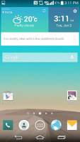
Smart Notice keeps an eye on the weather and offers helpful reminders
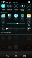
The notification area of Sense UI on the HTC One (M8) is identical to stock Android, topped with a few extra options. LG meanwhile went to town and added a row of quick toggles, a row of shortcuts, two sliders and the actual notifications begin only halfway down the screen.
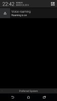
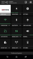
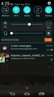
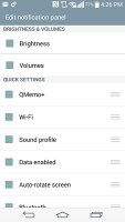
Near-stock notification area on Sense UI • overburdened but customizable notification area on Optimus UI
The good news is that these are all fully customizable - the selection and order of quick toggles can be tweaked, the two sliders (Brightness and Volume) can be hidden individually and the row of shortcuts can be disabled (they are part of the QSlide feature, more on that later).
Surprisingly, both companies went for the same style app switcher - tiled app thumbnails, three on a row. This arrangement has the upside that it fits more apps on the screen. The downside in HTC's implementation is that you can't scroll so nine is all the apps you get.
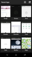
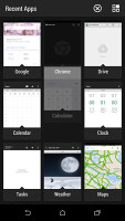
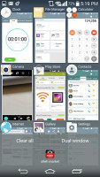
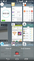
Similar looking app switchers • the LG one is vertically scrollable so it fits more apps
LG switched to side-swipes for terminating app so you can scroll up and down to view more apps. There are buttons to dismiss all apps or to enable Dual Window.
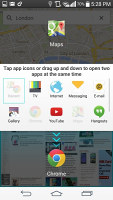
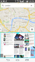
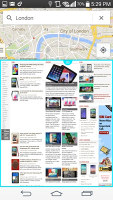
Dual Window is one of two multitasking methods offered by the LG G3. It works like Samsung's Multi Window by splitting the screen in two and giving each half to a supported app. We say "half" as that's the default split but you can move the divider to any proportion you like. Recently coupled apps will be remembered so you can easily relaunch them.
Then there's QSlide, LG's previous attempt at multitasking. It's similar to Sony's Small apps and runs apps in small, floating windows that can be moved around. You can even reduce their opacity to keep an eye on whatever's going on below.
The shortcuts in the notification area launch the QSlide apps.
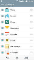
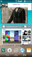
QSlide offers multitasking with floating apps
Both phones have additional homescreen options. The HTC One (M8) offers Car mode and Kid mode, while the LG G3 has EasyHome and Guest mode.
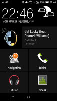
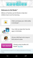
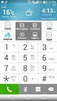
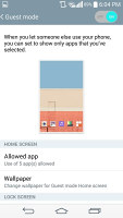
HTC's Car mode and Kids mode • LG's EasyHome • Guest Mode
Besides a simple Guest mode, the G3 also features Content Lock, which hides sensitive files (like Galaxy S5's Private mode) by using 128-bit encryption. Files in both the internal memory and the microSD card are protected even if you plug the phone into a computer.
Then there's Kill Switch that re-implements Google's Android Device Manager (available on all Androids, including the One). It can make the LG G3 ring so you can find it and, if it's not under the couch, it will let you erase all data on the phone. It also promises anti-virus scans, which doubles another Google feature (the Play Store periodically scans your installed apps).
Winner: LG G3. The larger screen favors multitasking, augmented by features such as split-screen and floating apps. The Smart and security features also made a good impression.
Sense UI is better than ever and is certainly a viable option. It lacks some polish (the app switcher could've been better) but BlinkFeed is a great tool.
Reader comments
- Hamza Amin Khokhar
- 30 Aug 2020
- uZa
LG,s All the devices Are still beast .. Because I have recently buy LG g3 a 6 years old device with good camera and best processor in just 30$.
- sandip
- 01 Oct 2015
- t1$
HTC M9+ or LG G4 which one should go for ??
- liz
- 28 Jun 2015
- K5g
Go for 32gig ....personally I haven't had one but I'm pretty sure LG users are very proud to recommend this..so am I..
