LG G4 vs. Samsung Galaxy S6: Next door rivals
Next door rivals
Interface comparison
Currently the Samsung Galaxy S6 runs on Android 5.0.2 Lollipop, while the LG G4 benefits from launching a little later and the company had time to prepare 5.1 Lollipop for launch. The difference isn't that big though, both phones come with pretty heavy customizations to stock Android.
Lockscreen
The lockscreen shows notifications by default, but you can hide them for privacy reasons. LG kept a row of notifications on the bottom, while Samsung placed only Camera and Dialer shortcuts.
There are better ways to launch the camera - double press the Home key of the Galaxy S6 or the Volume down key on the LG G4 (note that this also takes a photo). These work from even when the screen is off.
Both companies implement custom security measures for the lockscreen. The Galaxy S6 boasts a fingerprint sensor on the Home key, which just requires you to place your finger on the key for a second. It's less sensitive to the position of your finger than the old swipe sensor of the Galaxy S5.
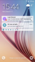
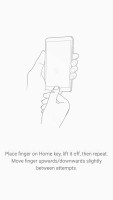
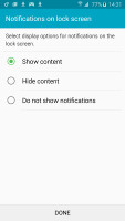
Samsung lockscreen with fingerprint protection
LG meanwhile relies on their Knock Code, essentially a tap based password that lets you tap a pattern in four quadrants. Double tapping wakes up the screen or you can do the Knock Code, which bypasses the lockscreen altogether. You can check the time and notifications with a simple swipe from the top while the screen is off.
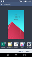
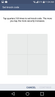

LG lockscreen • shortcuts • KnockCode • swiping from the top while the screen
Security
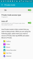
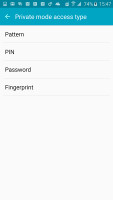
The Samsung Galaxy S6 uses the fingerprint sensor to secure Private mode. This mode creates a secure section of storage that can hold sensitive files and photos. When you are not logged on to Private mode, this storage becomes inaccessible for anyone else using your phone until you unlock it again with your finger.
The fingerprint sensor can also be used to replace passwords for certain apps. It works with PayPal for authorizing transactions and you can sign into web pages using your key, which is much faster than the typing your password (especially if it contains special symbols).
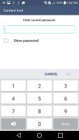
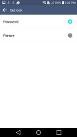
LG has a similar feature, Content lock, though it's limited to PIN or Pattern protection. You can "lock" photos and videos from the Gallery and Qmemo+ notes, those will be hidden from anyone who doesn't know the PIN/pattern.
Notifications
Both companies follow the same model for the notification area. The top row contains the date and basic shortcuts, below are the Quick toggles, below that the brightness slider then additional widgets and only then the actual notifications.
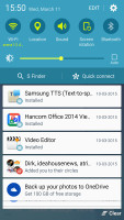
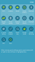
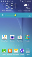
Samsung's take on the notification area
Both companies waste a good deal of space. Samsung has kept things somewhat more compact, adding only the S Finder and Quick connect buttons to the formula (no, you can't remove them).
Meanwhile LG has added a Volume slider and if you happen to enable the QSlide apps, then an extra row is reserved for their shortcuts, leaving you with about a third of the screen for actual notifications.
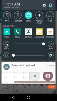
LG G4 notification area with QSlide enabled
Neither TouchWiz nor LG UX lets you do a two-finger swipe to view all quick toggles, but on the Galaxy you can tap the edit button and use the toggles there.
Multiple users
Multi-user support was first supposed to arrive with Android 4.2, then again with 5.0, but it's still a rare sight. The LG G4 does support an additional guest account (just one). This account gets its own homescreen and Play Store account, though app installs/updates affect the phone as a whole.
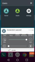
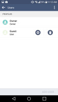

Multi-user support on the LG G4
So, it offers no protection against malicious users, you can use it to create Personal and Work accounts or a Guest account you can hand over to a friend (with Content lock keeping private things private).
The Samsung Galaxy S6 doesn't have such functionality, which is a shame since we imagine it would have worked great with the fingerprint sensor, opening the right account for the right person.
Themes
Samsung introduced theming support with the Galaxy S6 and has created a dedicated Theme store. It's a bit light on content right now, but it's growing fast. Themes can change wallpapers, icons, affect Samsung apps (dialer, contacts, messages) and the notification area).
Themes can also add matching audio elements - ringtones, notification tones, alarm sounds and so on.
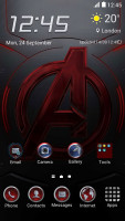

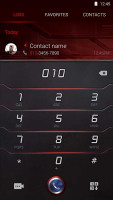
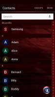
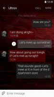
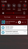
The Avenger theme is pretty extensive
LG used to have themes on previous models, though this option is gone on our review unit. Interestingly, a quick online search revealed that there are models out there that still offer a Themes menu in the Homescreen settings so we guess it's an odd regional limitation.
Multitasking
Both companies use the standard 3D rolodex look for their app switcher and implement their own multitasking solutions, which turn out almost identical.
Samsung has been doing Multi-Window for ages, it splits the screen in two and runs an app in each half. You can drag and drop an image or a paragraph of text between apps. Only certain apps are available, but the most used apps work - Facebook, Hangout, Instagram, WhatsApp, Skype, Gmail, Maps and others.
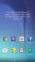
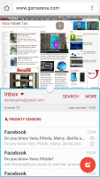
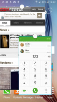
Multi-Window • floating mini apps
The LG solution, Dual Window, works the same way, except without the drag and drop functionality and even fewer apps are supported - WhatsApp and Facebook are not supported, for example.
The alternative is small floating apps. This was LG's original attempt at multitasking, the QSlide feature. It creates floating, resizable apps and lets you make them semi-transparent.
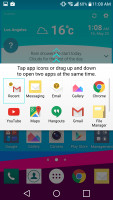
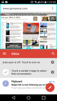
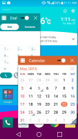
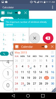
Dual Window and QSlide in action
Samsung also allows floating apps, but adds a cool gesture to the mix - a swipe from the upper right corner will minimize a full screen app into a floating state. All apps that support Multi-Window can work in this mode, but not all Dual Window apps work with QSlide.
Staying in touch
HTC started the trend of dedicating a homescreen pane to news and Samsung followed up with the Briefing pane. It's really Flipboard on your homescreen (you can remove it if you like). Unlike HTC's solution, this one can't show social networking notifications.

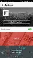
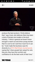
The Flipboard-powered Briefing homescreen pane
LG has Smart Bulletin, which doesn't really do news but focuses on you instead. It shows a column of widgets, starting with LG Health (counting your steps), then Calendar (a peek at your schedule), the Music player, Smart Settings, QRemote and so on.

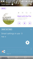
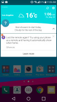
Smart Bulletin homescreen pane • and as a widget
Settings
Samsung puts a selection of commonly used settings on top (you can customize the list) and below that a list of all settings. It's best to use the quick settings on top or hit the Search button instead of digging through layers of settings.
LG gives you two options - a list or a tabbed view of the settings. There's no search functionality though, which can make things tougher if you don't know where you need to go for a specific option.
Winner: Samsung Galaxy S6. It's a minor Android version behind for now, but the security options enabled by the fingerprint sensor and the more mature multitasking options tilt the scales in its favor. The theming support is great to have too.
LG's multi-user implementation is welcome, while the Knock Code and Content lock feature provide an alternative to Samsung's features (though not as good). And how come themes is a regional feature?
Reader comments
- Ldd
- 28 Jul 2019
- xja
Lg g4 still remains my number one over the S6...and I rather go for Lg than for Samsung
- Anonymous
- 11 Jul 2019
- syt
The vest phone in the wirld is lg g4
- AnonD-674684
- 05 Jun 2017
- 7BP
thank you
