LG G Pad 8.3 review: Couch surfer
Couch surfer
User interface powered by Android Jelly Bean
The LG G Pad 8.3 is powered by Android 4.2.2 Jelly Bean with the company's own custom skin on top. The customizations run deep and there's a rich selection of themes, changeable icons and home-brewed apps.
We've shot a brief video showing off the Android Jelly Bean user interface:
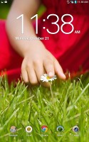
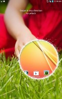
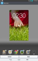
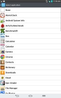
The cool LG lockscreen is very similar to what's found on the original Optimus G, where swiping from any spot on the homescreen pops up a circular preview of what's underneath. You can choose from a variety of circular effects, including the classic magnified bubble view, or the default particle effect. You can also place up to five shortcuts that will unlock the phone straight into an app.
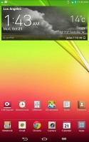
You can add lockscreen widgets as well - including different clocks - and have a shortcut to the camera when you swipe to the right from the clock.
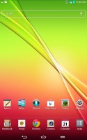
The bottom of the homescreen fits up to 8 shortcuts, which includes the shortcut to the App Drawer. You don't have to use all available slots though - you can discard all but the App Drawer shortcut if you want.
As usual, the shortcuts are visible on any of the homescreen panes. With the exception of the app drawer shortcut, you can rearrange, delete or replace any of these with shortcuts of your choosing, even folders. In fact, most aspects of the phone's behavior can be customized, you can go to as small detail as the capacitive key backlight and the transition effect between homescreen panes.
The LG home-baked tweaks and enhancements are by no means limited to the visuals. The Q Slide option makes it possible for you to watch a video while using other apps, while the system-wide QuickMemo integration allows you to take a screenshot anywhere in the phone and take notes over it.
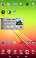
You can resize widgets or you can even shrink a widget down to the corresponding app's icon. Also if you move a widget over an occupied slot on the homescreen, the icons underneath immediately move out of the way, which is really neat and comes as part of Jelly Bean.
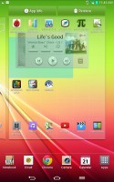
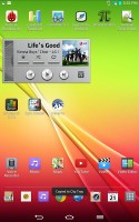
Reordering and resizing widgets
Adding stuff to the homescreen is done by tapping and holding on a blank area on any of the panes. A context menu appears, allowing you to add various customizations to your phone. The tabs along the bottom let you select the appropriate app, widget or wallpaper, which you can add to the homescreen pane of your choice. Gridlines will appear when you hold and drag an app or widget, allowing you to easily place it on the homescreen.
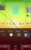
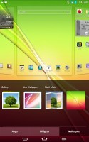
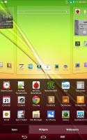
Placing widgets and changing the wallpaper
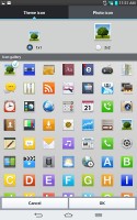
There's a set of different icons to choose from and you can even make custom ones.
The contextual menu gives you quick access to different settings, as well as themes.
LG has also enabled plenty of other customization options for the homescreen. There's a dedicated setting for looped homescreen scrolling and the so-called screen effect changes the transition effect between homescreen panes.
The notification area has also been tweaked to let you rearrange the toggle buttons available. You are also free to add and remove toggles from the edit menu. You can add an insane amount of shortcuts here, and don't have to worry about whether they'll fit on the screen - the row becomes side-scrollable so you can still access them all.
As usual, if you have a music track playing in the background, quick controls will show up here. You can also swipe notifications to the left or right to dismiss them.
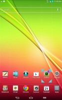
By default you get seven homescreen panes to fill up with widgets and shortcuts, but you are free to delete any that you don't need to speed up navigation. You can also set any one homescreen as your default, which pops up first whenever you unlock the phone.
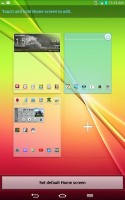
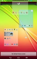
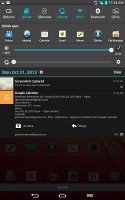
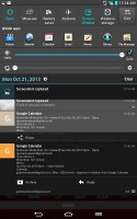
Homescreen preview • The notification area with reorderable settings
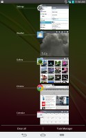
The task switcher hasn't changed a whole lot since ICS. It's accessed by holding down the home button, and shows you all of the currently running apps that you can then swipe left or right to terminate. The task switcher is accessed by holding down on the hardware home button. There, you'll also find a shortcut to Google Now.
Additionally, there are number of icons at the bottom, which let you quickly open up a particular app or even stop all apps simultaneously.
Finally, there's a shortcut to the task manager.
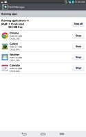
LG's task manager lists the currently running apps, but also lets you uninstall apps and gives you info on your storage. It comes with its own dedicated widget, which shows a graph of the available RAM and conveniently offers a button to clear up memory.
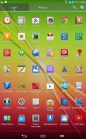
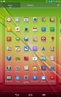
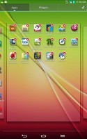
The app drawer lists all your available apps and widgets, with a dedicated tab for user downloads. There is a button in the top right corner, which triggers edit mode and lets you to easily reshuffle or uninstall applications.
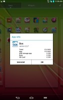
You can make the icons in the app drawer smaller too. If you select an app whilst in edit mode, a pop up will let you see information like RAM usage.
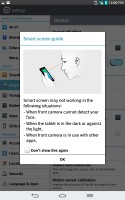
LG borrowed a trick from Samsung's TouchWiz and implemented its own version of Samsung's Smart Stay - called Smart screen. It uses the front-facing camera to detect whether you're looking at the screen. This means you can browse the phone for hours on end without it auto-locking itself. We can confirm that the feature works very well.
Reader comments
- AnonD-142628
- 19 Dec 2013
- xpA
People complaing bout poor camera quality? well i don't care about the camera on a tablet. who takes pics with a tablet anyway....thats stupid.
- AnonD-142628
- 19 Dec 2013
- xpA
Great review. Sounds like serious competition for Nexus 7 2013. I was about to buy nexus 7, but i'll wait and try out LG G Pad first.I like the bigger screen..it's much wider. Only thing i don't like is LG UI. Nexus is 32 GB, LG only 16 GB, but LG is...
- vicky
- 16 Nov 2013
- 956
good
