LG GD880 Mini review: Going minimalist
Going minimalist
Pixel-dense screen makes for crisp text, vivid pictures
The screen is the centerpiece of the GD880 Mini – it’s where you get to enjoy the S-class interface, where the HTML5 browser does its magic, and the DivX/XviD videos are played. And it’s a very good display.
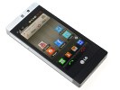
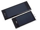
The display is amazing: short for high-resolution, capacitive, multi-touch-enabled
With 480 x 854 pixels on a 3.2” diagonal, it’s easily one of the most pixel-dense displays we’ve seen. And the image quality is great - watching videos and browsing photos is a treat and text remains legible at very low zoom levels, which is great for web browsing of full-featured web sites.
The black colors are deep enough, but sunlight legibility is unimpressive – it’s on a level with the LG Arena. And phones like the Samsung S8500 Wave have raised the sunlight legibility bar too high it seems.
Indoors however, the high-resolution screen renders a crisp, vivid picture. It has a scratch-resistant finish too to keep it from getting damaged.
The updated S-Class UI: new homescreen, widgets and menu
The S-Class UI has already earned its place among feature phone user interfaces. Since the first S-Class device – the LG KM900 Arena – the BL40 New Chocolate was the only one to bring some changes in both functionality and looks. LG GD880 Mini carries the improvements on with even bolder decisions.
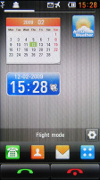
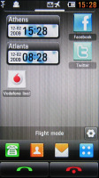
The original S-Class Cube interface is now gone – the four homescreens are now replaced by one extended desktop that nods at Android. It’s three times the size of the display (side-scrollable), giving you enough room to organize all the items you want to put up front. And there are plenty of things that can go up there. The screen shows you one third of the actual homescreen and you can sweep left or right to get to the other panes.
You can add different items on the homescreen with the dedicated virtual key in the bottom right corner of the display. In edit mode you can also shake the phone to auto align all the stuff on the homescreen.
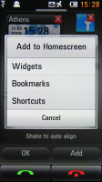
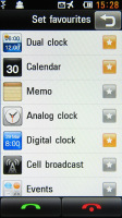
If you’re about to add a new item you will first have to choose between widget, bookmark or shortcut. The widgets are similar to what we’ve already seen in previous S-Class handsets, some of them with small visual changes. There are two new major additions – the Facebook and Twitter widgets plus their mini versions, but we’ll talk about them later.
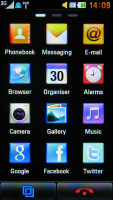
Besides widgets, you can also put bookmarks or shortcuts to almost anything in your phone. They look exactly like the iPhone’s icons and work in a similar way.
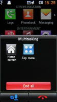
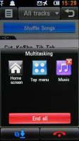
A Task manager virtual button is always available in the bottom left corner of the screen, except on the homescreen where it is replaced by the virtual green receiver key. This time around, the task manager is more user-friendly and resembles Symbian by popping up to show the running apps. You can terminate or switch between the currently running apps.
In the bottom right corner of the screen you will always find a red receiver button. In addition to its main purpose, it will also terminate any app you are currently using and take you back to the homescreen.
LG have got it right again and the S-class interface is as visually impressive as before, and perhaps more mature.
Everything from homescreen to dropdown menus roll, sweep in, unfold and rotate extra smoothly with a responsiveness that suggests some powerful graphics acceleration.
The lockscreen is the "Press & Hold to Unlock" kind, which is the same as in the LG Arena, Viewty Smart and the Crystal. In addition, the Mini has gesture lock too. You can assign up to 9 shortcuts to different phone features – contacts, call log, alarms, music, etc.
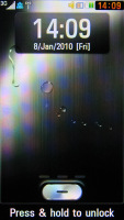
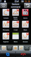
The familiar locksreen • assigning gestures for quick app launch from the lockscreen
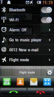
Tapping the Status bar at the top of the screen launches a semitransparent quick switcher that can be used to toggle Wi-Fi and Bluetooth on and off, change profiles and view recent events.
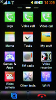
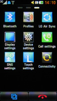
The main menu is accessible via the dedicated shortcut on the home screen. It has been completely redesigned. Instead of the four scrollable rows structure it is now page-organized. Similar to the homescreen you now have three pages housing all the usual S-Class icons. You can scroll through the pages with finger sweeps and rearrange the icons by tap-and-hold. We’ve seen that elsewhere, haven’t we?
Unfortunately, because of the new menu organization, there is no landscape view.
Reader comments
- Neuza
- 03 Aug 2012
- Le}
bristolboyO2 was advertising it and the sntsaeion xe in the metro and other papers with a full page advert plus get free headphones if buying direct from o2! All that advertising costs though hence the high selling price!
- Mira
- 03 Aug 2012
- 0vS
I've had Froyo on my Galaxy S for months! It's dlerveied by your carrier, NOT Samsung, so instead of whinging about Samsung not updating, get onto your service provider Btw, I haven't had any problems with mine (aside from the GPS lock) however I re...
