LG KC910 Renoir review: Portrait of a high-flyer
Portrait of a high-flyer
A fresh touch to the user interface
The Renoir has the latest Flash-based touch user interface by LG. The first time we saw that was in LG Viewty, and it even got jazzed up with the LG KF700 (although stripped of some features to reflect its downmarket positioning).
LG Renoir boasts an even more advanced UI version with quite some little tweaks noticeable throughout. We'll be glad to share those with you, as we go on to check what the user interface of the latest 8 megapixel cameraphone offers.
By the way, LG Cookie seems to offer even more new features, but we are yet to see those in action. For now, the LG Renoir interface is the most advanced touch UI we've seen by LG.
There are a lot more animations now, scrolling is much smoother and more Apple iPhone. For example, when you get to the bottom of a scrolling list, the items don't just stop rolling, but bounce and throb to your sweeps with almost physical elasticity. As expected, every touch is accompanied by a short vibration.
The only drawback we noticed is that the interface tends to be a bit slow, every operation involving a bit of lag. It's not really a big deal, and some probably won't even notice it. But truth be told, the competing Samsung Pixon feels snappier compared to the LG Renoir.
But let's start with the new stuff.
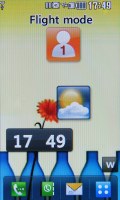
There is a wider choice of desktop widgets now to put on your homescreen, and they are easier to control. A touch on the W icon on the homescreen activates the Widgets bar - choose the ones you want and hide the ones you don't.
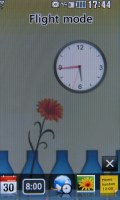
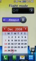
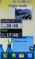
Various widgets on the LG Renoir home screen
Among those there is a Weather widget, which continuously retrieves information about your local weather. There is also a Contacts widgets, which offers an image-based quick dial pad.
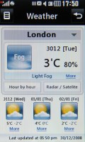
The Weather widgest is the first web-enabled widget on an LG handset
An interesting note is that when the active widgets on your screen become too many, you can fluidly scroll them right on your home screen.
The new widgets system has a slight imperfection - the currently active widgets take some time to appear on the Home screen each time you wake up the device and that can be nagging if you just want to see the time for example.
And truth be told, Samsung seem to have a nicer choice of widgets with their TouchWiz interface on the Samsung Pixon. Plus you can even download new widgets in various languages.
One of the other updates of the interface is that the main menu items are no longer fixed - upon a longer press you can move the icons around and reposition them within the grid - much like on the Apple iPhone, but without the wiggling. The Samsung Pixon for example, doesn't offer that.
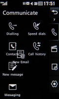
You can move icons around as easy as a piece of cake
And finally, thanks to the built-in accelerometer, the LG Renoir interface auto rotates when you turn the handset to landscape mode. The feature works selectively and is only available when you're typing a message, browsing images, watching a video or viewing documents. Rotation is smooth and the phone reacts promptly to your movement.
There are of course many other changes and, though less significant, they will get mentioned along the way.
All the basics are covered
For those of you that meet the LG Flash interface for the first time, we'll also cover the basics.
On the LG Renoir homescreen you will find a navigation bar with shortcuts sitting at the bottom of the screen - just as in the Viewty.
The four available shortcuts are not user configurable. The first shortcut takes you to the Dial pad to punch in a number, the second opens the Contacts list, the third one opens the Messaging submenu, and the last one takes you to the main menu.
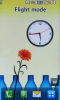
The traditional Home screen shortcuts
Beside all that, the user interface of the LG Renoir retains the same menu system as the LG Viewty - simple, yet nicely elaborate and functional. LG have made a really nice job designing the user interface and we like that they are improving it with every new handset they release.
The main menu consists of four tabs - they are displayed in a column on the right-hand side of the screen. They don't have names but the first one is related to making calls and sending messages.
The second one is the entertainment package, which houses the multimedia files, the camera, the FM radio, the games, and the music player.
The third tab includes tools such as the web browser, the Google package, organizer applications such as the Calendar, Calculator, Unit converter, etc. And, finally, the fourth item handles all the settings.
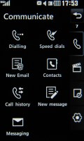
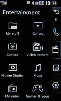
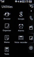
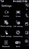
The four sub-menus: calling and texting • multimedia • various tools • settings
By default, the user interface comes in the black and white theme, well-known ever since the LG Prada phone. Beside that default one, the LG Renoir has another color theme as well.
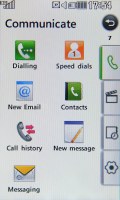
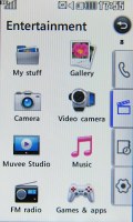
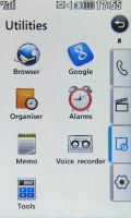
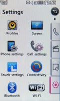
Applying a more lively interface theme
An absolute must-have for every full touch-operated handset, and a feature we miss in the Apple iPhone (used to actually - thanks to some smart third-party developers), is some sort of feedback when the screen is pressed - besides the touch tone and the touch animation.
LG KC910 Renoir is haptic-enabled of course, every press is accompanied by a gentle vibration to let you know your press has been accepted. Settings for it include a choice of three types of vibration plus 7 levels of vibration strength.
The LG KF700 was the first touch handset by LG to make use of a task manager and the concept has been extended to the LG Renoir as well. You can run several Java and native applications simultaneously and effortlessly switch between them.
The task manager on the Renoir has a new "launcher" tab that hosts a number of configurable shortcuts to various applications. The list is scrollable so you can fit quite a bunch.
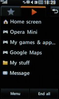
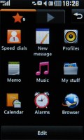
The Renoir task manager and the new "launcher" tab
The Samsung Pixon allows Java multi-tasking too, however it doesn't have a Task Manager of any kind. When you minimize a Java title on the Pixon, the only way to see it's still running is the small status icon next to its name. And the only way to end it, is to open it again.
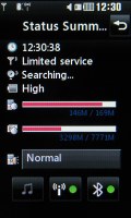
Now let's get back to the Renoir. Another thing borrowed from KF700 is the Status screen - touching on any of the icons on the top status row (next to the clock) opens up a screen that displays signal, battery and memory stats and allows you to quickly toggle the ringing profiles, Wi-Fi and Bluetooth. The Samsung Pixon lacks a screen with similar functionality.
Reader comments
- AnonD-212727
- 20 Aug 2015
- 7JS
eBay and Amazon sell the batteries for this phone. Very cheap and brand new so I would order them from there
- nikky
- 25 Jul 2014
- N9@
Pls how can I get original battery and camera for this phone ? My sis sent it to me sinve 2010 but I've not been able to use it. Thanks
