LG KF700 review: A touch of slide, a touch of scroll
A touch of slide
Flashy user interface
The user interface of LG KF700 is Flash-based, much like the one in LG Viewty. There are a number of novelties but the KF700 is positioned just below the Viewty in the LG portfolio, so it's natural to have some features missing too.
Let's start with the new stuff. Firstly, there is a new centralized menu for managing profiles, music player and Bluetooth connectivity. It also displays the memory status. To access it, you just need to press the upper part of the screen in standby or in the main menu.
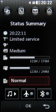
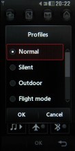
The new menu with status readings
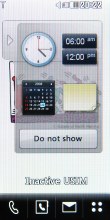
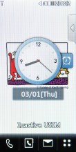
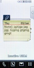
Next, there is new handling of desktop widgets - all of them are hidden onto a sliding pane to the right. You can easily choose which one of them to show on the desktop by sliding out the pane. When you are done you just tuck it away.
Then, there is a new navigation row of icons, which is available across all submenus. The icons are shortcuts to applications such as the task manager, phonebook, messaging and homescreen. The task manager is really nice and it even allows you to run several applications simultaneously.
The new navigation bar appears everywhere • the task manager is quite capable
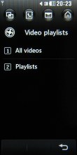
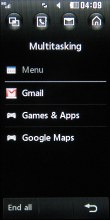
The new navigation bar appears everywhere • the task manager is really nice and capable
And finally, the scroll wheel - the new navigation solution on the side of the handset - brings along its own customizable dial-shaped shortcut menu. However, since the scroll wheel is two-directional only (you can't press it) - you have to start the menu manually pressing the adjacent OK key.
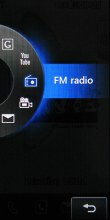
The side scroll wheel is not that impressive
The scroll wheel can be used throughout the whole menu system, however you can't select items in the main menu using the scroll wheel/OK key combo. The scroll wheel allows you to scroll through the tabs of the main menu or in the submenus. Last time we checked, the scroll wheel flipped through one item at a time and you had to scroll like hell to go faster. We are happy that LG have sorted that out in the retail unit and a full rotation of the scroll wheel jumps several items with a single scroll.
Other than that, the same old navigation bar with shortcuts sits at the bottom of the screen - just as in the Viewty. The four available shortcuts are not user configurable. The first shortcut takes you to the Dial pad to punch in a number, the second opens the Contacts list, the third one opens the Messaging submenu, and the last one takes you to the main menu.
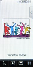
The traditional Home screen shortcuts
Beside all that, the user interface of the LG KF700 retains the same menu system as the LG Viewty - simple, yet impressively sophisticated. LG have made a really nice job designing the user interface.
Since built-in accelerometers are all the rage now and there are many handsets that have those already - we find the lack of one (and hence no screen auto rotation) a bit of a letdown. We shouldn't forget though that the LG KF700 was probably developed last year, so it's only natural it wasn't caught up in the accelerometer fad in the first place.
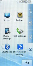
The main menu consists of four tabs - they are displayed in a column on the right-hand side of the screen. They don't have names but the first one is related to making calls and sending messages. The second one is the entertainment package, which houses the multimedia files, the camera, the FM radio, the games, and the music player. The third submenu includes tools such as the web browser, the Google package, organizer applications such as the Calendar, the Calculator, the Unit converter, etc. And finally, the fourth item handles all the settings.
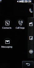
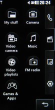
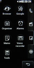
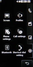
The four sub-menus: calling and texting • multimedia • various tools • settings
By default, the user interface comes in the black and white theme, well-known ever since the LG Prada phone. Beside that default one, the LG KF700 has another color theme as well.
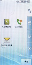
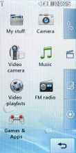
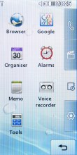
Applying a more lively interface theme
An absolute must-have for every full touch-based handset, and a feature we miss in the Apple iPhone (both versions), is some sort of feedback when the screen is pressed - something besides the touch tone and the touch animation. LG KF700 comes with vibration feedback, which means that every press is accompanied by a gentle vibration, that let's you know your press has been accepted. Settings for it include a choice of three types of vibration plus 7 levels of vibration strength.
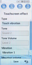
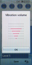
Touch feedback (haptics) settings
Unlike the LG Viewty however, there is no on-screen QWERTY keyboard, and there is no handwriting recognition either. You now have a sliding hardware keypad always at hand.
Reader comments
- JC
- 27 Sep 2010
- v0q
please post a reply..i need to restart the touchscreen effect without selecting menu because when i select menu it automatically restart..OMG
- LG new fan
- 07 Mar 2009
- vfY
well... i have an experience with battery consume... i use the factory setting brightness(100%), listen not more than 1hour mp3, and receive 15 minutes of phone calls, and it last for 20hour standby only! Maybe that's the only disadvantages of this...
- A regretted KF 700 B
- 26 Dec 2008
- Rxs
I bought a KF 700 about one month ago. The monitor is extremely power demanding. I used the factory setting and talked a few calls, took a few photos with flash and listened about 1 hr mp3, it lasted less than one day and needed recharging! ...
