LG KG800 Chocolate review: Dressed to impress
Imagining the image
The 262K color TFT display of the LG Chocolate phone is not bad at all but it fails to impress with a resolution of 176 x 220 pixels. The display has dimensions of 31x33 mm. Legibility of the display under direct sunlight is very good with one exception - and that is reading something under sunlight when the there are some fingerprints left on the display. The display also doesn't have wide viewing angles and you should generally view it directly head on otherwise you risk of seeing wrong colors or brightness. So to sum up, it's not the best display you could get and the resolution really doesn't cut the mustard nowadays.
Talking is what it's all about
Our overall impression is that the phone is fairly good at what it was built mainly for - making and receiving calls with no bells and whistles. The real polyphonic sounds of bells and whistles on the other hand sound wonderfully pleasant. They are loud and clear and one shouldn't miss a call even in a crowded street. If you still manage to miss the bells and whistles, no pun intended, the vibration is strong enough. The MP3 ringing is also loud but really lacks bass elements.
One of the peculiarities of the handset is that the speaker that you use for conversations on the front panel is used as a loudspeaker for the ringing melodies. That is why the volume level of the ringer is limited to 3 when the slide is open. Talking about loudspeakers, it's worth mentioning that the phone doesn't offer loudspeaker capabilities during a call.
Otherwise, the handset has a very good signal reception and the voices during call have a pleasant depth and sufficient loudness. That provides for pleasant conversations even in noisy streets.
Delving even further
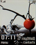
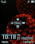
The standby screen of the handset displays info about the battery status and signal strength. The carrier's name can be turned off and we find that a really pleasant feature that should be seen in other phones too. In standby the two soft keys correspond to the Main Menu and the Contacts menu.
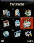
The main menu is a 3 x 3 grid matrix of icons which get zoomed in when you select them. Their graphics are rather grainy and don't please the exacting eye but it seems that it appealed to most people that saw it. We suppose that the graininess is due to the relatively low resolution and as such it's rather a subjective perception depending on what resolution you are used to. We must admit that the overall color scheme and icons match perfectly the design of the phone. And if you look carefully the design of the main menu grid you will notice that each icon is positioned in a black square which in fact copies the design of the numeric keys.
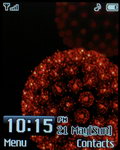
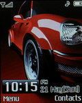
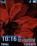
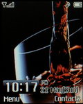
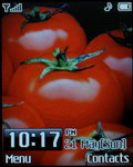
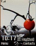
The submenus are viewed as a list. Generally speaking the phone lacks any complicated settings and doesn't require lengthy set-ups. Here are the nice wallpapers that come preinstalled with the handset. It should be noted that you can set any image file as a wallpaper as long as it doesn't exceed 100k in size, for others you should use the proprietary PC Suite software that come on CD with the phone.
The menu can be viewed in two color combinations - either black or silver, which match equally well the overall design and looks of the LG Chocolate. There are no visual themes available.
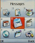
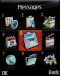
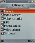
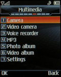
Two color schemes: silver & black
In standby the four navigation keys each have a predefined shortcut function. If you wish you could visualize the respective assigned functions of the standby screen in order to make your life easier. We found it a preferred option in the first couple of days we used the phone.
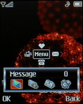
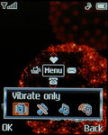
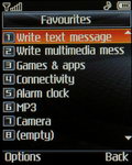
Pressing the LEFT key takes you to the Profile shortcut menu. Pressing the DOWN key naturally takes you to the Phonebook list. Pressing the RIGHT key takes you to a special functional menu that allows you to open the Messages menu, check your voicemail messages, schedule an appointment in the Organizer or schedule an Alarm. Pressing the UP key takes you to the Favorites menu which is a list of shortcuts which is user-configurable.
It's a good thing that all the menu items have numeric shortcuts assigned to them. You can see those in front of every menu item while browsing the menu.
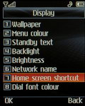
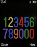
Numeric shortcut icons in the beginning of each row • dialing a colorful number
There's also an interesting option to colorize the phone numbers when dialing in order to distinguish the individual numbers more easily.
Plenty of space, clumsy interface
The phonebook is about average and all we can say about it is that it does it job on a satisfactory level. The phonebook doesn't have a dedicated main menu icon; instead strangely enough it's positioned under the Organizer menu item.
The phonebook capacity is 1000 contacts which is more than enough for most users. Search is performed through gradual typing of a name's characters. The phonebook allows the storing of 4 numbers /mobile, home, office, fax/ and an email. Further on the contact can be included into a caller group or can be assigned a picture. All the available options are showed into separate screens. Generally the phonebook interface has a clumsy design and reminds the phonebook interface of older mobile phones regarding the way the options are ordered and altered.
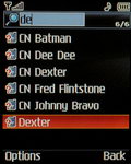
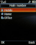
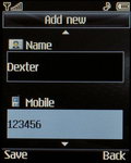
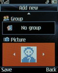
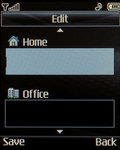
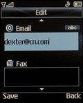
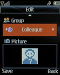
Phonebook search • Different contact fields: clumsy and inconvenient
As we already mentioned any contact can be assigned a picture. There are several limitations to that. Firstly, there are some restrictions to the picture itself - it has to be in .bmp format and it has to be of 72 x 72 pixels size. Now the camera has a dedicated mode for taking pictures of that kind so that helps a lot but still it's an inconvenience that you cannot use regular .jpg picture files. What's more, you cannot even upload your own photo from the PC because for some unknown reason .bmp files are not listed in the phone file browser after you upload them.
An interesting solution is the option to view the contacts list along with the respective pictures. It's a cool solution but poses certain inconvenience since the picture hides some characters from the contacts names.
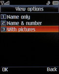
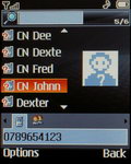
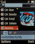
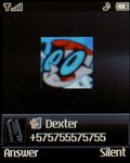
Viewing the contacts with pictures
Another limitation to the phonebook is that you cannot assign a ringtone to a certain contact of your choice. The only way to do that is by including the contact in a caller group and assigning a specific ringtone to the caller group itself. The phone has several preinstalled caller groups which can be customized.
Each caller group has its icon and that can be shown in front of the respective members' names in the contacts list in order to recognize easily which group they belong to.
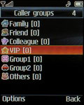
Caller groups list with their respective icons
Yet another limitation of the phonebook is that you cannot save a second or a third number to an already existing contact directly from the standby screen. For that you have to find the contact in the phonebook and enter the Edit mode.
Reader comments
- Anonymous
- 19 Jun 2023
- IbI
Just buy a new phone.
- robert
- 05 Apr 2010
- vGS
if it really compares to the other ones then its a great buy. I checked Lg chocolate 3 skin covers out at internet and they seemed pretty good - they were even giving them away free if you gave htem your current old chunky case
- sandeep
- 06 Oct 2009
- Pxn
as i brought new cell it is chocolate it is cute phone but i have sliding problem plz could any body solve this

