LG KU970 Shine review: A Vodafone touch
A Vodafone touch
Using and abusing
The LG Shine display provided for a nice experience – whether outside or indoors. The legibility remained tolerable under direct sunlight – something that we didn’t expect having in mind its mirror-like finish. The QVGA resolution is pretty adequate and the images shown on the display had fine and wonderful colors. The brightness levels are user configurable but they provided enough flexibility to allow using the handset with an ease both under strong light and in complete darkness.

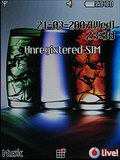
LG KE970 Shine display in the dark
After commenting on the navigation part of the keypad, let us now concentrate on the alphanumeric part. Typing messages was not the easiest thing to do since there are no tactile differences between neighboring keys. Other than that the individual keys themselves have a nice feedback and typing phone numbers was a pleasant thing to do. It’s got to be noted that as with most sliders, the upper row of the keypad wasn’t easily accessible. The green receiver key proved especially hard to get to. The keys pad has a nice but somewhat uneven blue backlighting as you may see from the pictures taken in total darkness.
Ring, ring
We are pretty happy with the LG KU970 Shine when it comes to making and receiving calls. The sound volume is satisfactory and is the same as the one of LG KE970 Shine which comes as no wonder as they have the same hardware. Again much like the KE970 the KU970 doesn’t have a dedicated loud speaker and instead uses the in-call speaker on the front panel for the ringing melodies. Having in mind that dual purpose of the speaker it comes as no surprise that the sound during conversations is really loud and clear. That provides for pleasant conversations even in noisy streets. Both the MIDI and MP3 ringing sound nice and crisp but really lack bass elements.
Vodafone interface
The LG KU970 Shine doesn’t have much in common with the usual LG user interface. The Vodafone presence is pretty obvious and it is clear that they have tweaked the interface in many ways. Since the user interface of the LG KE970 Shine is among the latest developments of the Korean manufacturer we would use it as a reference when marking the differences.
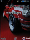
The standby screen of the handset displays info about the battery status and signal strength. Unlike the KE970, the carrier’s name here cannot be turned off which we regret a lot since we find that a really pleasant feature. In standby the two soft keys correspond to the Music player and the Vodafone Live! shortcut.
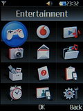
Unlike all the LG GSM phones we have reviewed the LG KU970 has a main menu consisting of a 3 x 4 grid of icons. The graphic icons aren’t different to the ones used in the KE970. Unlike KE970 though the icon are not marked with a number but you still can use the corresponding numeric keys on the keypad as shortcuts for the menu items.
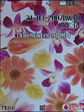
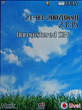
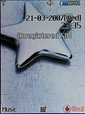
The submenus are viewed as a list. Once you open a menu item you can scroll to the other menu items with the navigation roller without the need for returning to the main menu. Here are the nice wallpapers that come preinstalled with the handset.
There are no themes available for customizing the looks of the interface, but there is the option to change the menu style. Beside the regular 3x3 grid you are given the opportunity to use the list style menu. Unfortunately the highly attractive Arc style we saw in LG KE800 Platinum is not among the available options.
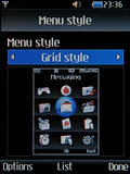
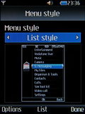
Two possible options: grid style or list style menu
In standby each of the four ways of the navigation roller has a predefined shortcut function. If you wish you could visualize the respective assigned functions of the standby screen in order to make your life easier. We found it a preferred option in the first couple of days we used the phone.
| The LG KU970 Shine doesn’t have much in common with the usual LG user interface. The Vodafone presence is pretty obvious and it is clear that they have tweaked the interface in many ways. | <#AdRectangle#> |
Pressing the LEFT key takes you to the Messaging menu. Scrolling DOWN naturally takes you to the contacts list. Pressing the RIGHT key opens the Calendar menu and scrolling UP opens a choice of available ringing profiles among which there are three fully customizable ones. What we miss here is the Favorites menu (a list of shortcuts which is user-configurable) which was present on all recent LG GSM phones.
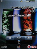
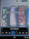
Standby screen shortcut menu • Profiles menu
It’s a good thing that all the submenu items have numeric shortcuts assigned to them. You can see those in front of every menu item while browsing the menu. The system font used can be changed to a funkier one if you wish. An option like that lacked in other LG phones.
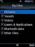
Numeric shortcut icons in the beginning of each row
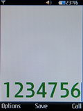
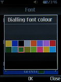
There’s also an interesting option to colorize the phone numbers when dialing. You can choose your favorite color from a preset palette.
The phonebook is different too
The phonebook of the LG KU970 Shine differs from the KE970’s phonebook in a number of ways. We liked the KE970 phonebook and as you would see there is no reason why not to like the KU970 phonebook too.
Instead of 1000 contacts, the KU970 phonebook has available storage space for 500 contacts only but we find that pretty adequate for most people. Unlike KE970, with the KU970 phonebook you can choose whether you wan to see only your phone memory contacts, only your SIM card contacts or both. In KE970, as in all other recent LG GSM mobiles, both lists were displayed simultaneously and there was no option to change that.
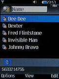
Search is performed through gradual typing of a name’s characters. In KE970 typing the initial letters of a contact’s name only led to highlighting the searched contact. In KU970 typing even one letter filters the contact lists in order to show you only the contacts which start with that letter – a much user-friendly solution.
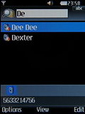
Searching with several characters
Beside all those changes, a significant face lift has received even the graphical way the contact details are presented and edited. Instead unnecessarily large fields, the LG KU970 contact details are presented into a tightly build table.
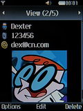
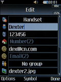
Viewing a contact • editing a contact
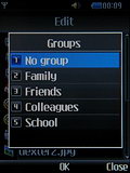
The phonebook allows the storing of 5 numbers and 2 emails. Further on the contact can be included into a caller group or can be assigned a picture. You can add several other business details such as company name, company address, etc. You can again add a note to the contact too. It’s good to see that the phonebook has gained a lot in user friendliness.
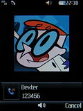
Unlike KE970 now there are no restrictions as regards the size of the pictures that can be assigned to contacts. As usual you can view the contacts along with their respective pictures. It’s a cool, but poses certain inconvenience since the picture hides some characters from the contacts names. A nice innovation in that department though is that with the KU970 the contact image appears with a slide only after you stop at a given contact in the list for a second. Once you continue browsing the images get hidden again.
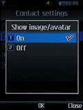
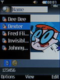
Viewing the contacts with pictures
You can assign a ringtone to individual contacts as in KE970 Shine. The phone has several preinstalled caller groups which can be customized.
As with LG KE970 Shine you can save a second or a third number to an already existing contact directly from the standby screen – something impossible in the original Chocolate.
Reader comments
- Anonymous
- 30 Aug 2008
- kIx
pls tell me hoe to use this phone,, i dont know how to add contact in this phone,, i dont know where to press to finish adding the contact. pls help
- VC
- 15 Jul 2008
- ubH
Hi, I want to copy all my phone contacts to SIM card, however due to some reason the screen is not working even the mobile still works. Can someone please advice the number keys to navigate the menus all the way through, then post the key combination...
- Anonymous
- 06 Mar 2008
- 2Gw
LGKU970 isnt exclusive to any company. i work for 3 and you can have it free on a $29 cap.


