LG KU990 Viewty review: Eyes wide open
Eyes wide open
Telephony
The LG KU990 deals great with making phone calls, as you have all the rights to expect. When it comes to loudspeaker volume, it was a nice surprise that it's the loudest handset we've tested recently in our office.
This will be the first review where we publish the results of our latest sound level test setup. We are using a digital noise meter to measure the highest sound levels, that our test handsets manage to reach. All measurements are made with the device's loudspeaker physically facing the noise meter at a distance of 1 m. There are three types of test sounds that we use - a selected ringtone (sounds like an old telephone ringing), pink noise (which for our purposes stands for the loudest levels of a music track) and - finally - human speech (which you would normally hear when using the handset speakerphone during a call). The maximum values for each type of sound are recorded in three consecutive tests and the highest one is taken for our records. When comparing results, bear in mind that we are dealing with a logarithmic scale here, which practically means that even a slightly higher readings may mean a significant audible difference in reality.
Here is how the LG KU990 Viewty stacks alongside some of the other handsets we've tested recently. More info on our test here.
Speakerphone test results
| Test sample | LG KU990 Viewty | Sony Ericson K770 | Samsung U600 |
| Ringing phone, dB | 77.8 | 76.2 | 75.3 |
| Pink noise/Music, dB | 68.8 | 67.1 | 66.2 |
| Voice, dB | 72.0 | 68.7 | 67.7 |
| Overall score | Good | Good | Good |
Flashy user interface
The user interface of LG KU990 is based on Flash technology, much like the one in LG Prada. The KU990 is still not a smartphone or anything, but it has one huge difference in comparison to the Prada phone. It's that now we have ourselves a nifty little task manager, that works great and all open applications such as the phonebook, new message window, calendar, calculator, etc., are listed once you've launched them.
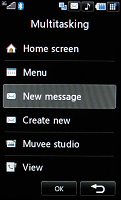
The task manager has room for all running processes
At the top of the standby screen there is info about the battery status, current profile and signal strength. The task manager icon is there too - right in the corner. A tap on the profiles icon brings out a popup with the available profiles. The main screen can visualize a floating clock as the Prada phone, but now you can opt for adding a calendar next to it, or even make them both disappear. A single tap on the clock brings out the Alarms flag which allows you to setup an alarm straight from the standby screen - comfortable enough, we would say. You can even set two time zones to display simultaneously on the screen.
At the bottom of the screen there is a navigation bar with shortcuts. Unfortunately, the available four shortcuts are not user configurable. The first shortcut takes you to the main menu, the second opens the Dial pad for you to type in a number, the third opens the messages submenu and the last one opens the Contacts list - no changes here as compared to the Prada phone.
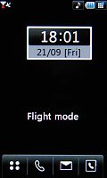
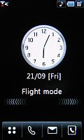
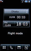
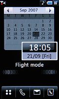
You can set a clock and/or a calendar to float on the screen
As we mentioned, the four shortcuts in the bottom of the screen are not user-configurable, so a nice upgrade over the Prada phone is the new shortcuts grid that overlays the Home screen once you tap on the arrows you might have noticed on the previous Calendar screenshot. The shortcuts grid doesn't simply appear on the screen but slides in stylishly. Tap the right arrows and it goes away, and you are again left alone with the clock.
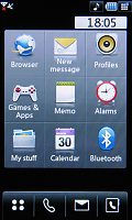
The new icons grid offers shortcuts to some of the most used features
Next to the small icon of the task manager in top right corner, you will see an icon of the currently active ringing profile. A press on it invokes the Profile menu, which offers extensive setup options for the available profiles.
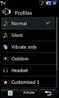
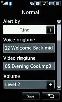
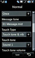
There are several ringing profiles with numerous settings
The user interface of KU990 retains the same menu system as the Prada phone - simple, yet impressively sophisticated. Ergonomics and user-friendliness are at their heights. LG have made a really nice job designing the user interface system.
Have a look at our video showing the home screen and the main menu:
Home screen & main menu
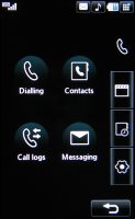
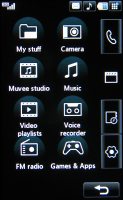
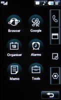
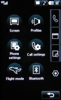
The main menu consists of four submenus - they are displayed in a column on the right-hand side of the screen. They don't have names but the first one contains elements related to making calls and sending messages. The second one is the entertainment package, which houses the multimedia files, the camera, the FM radio, the games, the music player, the web browser, and two streaming video applications. The third submenu includes organizer applications such as the Calendar, the Calculator, the Unit converter, etc. And finally, the fourth item handles all the settings.
By default, the user interface comes in the black and white theme, well-known from the LG Prada phone. There are two other UI themes that come in full color, with beautiful icons. One of them offers a fish swimming on your display (the Prada had that, too). You can change the wallpaper on the welcome screen if you wish.
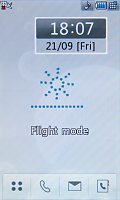
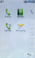
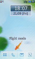
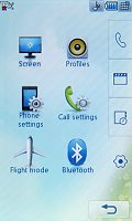
LG KU990 color themes: the fish would come to your finger once you touch the display
An absolute must-have for every fully touch-based handset and a feature we missed in the Prada phone is some sort of feedback when the screen is pressed - something besides the touch tone and the touch animation. LG have taken care of it for us and the KU990 is haptics-enabled, which means that every press is accompanied by a gentle vibration, that let's you know your press has been accepted. Settings for it include a choice of three types of vibration plus 7 levels of vibration strength.
| As we mentioned, the four shortcuts in the bottom of the screen are not user-configurable, so a nice upgrade over the Prada phone is the new shortcuts grid that overlays the Home screen once you tap on the arrows you might have noticed on the previous Calendar screenshot. | <#AdRectangle#> |
The phonebook has seen some changes
The Contacts list offers much the same function as any ordinary phonebook. The contacts capacity is 500 contacts (which is only half the count the Prada phone had). The phonebook allows storing extensive information on you contacts. You can organize your contacts into caller groups, and you can also assign them a picture and a ringtone. The phonebook has received a nice upgrade when it comes to filtering and searching your contacts. A new column which was missing in the Prada has now appeared on the left and you can use the alphabetic shortcuts to find contact based on the first letter of their names (kind of reminds of iPhone, doesn't it?). The system used in the Prada phone for filtering and searching your contacts is also an option here - a keypad is available all the time while you scroll through your contacts. Search is performed by gradual typing of the contact's name. It's handy for specific searches but only two contacts are visible at a time with it.
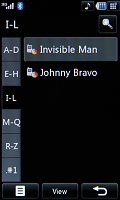
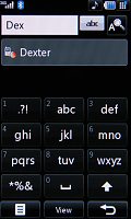

Contacts list • now you can filter contacts by using the left side column • viewing Dexter details
You can see the new phonebook in action in our special video:
Browsing the phonebook
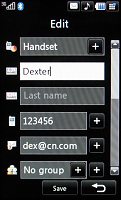
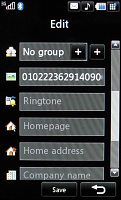
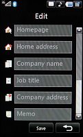
Editing a contact: a plethora of available fields
Unlike the Prada phone, you can set the phonebook to display phone and SIM contacts separately.
Texting gets easier
The phone supports the sending and receiving of SMS, MMS and email messages. The Prada had separate message editors, while with the KU990 turning an SMS into MMS is simpler. You just need to click on the paper-clip (attachment) icon you see on the screenshots. The actual typing of the messages without a hardware keypad is much easier now that LG have added haptics (slight vibrations) to provide feedback on every key press.
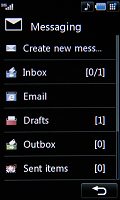
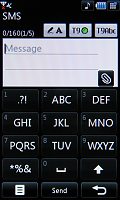
Messaging menu • typing a message
A great add-on to the messaging department is the handwriting recognition. You can use the stylus to input text or you can even edit text that has already been typed. Unfortunately, the handwriting recognition doesn't score as high as the one seen in Windows Mobile PocketPC. There are several text input methods - keypad, QWERTY keyboard, handwriting on the screen, handwriting in box.
See the QWERTY keyboard in action in our video:
Using the QWERTY keyboard
When you choose the QWERTY keyboard as an input method, the interface automatically turns in to landscape mode. If you think about it - it does resemble the iPhone keyboard, doesn't it? Generally speaking, we liked the QWERTY keyboard and we managed to get the hang of it really quickly. Unfortunately, the QWERTY keyboard input which we liked best is not available throughout the whole interface where text needs to be entered.


Using the QWERTY keyboard • writing on the screen
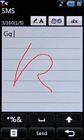
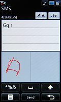
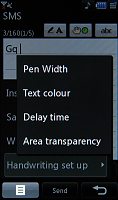
Using handwriting on screen and handwriting in box • we couldn't understand the difference between writing in the two boxes • handwriting recognition options
When it comes to emails, the LG KU990 deals with them with no hassle whatsoever. Both POP3 and IMAP4 protocols are supported. The maximum attachment size for incoming mail is 400KB. You can set the handset to auto retrieve your new emails at a preset interval of time with a separate option for that when you are in roaming. Unfortunately, we couldn't set it up to work with our test Gmail account, so we guess that the email client of the KU990 doesn't have support for SSL encryption.
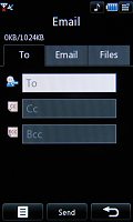
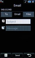
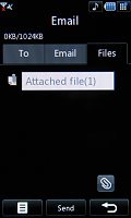
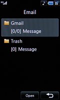
Email composing options are well structured • showing off your email inbox
Reader comments
- Shamim reza rubel
- 04 May 2015
- ubI
It is very very very good & good phone.
- Anonymous
- 24 Feb 2015
- t0L
this phone can recover?
- Anonymous
- 25 Apr 2014
- fsV
Cn i watsap?
