LG Nexus 5 review: Back to the future
Back to the future
Photos and Gallery handle your images and videos
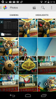
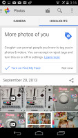
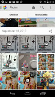
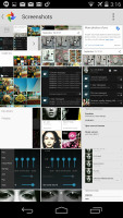
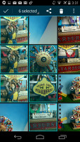
The gallery in Android 4.4 KitKat is called Photos and comes with new looks, functionality and a new user interface. Upon opening the app you'll see two tabs - Camera and Highlights. Above those two tabs you get the Movie, Search and Settings shortcuts.
The movie shortcuts allows you to easily select pictures and videos from which you want to create a movie and they will be automatically added to the brand new Video Creator. After that you can add music, stitching theme and voila - your video is ready with just a few taps. Nice!
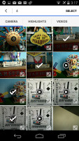
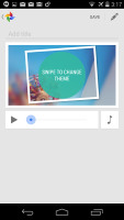
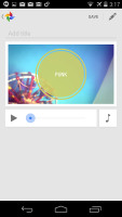
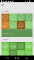
Creating a movie straight from the gallery is very easy
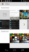
The Camera is a grid of your photos and videos, three on a line. The very first thumb is marked as Folders and will return you a step back to the old Album view, where you can choose to open a different album. The Gallery will always open the Camera album by default.
The Highlights tab has all of your Picasa and Google+ online photos. The Google Photo automatic upload is integrated in the new Gallery app. If you turn it on, your photos will be automatically uploaded to your Google+ profile, but won't be shared with others unless you do it manually.
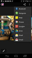
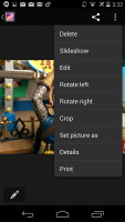
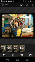
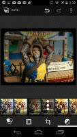
The single photo view is updated too - below the photo there are three shortcuts - Edit, Share and Delete. That's it. The Editor allows you to crop, rotate or add filters to your photo.


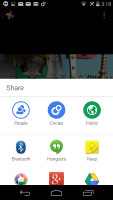
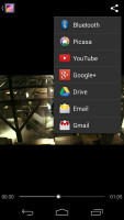
Viewing a single image • Sharing options • Editing an image
The new Gallery has a few hidden goodies that we almost missed. There is a hidden navigation menu pane that is revealed with a swipe from the edge of the screen anywhere in the gallery. You can easily switch Google+ accounts from there, go to Albums, Videos, Photos you are tagged in, all Google+ photos or even the deleted photos.
There is also an Auto Awesome section. It is something like a smart gallery that combines similar photos and videos in a cool way - it either exports a collage picture or a motion gif. If you like the combination the gallery has made for you, there is a dedicated shortcut to save the new picture in the gallery. Awesome, indeed!
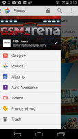
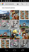
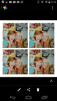
The hidden menu • Auto Awesome pictures
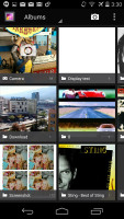
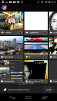
The old gallery that premiered with the Ice Cream Sandwich is also on board. The Default view of the gallery is Albums, the first of which is always the Camera album, which has a camera overlay icon too. Rather than the familiar stacks, the app uses a grid of photos, two on a line.
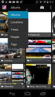
Besides, Album view, you also get Locations (photos are grouped based on where they were taken), Times (grouped by when they were taken), People (if the photos have tagged faces in them) and Tags (these are general tags you can add manually).
A handy option is the Make available offline feature - it lets you easily select multiple online albums and download them for offline viewing. The Gallery app supports online albums from Google+ and Picasa and sync is available just like in the new Photos app. You can make all of the albums available offline.
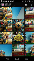
Getting inside an album displays all the photos in a rectangular grid, which is horizontally scrollable. When you try to scroll past the end, the photo thumbnails will tilt to remind you you're at the end.
Anyway, the single photo view is updated too - above the photo there are several sharing shortcuts and a delete button, while the underlying line of small thumbnails of all other photos in the album isn't present any more.
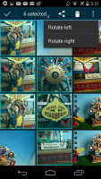
The settings menu lets you do simple edits to a photo (rotate, crop) or go into a more capable editor with a lot more option. The editor can be accessed from a small icon from the bottom left hand-side corner and offers light adjustments (so you can bring out the shadows or the highlights), effects, color styles, red eye correction, straightening a photo, sharpening and face glow (which detects faces automatically). Most of these options have a slider that lets you fine-tune the strength of the effect.
Poor video player integrated within the gallery apps
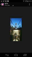
The video player is still not getting the necessary attention from Google and there's still no dedicated videos app (you have to go through the Gallery or Photos). The only supported format is MP4 up to 1080p resolution. That's it. There is no subtitle support.
Streaming videos to a Wi-Fi enabled TV is available. One way to go about this is to share your multimedia content over good ol' DLNA technology OR you can mirror your device's screen to the TV via the Miracast protocol.
Listen or stream your music via Google Play Music
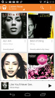
Google's own music player called Play Music and it went through a major UI overhaul recently. It is now snappier and more beautiful. It features the spanking New Listen Now feature, which tries to determine what you like and the sequence of your track-changing so that it can start offering you music you might like to play next.
Google Play Music also gives you the option to upload music onto the Google-branded cloud and stream it on your device via Wi-Fi or mobile data. There's also the nifty option of downloading the content onto the device if you want to have there for connection-less times.
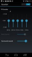
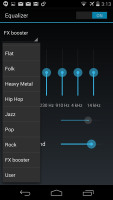
From the Settings key you can get into the equalizer. It can be turned on and off and features several equalizer presets along with a custom user defined one. If you plug in a headset, you can also play around with the Bass boost and 3D effect sliders.
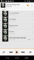
The Now Playing screen uses the song album art and gives you a quick shortcut to the rest of the artist's songs along with the play controls.
While the player is working, the entire lockscreen features the album art and track info for the current song along with dedicated playback controls. The notification area also lets you control the playback via an expandable notification.


Google Music in the Notification area and lockscreen
Audio output is smooth but quiet
The LG Nexus 5 audio output was almost identical to that of the LG G2, which means the smartphone showed nicely clean output in both parts of our traditional audio quality test. However the volume levels here were even lower than on the LG's own flagship, making them below average.
The scores stay close to perfect even when you plug in a pair of headphones. The stereo crosstalk worsens a bit but the rest of the readings are virtually unaffected (frequency response actually improves a bit). Unfortunately, the volume levels remained just as uninspiring.
And here go the results so you can see for yourselves.
| Test | Frequency response | Noise level | Dynamic range | THD | IMD + Noise | Stereo crosstalk |
| LG Nexus 5 | +0.02, -0.08 | -93.3 | 93.2 | 0.041 | 0.028 | -94.3 |
| LG Nexus 5 (headphones attached) | +0.18, -0.08 | -91.0 | 93.1 | 0.046 | 0.079 | -54.2 |
| LG G2 | +0.03, -0.28 | -91.9 | 91.9 | 0.0097 | 0.011 | -91.3 |
| LG G2 (headphones attached) | +0.07, -0.03 | -91.5 | 91.8 | 0.037 | 0.041 | -54.3 |
| HTC One | +0.11, -0.14 | -92.4 | 91.2 | 0.0012 | 0.013 | -92.4 |
| HTC One (headphones attached) | +0.16, -0.07 | -92.1 | 90.9 | 0.014 | 0.055 | -70.8 |
| Samsung Galaxy S4 | +0.03, -0.08 | -95.9 | 93.2 | 0.0030 | 0.0092 | -96.4 |
| Samsung Galaxy S4 (headphones attached) | +0.03, -0.08 | -96.0 | 93.3 | 0.0031 | 0.089 | -95.5 |
| LG Nexus 4 | +0.11, -0.10 | -82.3 | 82.3 | 0.0040 | 0.019 | -82.0 |
| LG Nexus 4 (headphones attached) | +0.06, -0.36 | -81.0 | 81.1 | 0.011 | 0.091 | -62.4 |
| +0.02, -0.05 | -93.6 | 93.7 | 0.0013 | 0.0068 | -90.3 | |
| +0.12, -0.00 | -93.4 | 93.3 | 0.0016 | 0.060 | -76.1 |
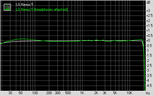
LG Nexus 5 frequency response
You can learn more about the whole testing process here.
Reader comments
- AnonD-1175762
- 22 Oct 2024
- Xy{
Nexus 5 because he have Stock Interfaces
- AnonD-1175762
- 22 Oct 2024
- Xy{
IDK I know that it's working up to 4F
- AnonD-1175762
- 22 Oct 2024
- Xy{
Yes U Can
